Before + After | Project Powhatan: Kitchen, Butler's Pantry, and Living Room
Welcome, welcome to the first before and after post of the year! I'm SO excited to finally share Project Powhatan with you today! I finished up this project back in the fall, but since it was located a few hours away, I didn't have a chance to shoot it until just before Christmas. If you follow along on Instagram, you may have caught a couple of sneak peeks that I couldn't resist sharing, but now it's time for the full reveal!
Hold onto your hats folks, because this is a good one. The homeowners and I worked together on many parts of the house, but the kitchen, butler's pantry, and living room saw the biggest changes, and that's what I'll be showing you today. With the way it was configured originally, the house felt way more cramped than the square footage you saw on paper. When my clients purchased the home last summer, they knew they it needed some serious renovating to bring it up to snuff for modern family living and brought Mix & Match on to help through my e-design services.
We decided to take down one major wall to open things up, and significantly reconfigured the floor plan on the first floor to make it functional for the way they wanted to live. To orient you for the photos to come, the original kitchen became the butler's pantry/mudroom, the original dining room was transformed into the kitchen, and the living room stayed put. The wall that came down was between the original dining room and living room, and not having it there made a HUGE difference.
When you're working with clients through e-design - especially when it involves a renovation - it has to be a very collaborative process that requires the homeowners to be right in the thick of it. These homeowners totally got that, and knocked the implementation and installation part out of the park. They even did some of the early demolition themselves!
Since we've got a lot to see today, I'll break the three rooms up into their own little before and afters. We'll start each one off with the before photos so you can get a sense of what each space looked like when my clients originally purchased the house (the photos are from inspection day, so the stuff you see all belonged to the original owner). It's crazy to look back at these now - it looks so different with all the changes, and I know it can be a little bit hard to tell how we got from the before to the after, but I'll do my best to explain how we did it along the way.
Let's get into it!
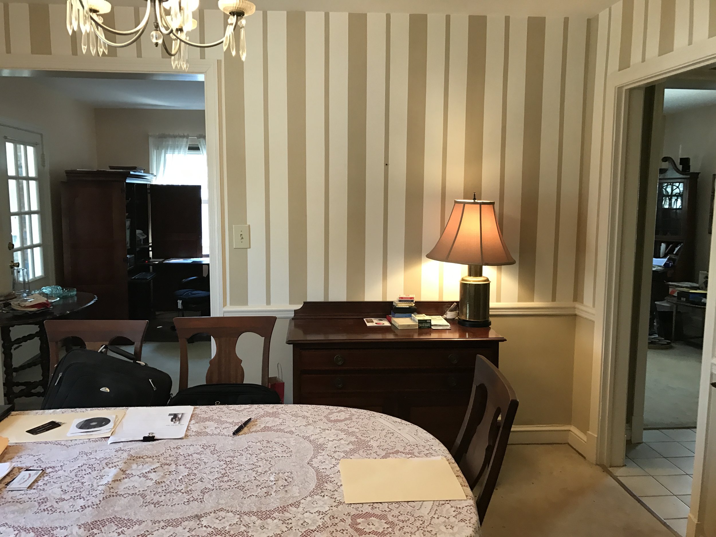
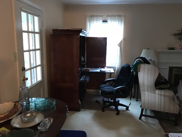
Before: Dining Room (Now the Kitchen)
As I mentioned in the introduction, the dining room is now the kitchen, and we took down one wall between this space and the living room to give the whole first floor a more open feel and flow. The wall that's no longer there is the one see straight ahead of you in the first photo above. The reason we wanted to move the kitchen was because the original kitchen was teeny and tucked away in an awkward corner of the home. Once you see the photos, you'll understand. :) You can catch a glimpse of it through the doorway in the third photo.
Now you might be asking, where's the dining room now? Well, we moved it to the sunporch! It worked well since that room is right off of the living room - it was like they gained an extra room without having to do an addition.
The kitchen is now the heart of the home, and it's stunning!
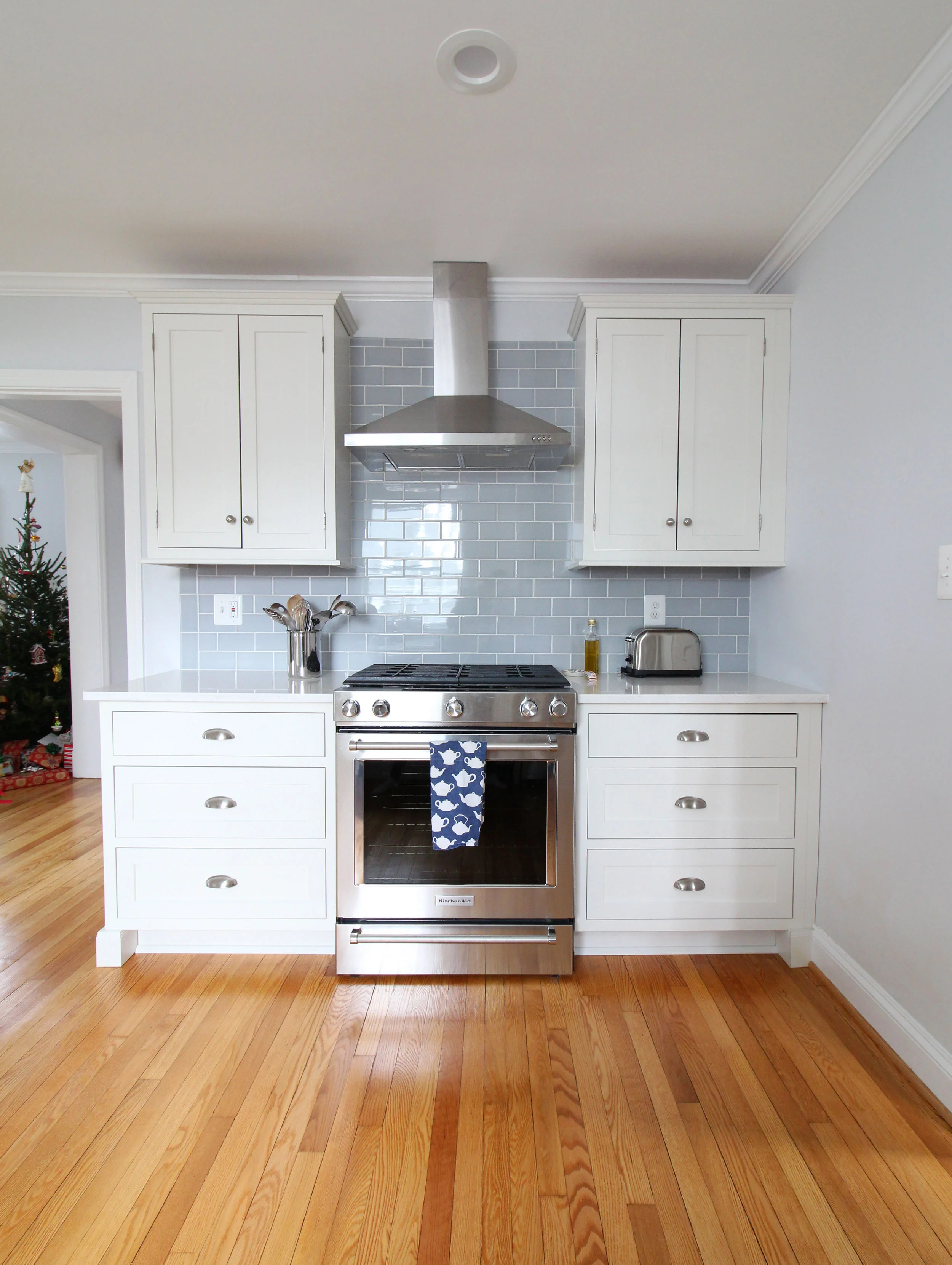
After: Kitchen
Isn't it beautiful? I'm calling their style "transitional farmhouse" and it feels so fresh, clean, and timeless. The inset white cabinets, open shelving, blue subway tile, and quartz countertops are a killer combination, and I'm loving the overall look.
By opening up the wall between the living room and the kitchen, we were able to add a peninsula that provides a nice, casual spot to eat or hang out and have a conversation with whoever is cooking. It feels so spacious, which is awesome since you pass through it all the time going from one place to another in the house.
Next up, the new butler's pantry/mudroom!
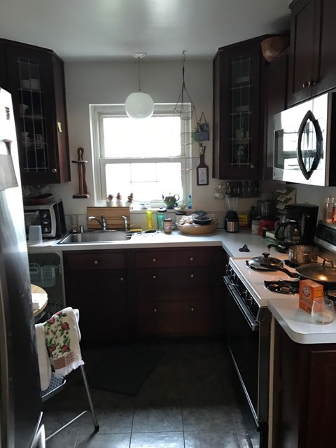
Before: Kitchen (Now Butler's Pantry/Mudroom)
The original kitchen was connected to the dining room, but was pretty much completely cut off from the rest of the house and felt very cramped (not to mention the fact that it was petite at about 8.5' x 11'). It needed a full renovation, but there really was no way to make it into what the homeowners truly wanted out of a kitchen, so that's when the decision was made to move it to the dining space. So we turned this spot into a butler's pantry and mudroom, which is perfect since there's an exterior door (not shown) that connects to their porch and backyard. It gives the homeowners a drop zone, extra storage, and prep space all in one. The homeowners are still tweaking the mudroom part of this space, so I'll just be sharing the butler's pantry.
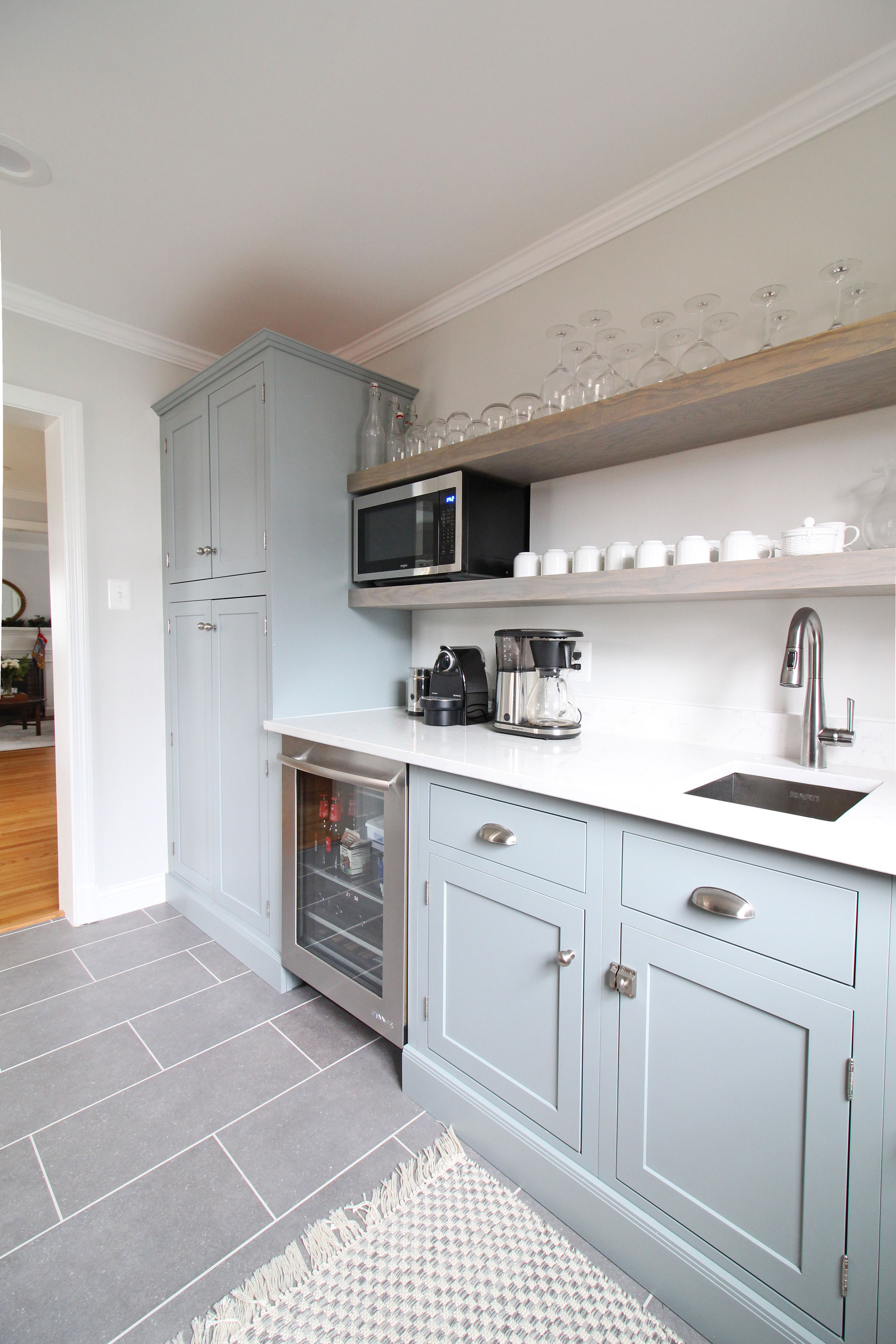
After: Butler's Pantry/Mudroom
I'm head over heels in love with this space now, aren't you? It's SO functional and SO beautiful at the same time. The blue-green cabinetry tie in perfectly with the blue glass subway tile in the neighboring kitchen and the open shelving provides great storage without the weight of upper cabinets. A floor-to-ceiling pantry, beverage fridge, and prep sink add additional functionality. I love that they have so much storage in here, but the space still feels open.
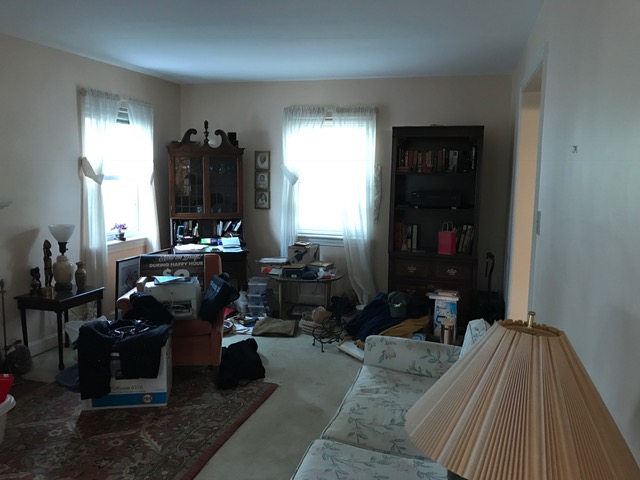
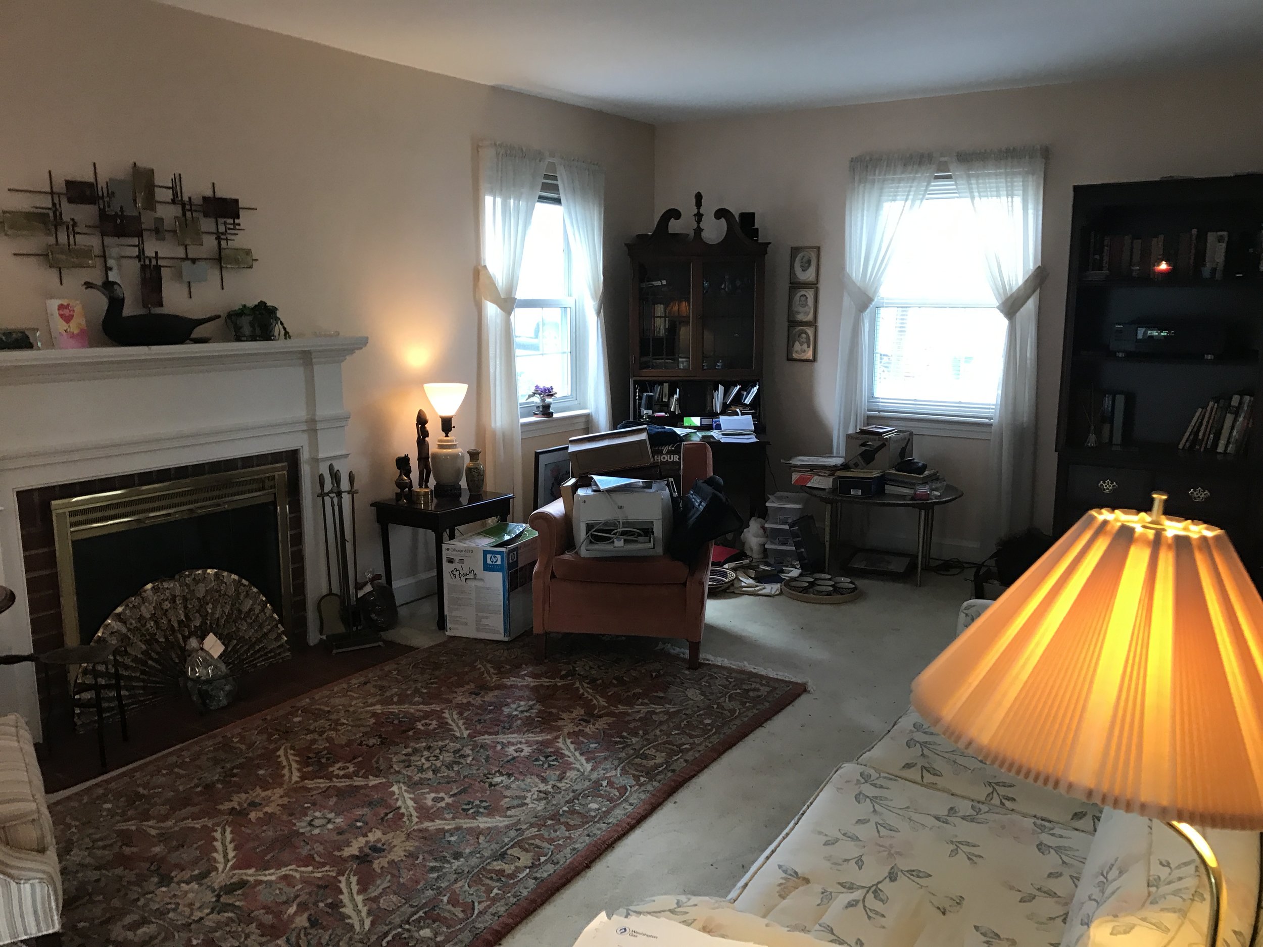
Before: Living Room
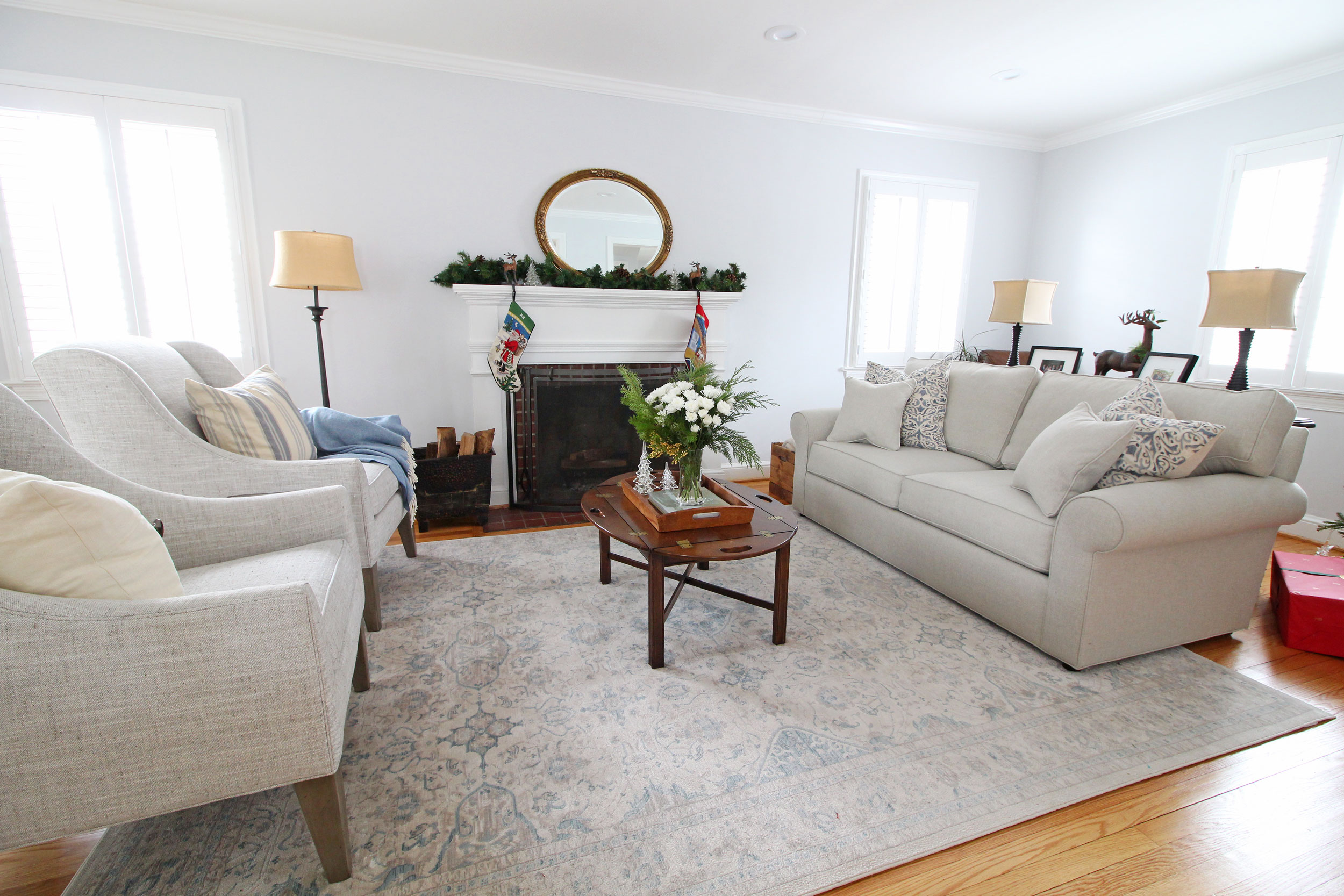
The living room may not have changed positions in the floor plan, but it definitely got a makeover! The old carpet came out and the hardwoods underneath got refinished, everything got a fresh coat of paint, and we brought in new furniture. It's a nice size, and is one of the first spaces you see when you come into the house, so we wanted to make sure it gave a really great first impression.
Since I snapped these photos days before Christmas and didn't want to disrupt the clients too much with the photoshoot, you will see Christmas decorations sprinkled around. This is real life, folks! When I shoot homes, I like to use what the homeowners already have and not stage it too much.
Now let's see the after shots!
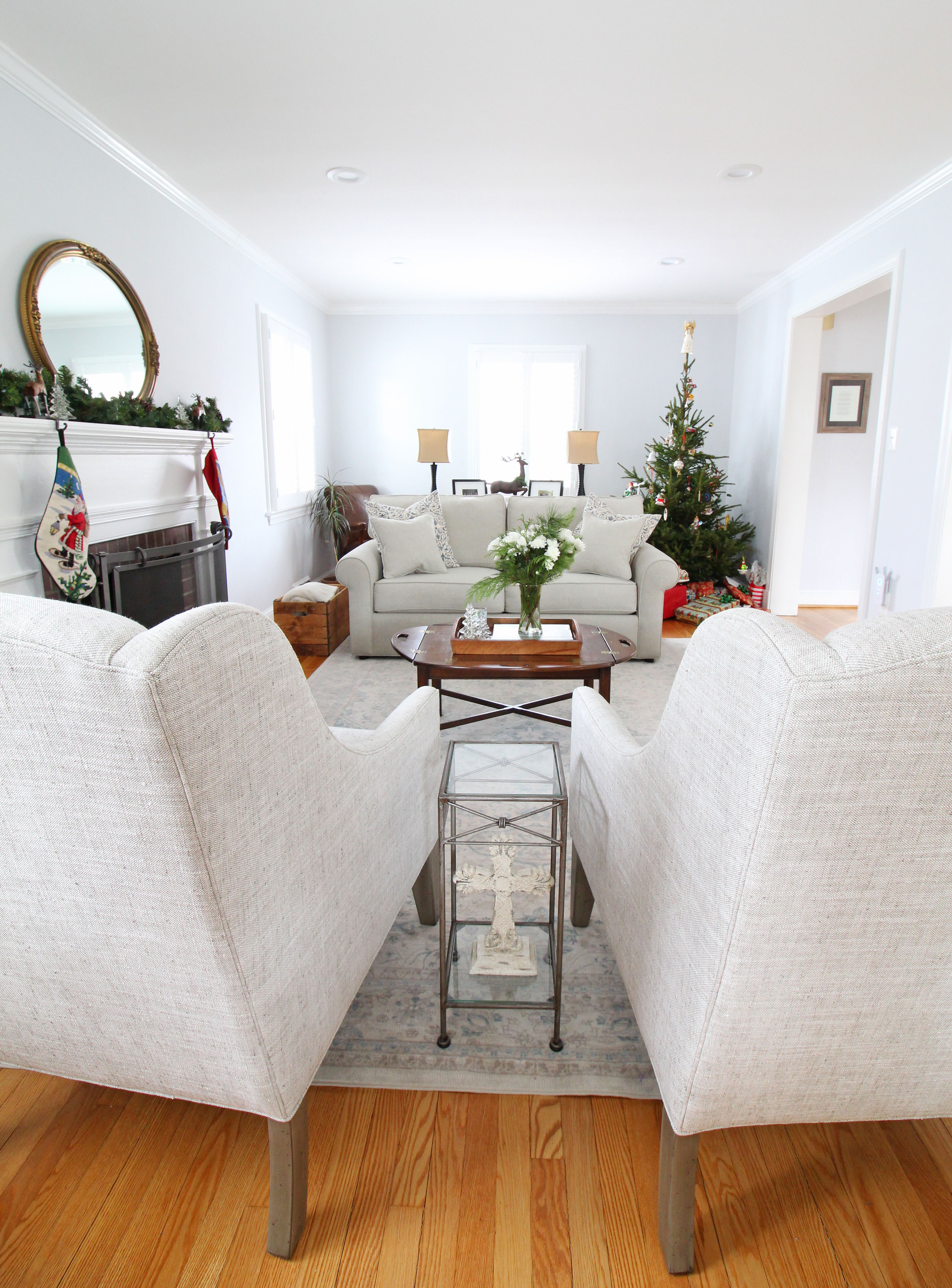
After: Living Room
Ahh, so fresh and bright! It definitely has a cozy and inviting feel, doesn't it? The look of this living room flows seamlessly into the adjacent kitchen with its blue, linen, and white color scheme. When one space is so open to another, they need to feel cohesive or it will feel disjointed. I also love how its openness provides an opportunity to pull up additional chairs if you have a larger group of people over.
The homeowners are still in the process of making a few final updates to this space, so I may need to go back sometime and snap some photos as an update at some point! They're currently waiting on a gorgeous ottoman to come in, and have been playing around with some art options for above the mantle. They have great taste, and I'm excited to watch all the final details come together. Sometimes it takes awhile to get things just right - especially when you're moving into a brand new home.
Overall, I'm thrilled with how Project Powhatan turned out, and the homeowners are too, which is the most important part! Though a renovation is a ton of work, it was 100% worth it to give them a home that functions well and will grow with them for a long time to come.
Ready to give YOUR home a fresh start this year? Mix & Match's online interior design services are ready for you. Check out more information about e-design here. Feel free to contact us if you have any questions!


