
My Favorite Warm Gray Paint Colors

I’m back with my third post on favorite paint colors! This time I’m covering warm grays - from almost whites to greiges to light taupes, which are some of the most versatile paint colors around. Here are the links to my other two posts:
I’ve also covered how I choose paint colors, which is a good post on paint strategy because let’s be honest, picking colors can be tricky! So head on over there if you’d like some general advice.
Paint colors look different in every room depending on the direction the room faces, the amount of light it gets, and the artificial light sources, so always, always, get a sample. See how it looks in your own home at different times of the day and under different lighting conditions before you commit! I find this is particularly true for neutrals and whites.
My best paint color sample hack that will save you time and a trip to the paint store (and avoid having a million tiny sample pots laying around) is to order peel-and-stick sample sheets from Samplize. They use real paint from your favorite brands so you’ll get an accurate representation of what the color looks like.
One final note before we jump into the paint colors themselves - always make sure you include the brand name when you search for a paint color. A lot of brands have very similar names for their colors (or even the exact same ones) and it would be such a painful mistake to accidentally get one when you meant to get the other!
One common mixup happens with Alabaster - both Sherwin Williams and Benjamin Moore have that one in their collections. The SW version is a warm neutral white, while the BM one is a white with pink undertones. Don’t accidentally get the wrong one!
Now let’s get into some of my favorite warm gray paint colors!
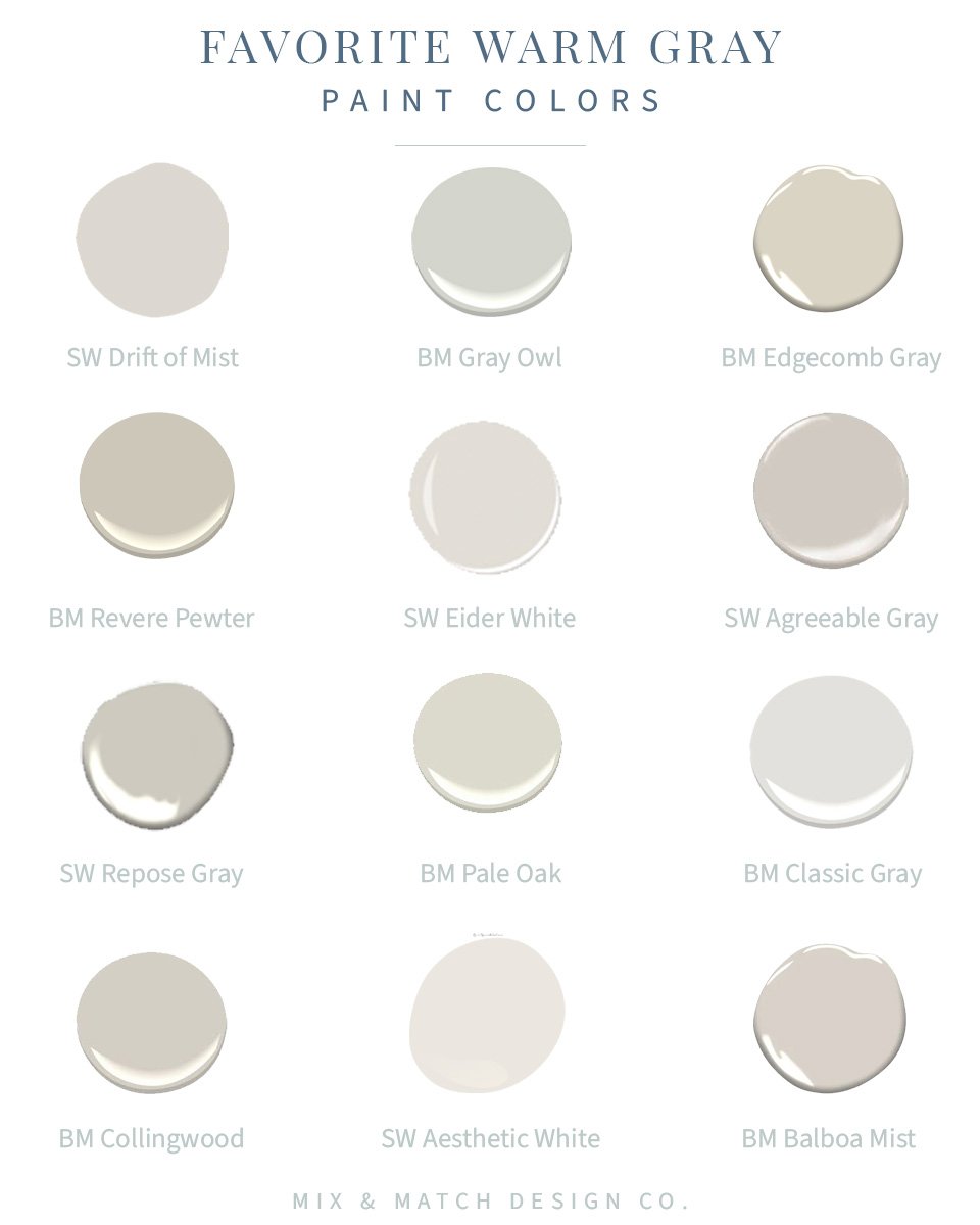
SW Drift of Mist
This warm gray has a bit of a brown undertone and has a warm, cozy vibe. It looks good in just about any room!
BM Gray Owl
This one’s teetering on the edge of warm and definitely looks gray. This was a color we tested for our Philadelphia home and it felt a little cold to me in our row house that didn’t get tons of natural light. I’d recommend using this one in a bright, east or west facing rooms.
BM Edgecomb Gray
Solidly in the warm gray (greige) category, Edgecomb Gray is one of the most popular paint colors out there and is part of Benjamin Moore’s Historic Collection. It can read almost tan depending on the light.
BM Revere Pewter
Another top paint color! It’s a tad darker in tone than Edgecomb Gray and is also part of the Historic Collection. The undertones are a warm brown, but it can appear more gray in bright light. I find this one can be a real chameleon sometimes.
SW Eider White
This one has just enough pigment to toe the line between a white and a light gray. It’s a great option for dim spaces that don’t have much natural light where you still want a light paint color. It adds a little warmth without making it feel dark!
SW Agreeable Gray
If you want a warm gray that works just about everywhere, this is a great option! It has olive green undertones and looks great in both natural and artificial light - it’ll just look a little different in each of those scenarios.
BM Repose Gray
Repose Gray is a touch cooler than some of the others I mentioned and is also really versatile, but is also another one of those chameleon colors, so you definitely want to sample it in varying lights and times of day. The undertones sometimes give it a purple, blue, or green hue depending on the light.
BM Pale Oak
This is my current favorite light taupe color that works in SO many places. I used this color for our perimeter kitchen cabinets, my mom used it in her long, dark hallway, and a client recently painted her bedroom with it. It’s a great balance of warmth and pigment, so if you’re looking for a great in-between color that’s not white and not gray, this is a good one to try.
BM Classic Gray
This was the runner up color for our Philadelphia home (we ended up with BM Winter White in all the rooms!). It has green undertones and can change in tone throughout the day.
BM Collingwood
I call this one a “gentle” warm gray. It’s light and easy on the eyes. It can have a violet undertone, but don’t worry - your walls won’t look purple unless you have a lot of greens or yellows nearby. Those complementary colors tend to bring out the violet undertones. It’s a shade darker than Balboa Mist (the last color mentioned here) and is a bit warmer.
SW Aesthetic White
Aesthetic White is probably the lightest color I included here (along with Eider White), but it still has enough pigment in it to lean gray to me! I love this color in places where you have bright white trim and want a little contrast on your walls, but not a ton. It has really neutral undertones and works just about everywhere.
BM Balboa Mist
This color will always be high on my list of warm grays - it’s hard to go wrong with it. It works well with rooms that face any direction; it just might look a little different in each space. Again, I like it paired with bright white trim for contrast.
That wraps things up for some of the best warm gray paint colors! Consider these little paint swatches a starting point. They’ll look different on the screen than they will in real life, so if you see something close to what you’re looking for, order a sample and see how it looks in your own home!
*This post contains affiliate links, which means Mix & Match Design Co earns a small commission from your purchase at no cost to you.