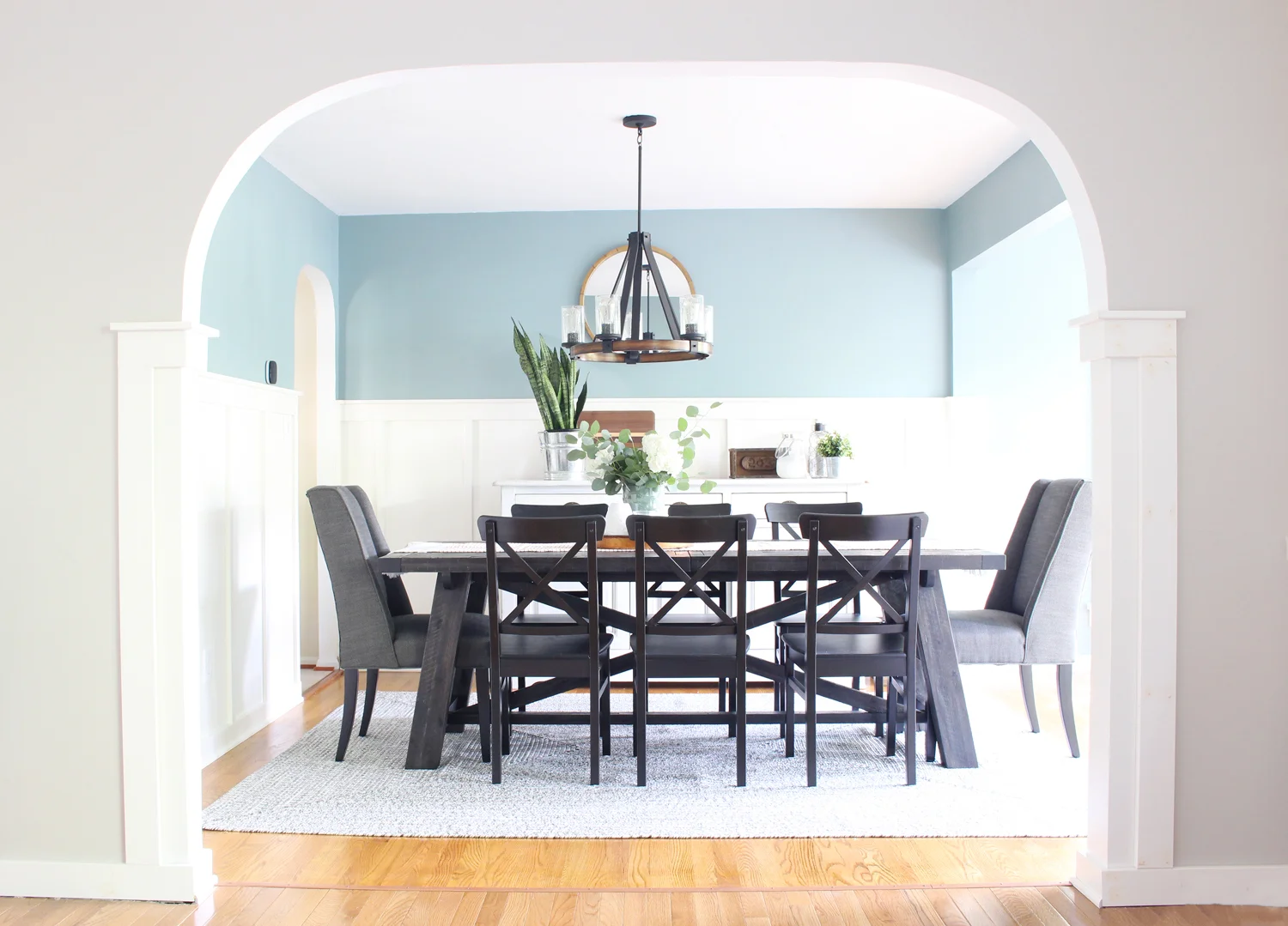
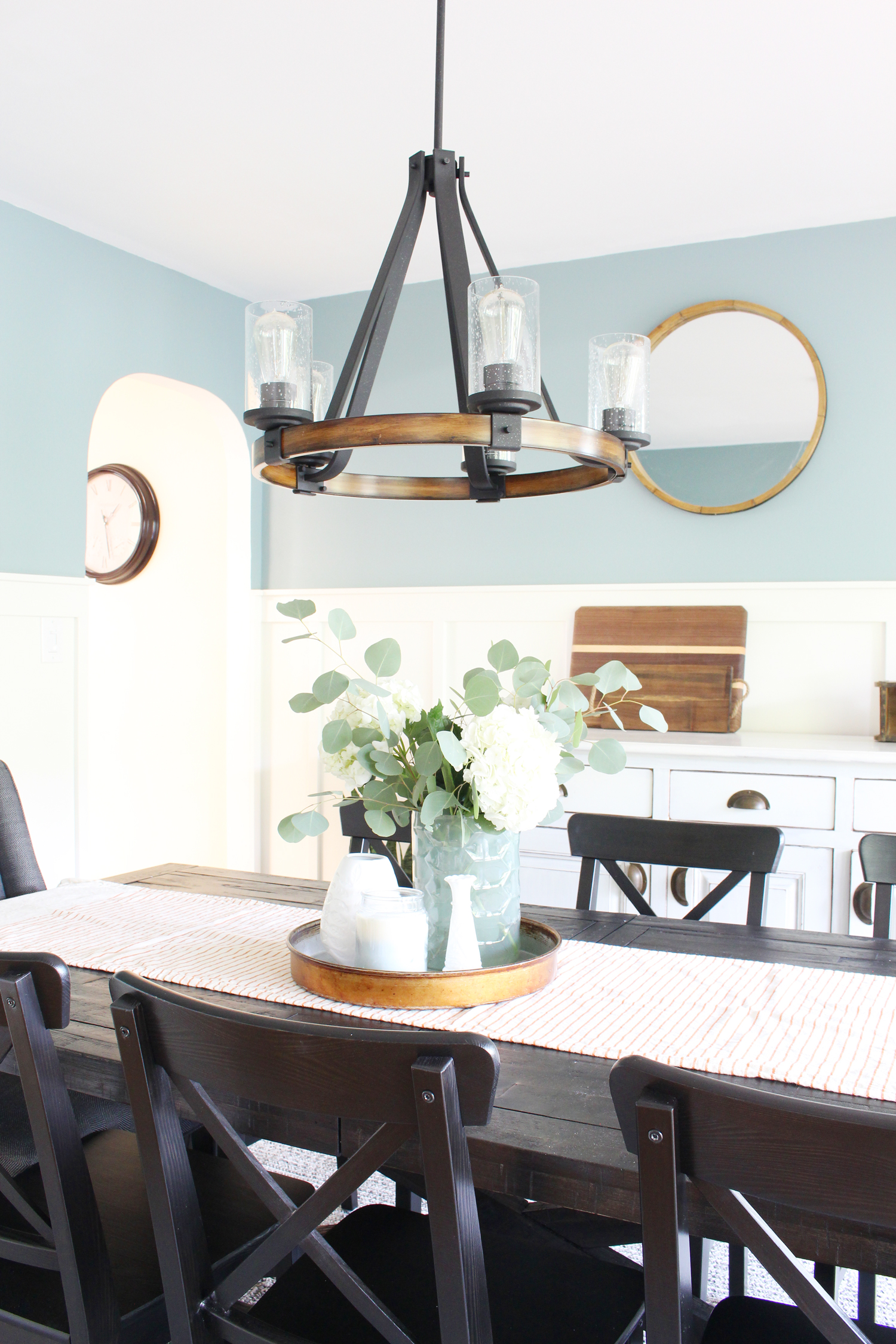
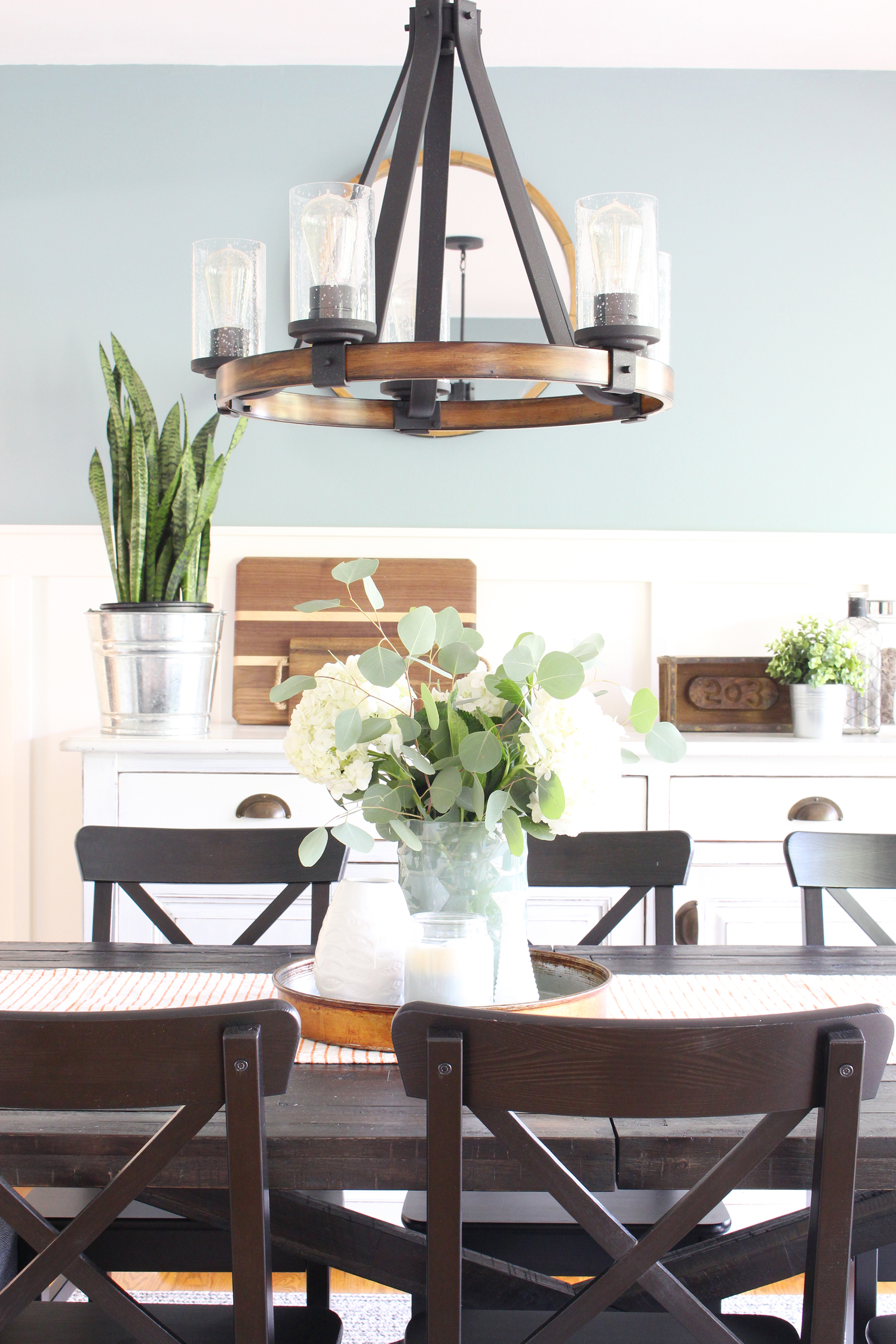
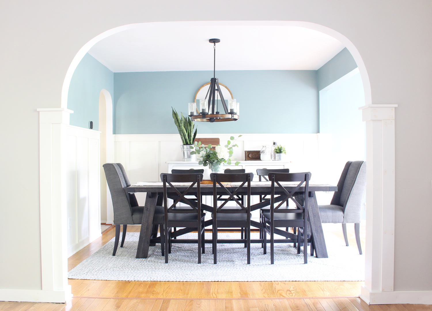
Springfield Dining Room: E-Design Giveaway Before and After
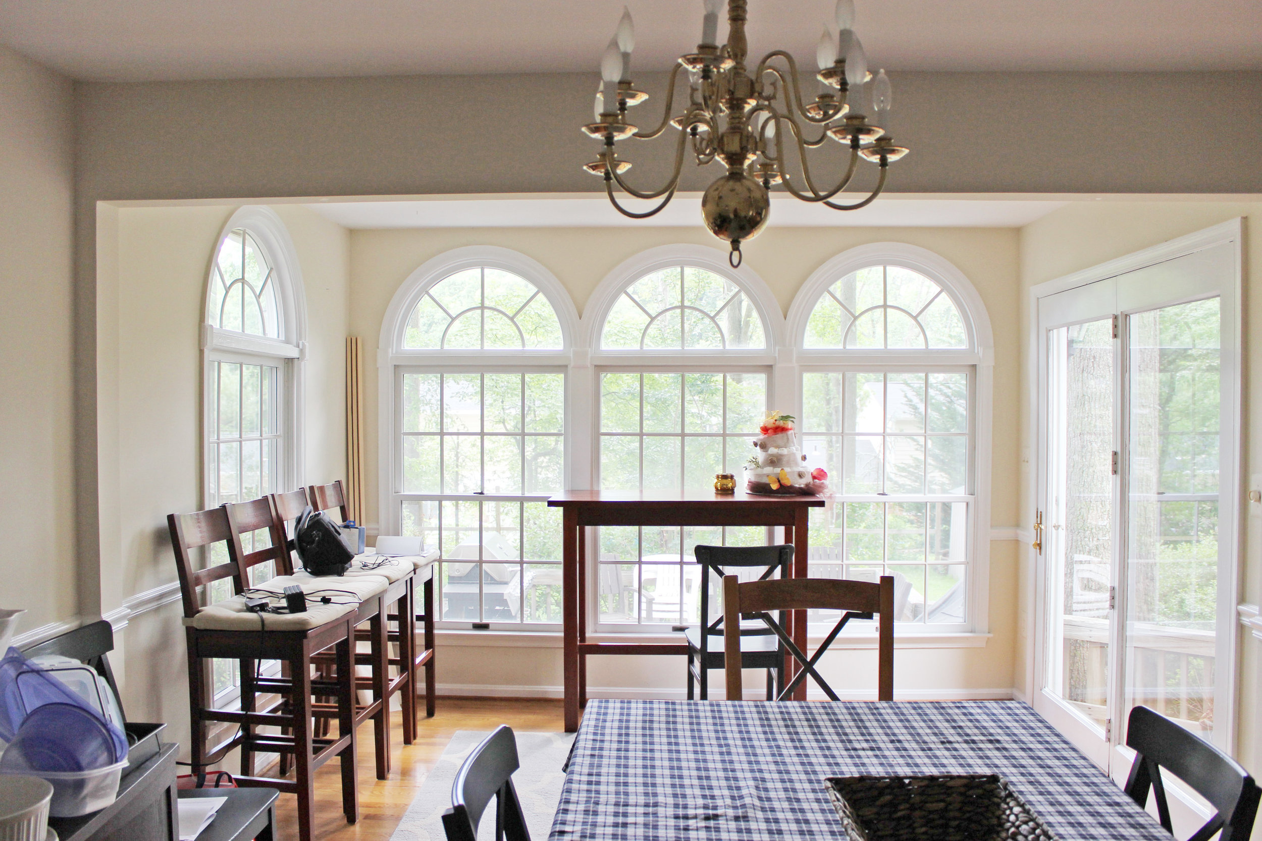
Back in the spring, I hosted a giveaway for a full room e-design package, and today I get to share the before and after! The winners, Erin and Ryan, submitted their dining room, which Erin described as "pretty much a blank canvas" that had a $100 table from Craigslist, a dated light fixture and a hodgepodge of other pieces they were ready to let go of so they could make the space into something they really enjoy. They love hosting friends for meals and large gatherings, so they couldn't wait for the room to be done.
Erin and Ryan are avid do-it-yourselfers, and have spent the past couple of years working on their house - transforming it room by room - to turn it into a place that feels more like them. They love a mix of craftsman, industrial and farmhouse styles and their dining room did not reflect that - it was time for a change!
Here are a few of the photos they submitted with their giveaway entry:
As you can see, it's a fantastic room (big windows! arched openings!) that had loads of potential. It has a main dining area that opens up into the living room on one side and the kitchen on the other. Then, on the back side, there's a sort of separate area that the previous owners added on that leads to the back deck, but Erin and Ryan weren't sure exactly what to do with it.
Erin sent over this floor plan to help me understand the space:
Their big needs were: a large dining room table for hosting their frequent, large gatherings, storage for serving pieces, and a way to make the addition feel like it was a part of the room. When I got involved, plans were already underway to clad the walls of the main dining area with board and batten and to replace the traditional trim with a simpler craftsman style. My job was to create a plan for the furniture and decor that would pull it all together - a challenge I was excited to take on!
Keeping in mind their needs and budget, and after a few rounds of revisions, we finalized the design and moved forward with a plan centered around this design board:
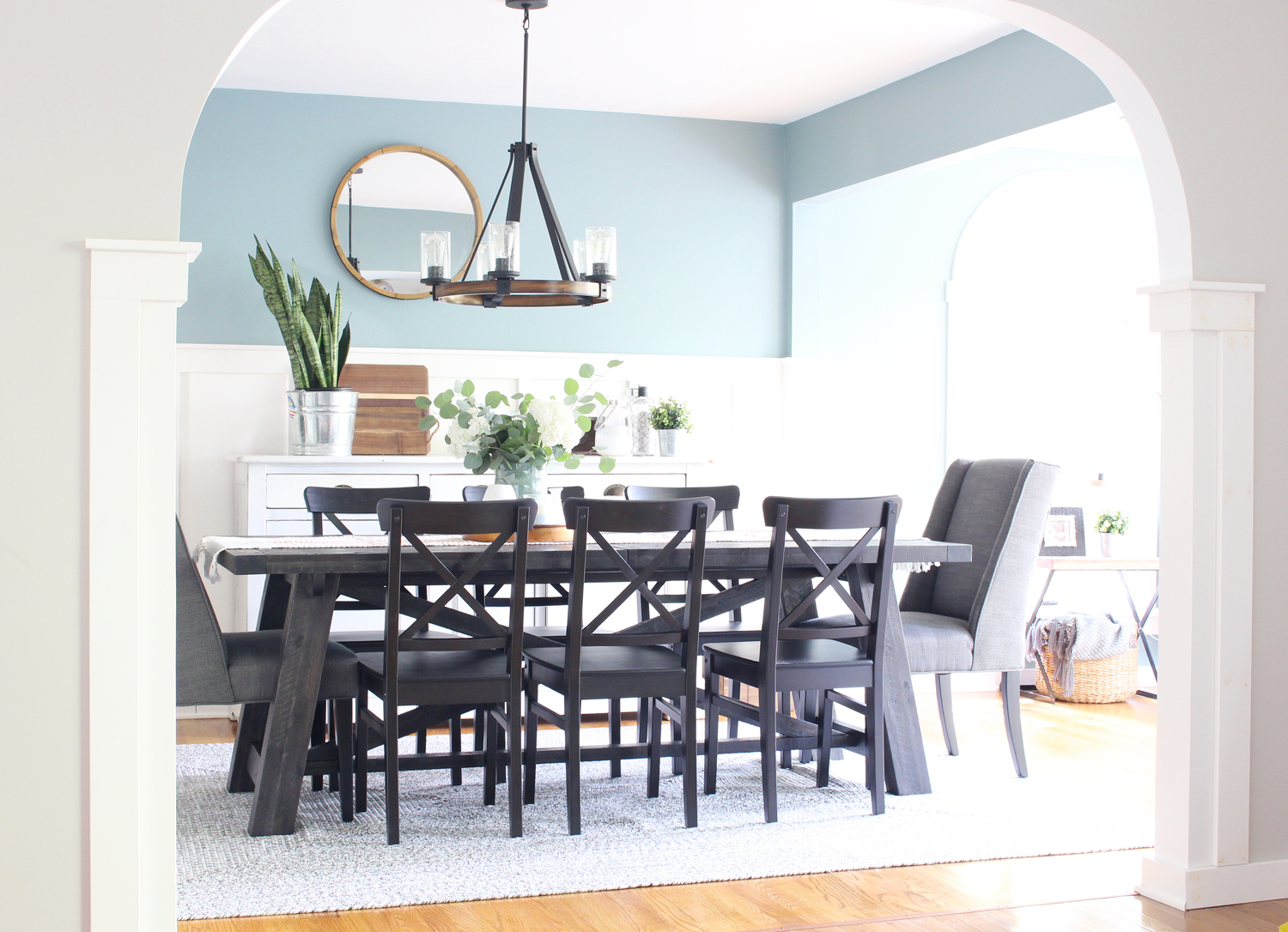
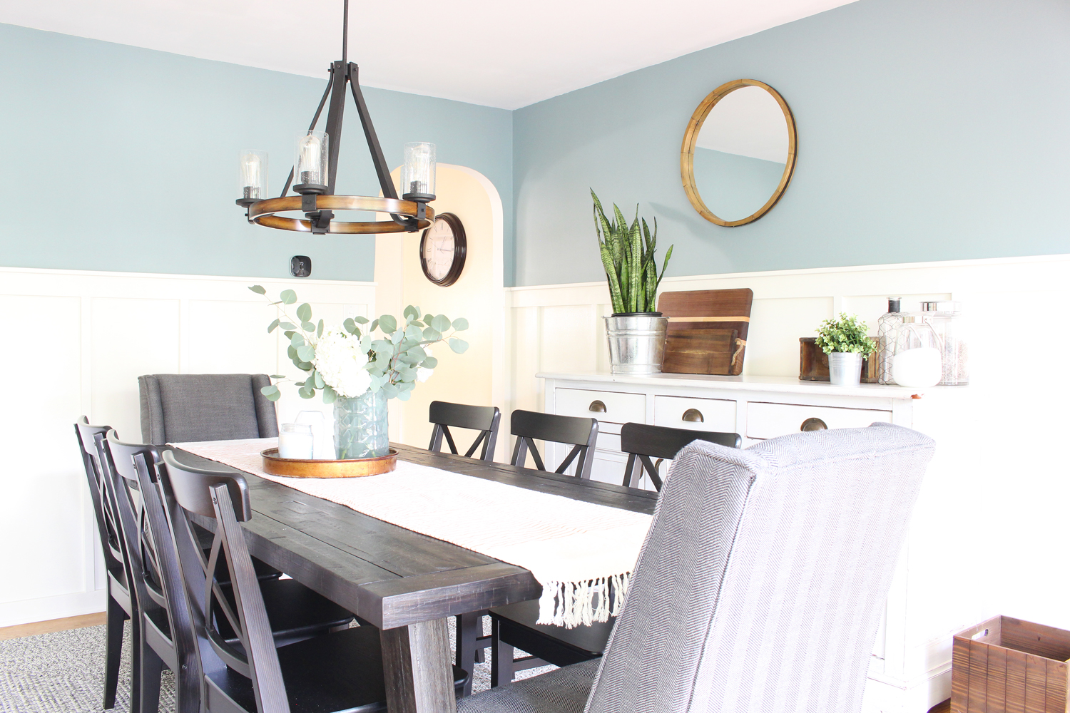
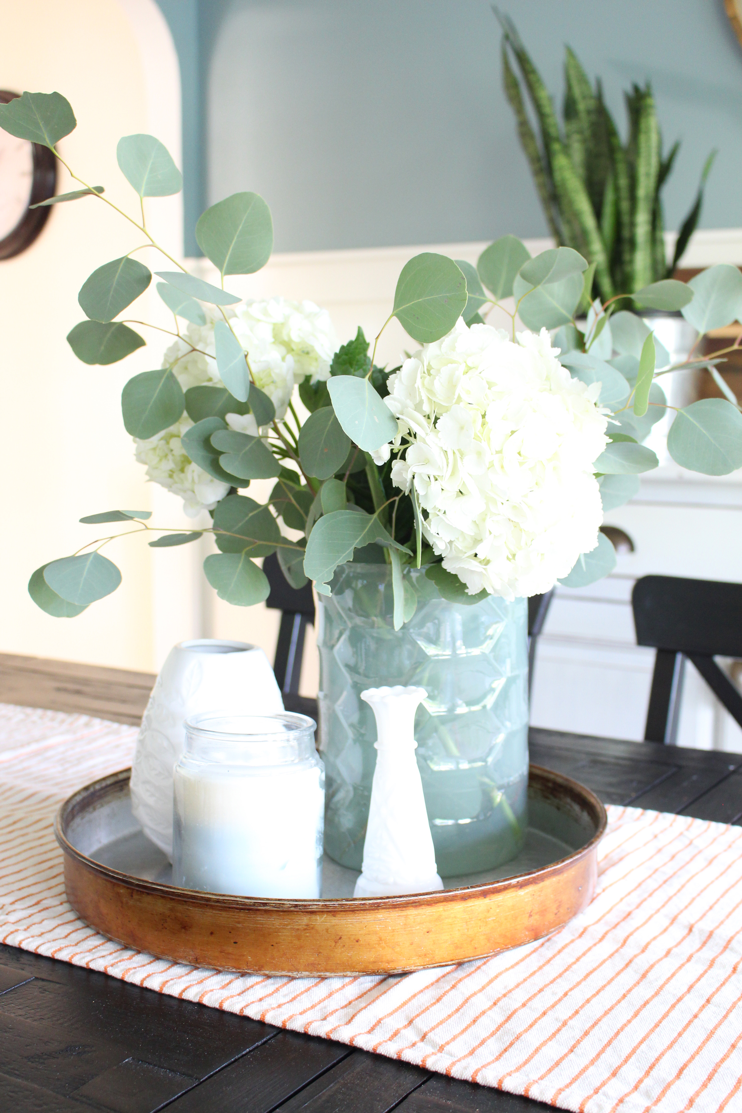
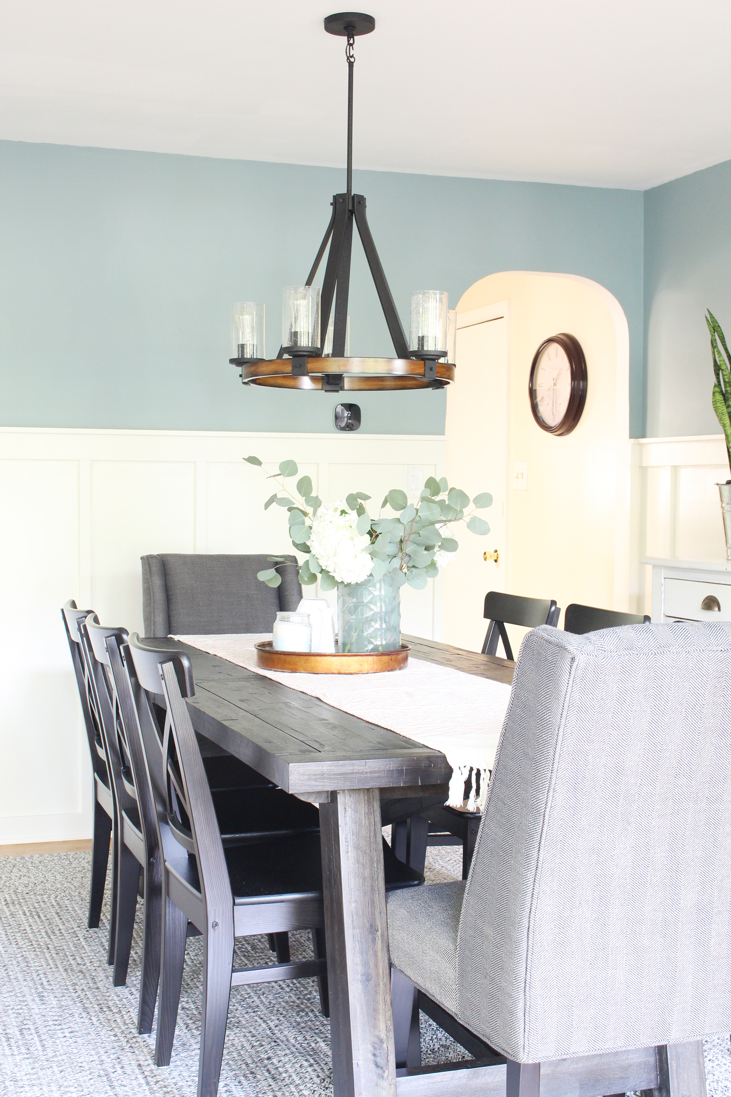
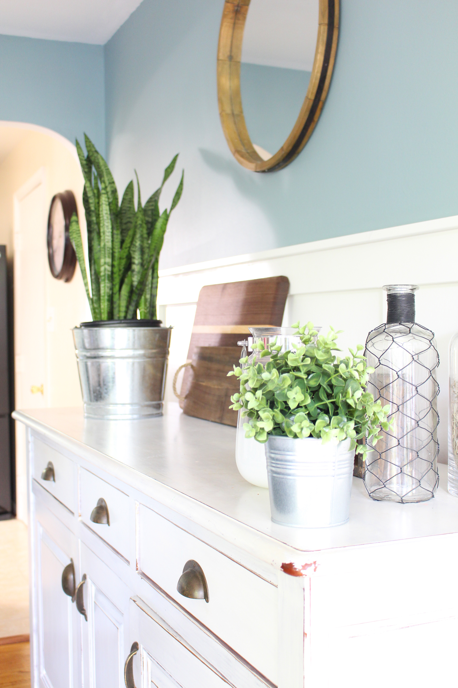
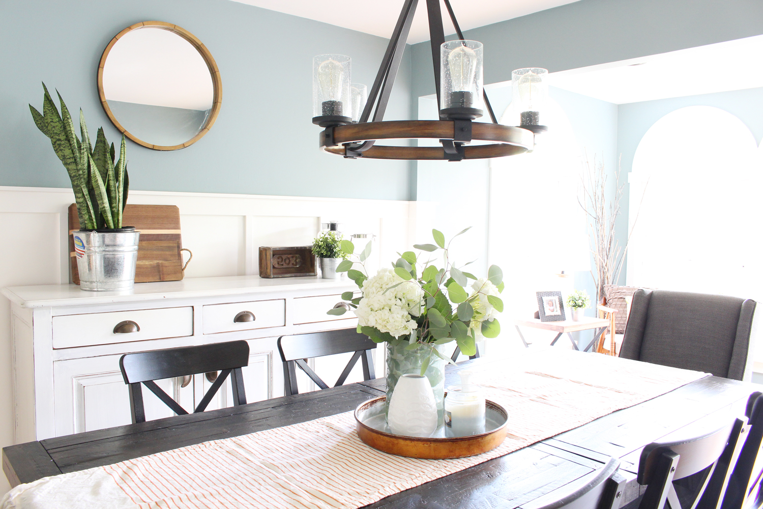
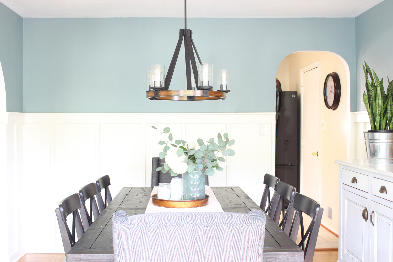
We decided to keep the furniture neutral and bring in color on the walls (the upper half is Benjamin Moore Sea Star), and in decor and accessories. Erin was actively involved in the search and putting the design together was a fun collaboration since she's got a great eye. She also has a talent for hunting places like Craigslist and Homegoods for deals - she ended up finding a buffet that was almost an exact replica of the one in the design board for a total steal that way! I find that some clients want to know which exact items to purchase and don't even want to have to think about doing any extra searching, and some just need an overall vision to guide them and they'll take care of the rest - Erin is definitely the latter and she did a great job with the final purchases.
So. Are y'all ready to see the "after?" Let's get to it!
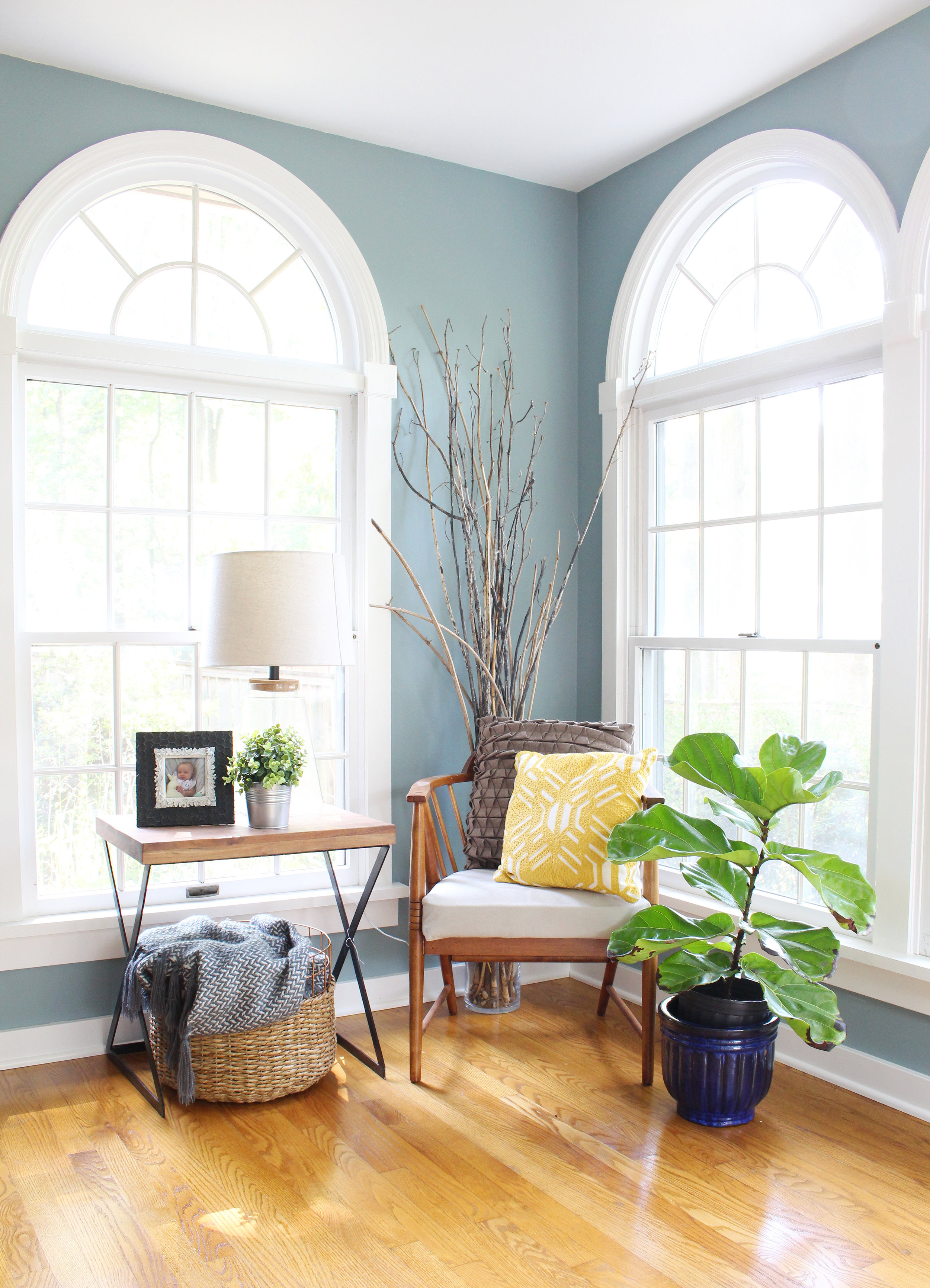
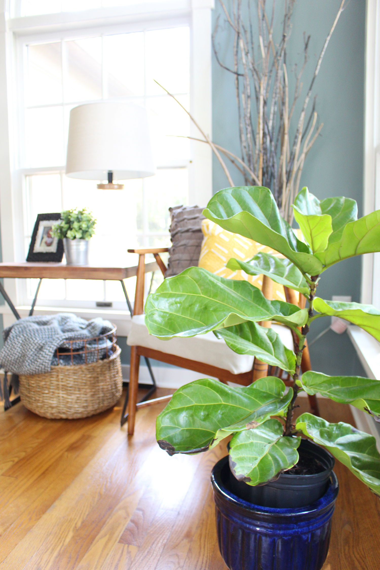
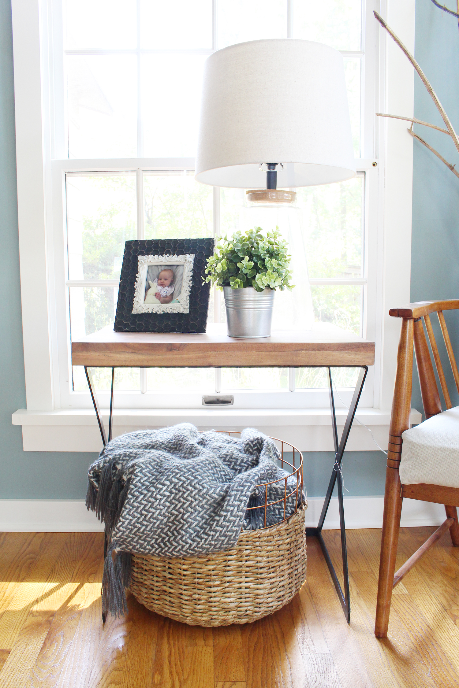
Designing the main part of the dining room was pretty straightforward. The tricky part was figuring out what to do with the addition since the walls are filled with windows that are a focal point in and of themselves. We knew it had to be something simple - we toyed around with the idea of placing an industrial iron and glass console against the windows with a lamp on top, but ultimately nixed that in favor of a chair, end table, and lamp combo for the corner. I think it ended up being the perfect choice! Plus, a happy plant or two never hurts - love that fiddle leaf fig!
The whole space is so cohesive and inviting now! I just love the feel of it. And most importantly, Erin and Ryan love it too. Here's what Erin had to say when they finished everything up a month or so ago:
"When we assembled the room, Ryan and I just stood there and whispered how much we love it. Last night, we opened a bottle of red wine and just sat at the table and did a puzzle. In fact, we had a "grand opening" of the dining room and invited some friends over and served a seven course Italian feast. In addition, we had a small group dinner the other night and just shared life around the table... exactly my dream for the room!"
Lastly, I have to give these two a shoutout for taking on this project with a newborn baby girl (who I had the privilege of meeting when I went to take the photos of their space), which was no easy feat I'm sure! Erin and Ryan, thank you for letting me help out with your dining room - I hope you enjoy it for many years to come!
Sources:*
Lawford Charcoal Herringbone dining chairs (head chairs)
Buffet - Craigslist (similar)
Table lamp - T.J. Maxx (similar)
End table - T.J. Maxx (similar)
Chair - Craigslist
Paint color: Benjamin Moore Sea Star
*Note: some of the links are affiliate links, which means that I may make a small commission off of your purchase (at no cost to you). Thanks for supporting Mix & Match Design Company in this way!

