Before + After: California Coastal Breakfast Nook Reveal
It’s before and after day, y’all! My client’s breakfast nook has seen quite a transformation since her family purchased their house about a year and a half ago, and I’m excited to share it with you! It turned out beautifully and this coastal California style space is now a functional, lovely spot for her family to enjoy casual meals, do homework, and just hang out. Everyone tends to end up in the kitchen, right? So you might as well give them a good spot to gather!
To give you a little bit of background, my client, Christine, had already done a ton of legwork and planning on the kitchen and breakfast nook, and I really only came in at the end to help her finish it off. She has amazing taste and great instincts, and she just needed a designer’s help to figure out how to best set up the dining space and what furniture would work best. I definitely can’t take all the credit here - I simply helped her bring it all together. Our styles align really well (yes!), so it was really fun to partner with her on this.
Here’s what Christine had to say about her home and the design process:
“We tend to move a lot and each time we can’t seem to resist renovating. It’s a belief of wanting to leave our space just a little bit better than when we found it. This past year was no different as we started to update our 20 year old kitchen in our 90 year old new house.
We were moving along fast and furious in the hopes of having the kitchen operational for Thanksgiving. Our game plan for our breakfast area banquette was measured out but we just couldn’t pull the trigger. Namely because with the railings gone, our crazy German short hair pointer was using the far side cabinet as a walk thru to scope out squirrels and birds in the backyard. We started second guessing everything.
That’s where Chaney came in and saved us. She gave her stamp of approval on the banquette and reviewed the different combinations of table and chairs we had found. Her understanding of size and proportions was crucial to the flow of the space. Then she solved our far cabinet dilemma with these brilliant custom made shelves that hung from the ceiling.
We couldn’t be happier and we are ever so grateful to Chaney for her keen eye and willingness to lend her design expertise to us. Not to mention, we are excited to host Thanksgiving this week in such a fun space for our family. Cheers to you Chaney.”
BEFORE
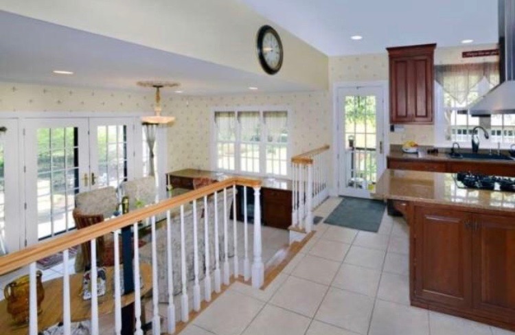
Now let’s take a look at what this space looked like when they bought it. As you’ll see in the real estate listing photo below, it was a little bit of an awkward setup and definitely didn’t fit her easy-breezy modern coastal style. The breakfast nook is adjacent to the kitchen, but you have to hop down three steps to enter it, which made things a little trickier than normal. The railings, while totally functional, really weren’t doing anything for the space style-wise and that wallpaper definitely had to go! She wasn’t into the cherry cabinetry either, but since the the kitchen was really functional and the cabinetry was in great shape, she decided to give it a refresh rather than a full remodel by painting the cabinets and putting in new white quartz countertops.
Once they moved in, they also replaced the tile with wood floors, swapped the ceiling light for a fan, and took down the dated railing to get to this point:
BEFORE (IN PROGRESS)
Next, in came the new quartz countertops and the cabinetry got its paint job done by local contractor, Yanni Fikaris. She went with Benjamin Moore Hale Navy lowers and white uppers, and had the walls painted white (bye wallpaper!). It felt so clean and fresh - it was a great decision! She got to bring in some of her modern eclectic California-esque style to her East Coast home, while still keeping with the overall style of the house, which has some traditional architectural elements.
Before I hopped into the project, she was at a point in the process where she was deciding where to place the dining area. She had set up a temporary table and chairs to test out whether they liked the idea of a seating area over in one of the corners, and after living with it for a bit, they decided that yes, they did like that idea. Now the question was, should they do a banquette? Just stick with a simple table and chairs? And what do you do with that long run of cabinetry over on the other side? It looked a little sad and incomplete by itself. No good!
This was the point where I came in! Now that the major parts of the makeover were complete, it was time to bring this space in for a landing. Given that the breakfast area is down a few steps and the table seemed like such a natural fit in the corner, we decided to move forward with the banquette idea. It would also provide an opportunity to build up a little bit of a wall around that area, which was great for both safety and to define that area now that the railing was gone.
Over on the cabinetry side, she had already painted the cabinets the same navy as the rest of the lowers in the kitchen, and I came up with the idea to add ceiling mounted open shelving to flank each side of the windows to add some height and finish off that area. Now that you have a little bit of context for what we planned, let’s take a look at the after photos - the best part!
AFTER - Welcome to the new California coastal breakfast nook!
Isn’t it gorgeous? I just love how it all came together!
We went with an L-shaped banquette and added a marble-topped oval pedestal table (here’s one that’s similar*) with two rattan chairs - it’s absolutely perfect for this nook! The elongated shape of the table worked perfectly within the narrow L-shape. (Side note: as a quick piece of advice, if you’re creating a banquette in your own home, round or oval tables are ideal since they’re easier to navigate around than a square or rectangle one.)
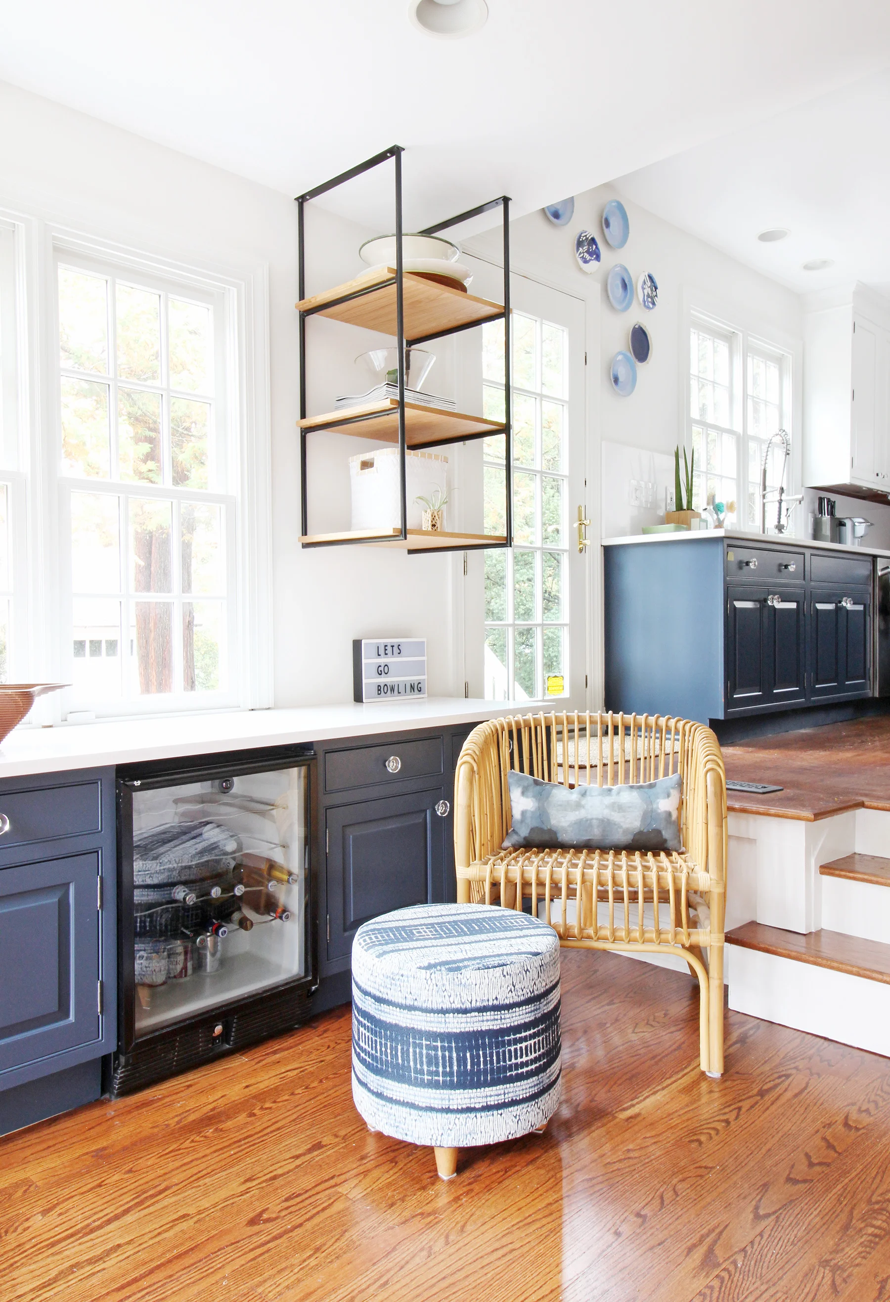
Moving over to the other side, you can see the ceiling hung open shelves, which I absolutely love. My client found a local metalworker to make these for her, so they’re completely custom to the space. I like how they add a slightly modern industrial vibe, but still have a nod to that coastal feel that’s going on with the lighter wood shelves. They’re deeper than your average upper cabinet, which works well here since you’re not using this set of cabinets for everyday food prep - they’re more setup for display and storage for fun and pretty pieces.
After we picked the main pieces for the space, it was time to decorate! My client had the vinyl bench cushions made along with a few custom pillows out of that fabulous shibori-style fabric, and then she mixed in some affordable pillows from places like Target to finish it off. Mixing high and low worked perfectly here!
And those fabulous rattan chairs? They’re from Target too! They were out of stock for forever (I thought they’d been discontinued for good), but it looks like they’re back! Grab ‘em while you can. My client mentioned that they’re not the most comfortable chairs in the world, but you could easily throw a cushion on the seat and I’d imagine they’d be just fine. :) They sure do make a fun statement and fit right in with the laid back modern coastal vibe we have going on.
I love the little eclectic collection of art she hung in the corner, don’t you? And fun fact: a couple of those pieces were done by her daughter!
From this angle (below), you can see how much more complete and finished the nook area is with those open shelves. They add such great height and heft to that side of the room!
The little details are really what pulls it all together. From the pillows to the baskets, I love how this whole space turned out. I’ll leave you with a few more photos to finish out this before + after today!
It was so wonderful to work with this client to bring this gorgeous space to life. I can’t believe how different it was when they bought the house! Like I mentioned in the introduction, she has great style and awesome instincts - I couldn’t have asked for a better client to work with on this project! The final details and touches she added at the end are It’s so cozy and inviting now (how cute is that rattan chair/shibori stool combo in that last photo?), and I’m thrilled that she and her family have a wonderful gathering spot in this part of their home now!
*This post contains affiliate links, which means Mix & Match Design Company earns a small commission from your purchase at no cost to you.


