One Room Challenge: Week 5 | The Dresser Side, A New Rug, and Marble Tabletops
Welcome to Week 5 of the One Room Challenge! I'm closing in on the finish line - good thing since the big reveal is next week! This week, I'm (finally!) showing you the other side of the room and sharing a peek at the new rug. I'm really digging how it's all coming together!
(Psst! Need to get caught up on this series? I've got you covered! Here are the links to the other posts: Week 1, Week 2, Week 3, and Week 4.)
We're so close, y'all! I cannot wait to share the whole room in all of it's finished glory next week, but for now, it's all about progress. I've got to leave some suspense for the grand finale. :)
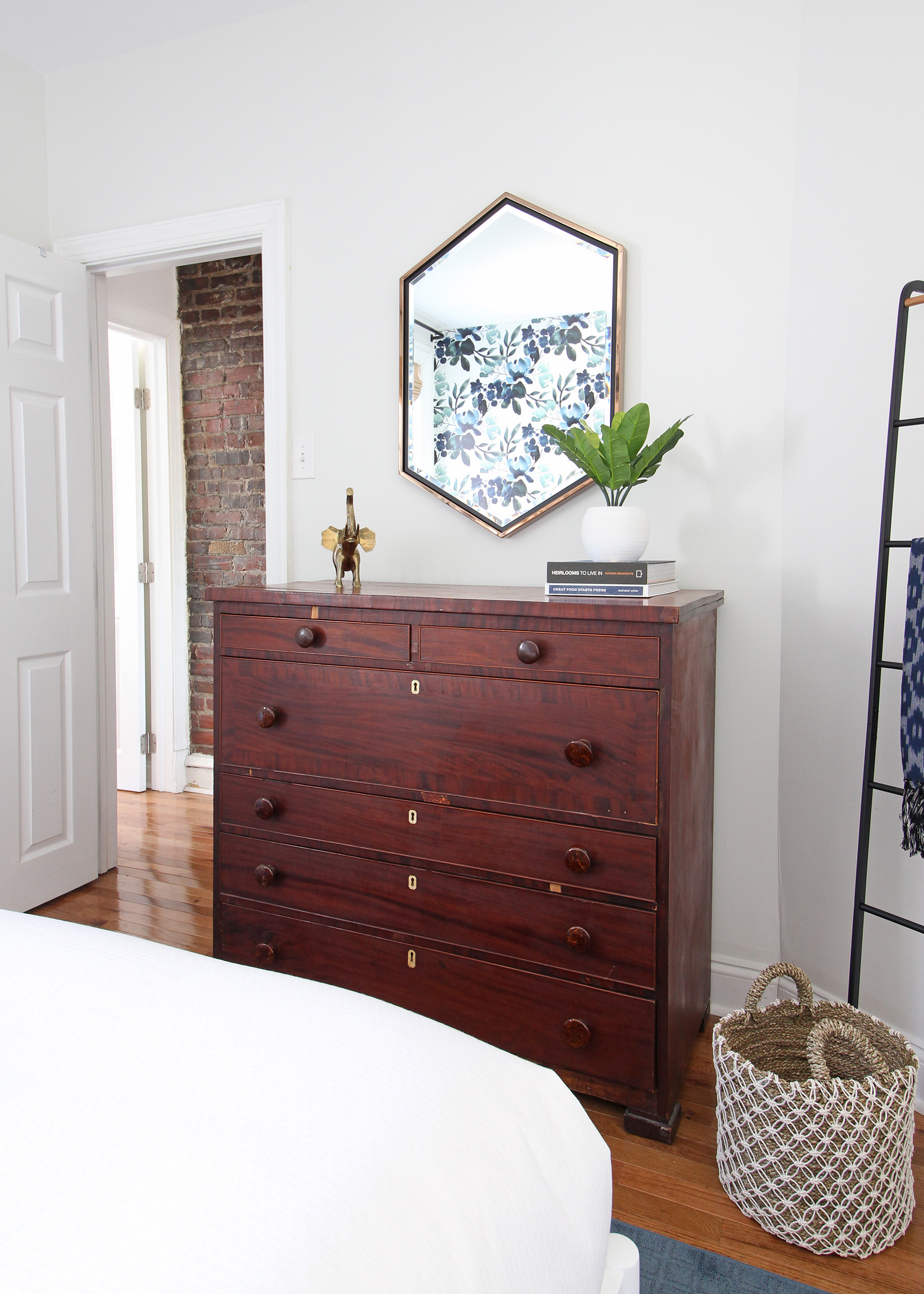
To kick things off, I want to show you the other side of the room that I've kept under wraps until now - the side with the dresser. Since it was the lead image for this post, let's chat about it first!
If you've been following along from the beginning, you might remember that this antique tallboy dresser was the only thing that stayed in this room from the "before" photos. It belonged to my grandparents and it's one of my absolute favorite pieces - imperfections and all. You can see that there are chips in the veneer and honestly, the drawers aren't in the best shape, but that makes it great for a guest room where it's not used all that often! The size is perfect for this little spot and I love the lived-in feel it adds to this little room.
To give this side of the room that eclectic modern farmhouse look I'm going for, I wanted to bring in something a little unexpected and modern - cue the Whexis hexagon mirror!* It's from Holly & Martin, one of my sponsors for this challenge and a brand I've loved working with over the past year or so. They have such a great collection of modern decor at really affordable prices. If you're not familiar with them, you should check them out! You can find their products on places like Wayfair, Overstock, The Mine, and Hayneedle.
The mirror is large and in-charge, and I love the black and champagne gold frame. It also ties in so nicely with the new pendant light fixture (you can catch a peek of that in Week 4's post).
The next update I want to share is the new rug from Mohawk Flooring! Finding the right rug for this room was a big challenge and I've gotta say, they saved the day. With the blue-green floral wallpaper being such an attention hog (in a good way!), I needed a rug that was simple, but had some structure to it. The folks at Mohawk worked with me to design a custom-bound rug with their SmartStrand carpet and it's awesome for this room. I want to give them a huge thank you for sponsoring this piece!
If you're unfamiliar, a custom-bound rug is made from wall-to-wall carpet - the edges are finished off ("bound") to create an area rug. They're a fantastic option for spaces that need non-standard size rug. I loved being able to measure my space and get the exact size I needed, which in this case, was a 6'x9'. I realize that's a pretty standard rug size, but I had a hard time finding one that was the right style and the right size, so a custom-bound rug was a wonderful way to solve that problem!
Another thing I love about this rug? It's virtually indestructible! The SmartStrand fibers offer unbeatable spill protection, permanent stain resistance, and long-lasting durability. I have a feeling this is a rug we'll have for a good, long time. Mohawk has a really wide selection of colors and styles too - I chose Enduring Qualities in Bay Blue to complement the blue hues in other pieces in the room. The grid pattern adds really nice texture and structure without competing with the wallpaper.
Finally, I just want to mention briefly that I picked up the marble tops I had made for the nightstands this week! I'm so glad I bit the bullet and decided to go for it as a solution to the sorry state of the existing tops.
Here's a peek at what they look like!
So that'll do it for the final progress week here with the One Room Challenge! My to do list is getting shorter and shorter, and I just have a few items to check off before I can style and shoot it for the final reveal next Thursday. I can't wait!
In the meantime, be sure to follow along on IG Stories - I'll probably be sharing a last sneak peek or two over there!
Psst! Want to see more One Room Challenge spaces? Head over here to see the full list of participants!
A big thanks to the companies that are helping make this room transformation happen by sponsoring some of the products you'll be seeing:
Sweet Pea Wall Designs & their sister shop MUSE
*This post contains affiliate links, which means Mix & Match Design Company earns a small commission from your purchase at no cost to you.


