Queen Village Cozy Modern Dining Room Reveal | E-Design
It's reveal day for one of my favorite e-design projects, my friends!
I'm beyond excited to share this Philadelphia dining room makeover with y'all for a whole host of reasons: the space turned out beautifully, it'll show you how a little work and adding a few key pieces goes a long way, and you'll see how transformative a bit of bold paint can be. My e-design clients did an amazing job pulling everything together. One of the joys of working with local clients is having the opportunity to actually see the project in person once it's finished. When this couple sent me a photo of their finished space recently, I knew I just had to get over there to shoot it so I could share it with y'all.
My clients, Pete and Lauren, live in Queen Village, which is a fantastic neighborhood in the heart of Philadelphia. I got to know Pete through a group of small business owners that I get together with regularly here in the city. He owns my favorite handyman service called The Home Hero, so if you're a Philly local and need some help on any smaller projects in your home, they're your guys. Be sure to check them out!
Pete and Lauren had already made a few purchases for their dining room by the time I got involved - including their table and chairs - but they got a little stuck on how to pull it all together. They have great taste and know what they like, but brought Mix & Match in to guide them in their decision-making process to finish it off. They needed more functional storage since they use their dining room not just for meals, but as a homework spot, and Pete often works at the table when he's not out and about for The Home Hero. It was crucial to have a few hidden spots to stash papers, school items, and laptops - goodbye clutter! They also knew they wanted to up their style game in general and add some color since the dining room is open to their all-white kitchen on the other side.
Here's what it looked like before:
The Design Plan for a Modern and Functional Dining Room
The dining room is fairly small (hello city living!), but it's efficient, and it has more space than you would expect based on its dimensions. I knew we could make better use of the back wall where the sideboard lives (which was an item they were keeping), so we decided to add some vertical bookcases on either side that had both closed and open storage. That mix of open and closed was important - the closed storage could hide all the miscellaneous paper, school supplies, laptops, etc., and open shelving would keep it from feeling too visually heavy and give us some spots for pretty decor.
Another request they had was to do something special with the back wall itself. We were all gung-ho at the beginning of the design process about adding wallpaper, but after playing with a lot of options, my clients ultimately decided to go the simple (and less expensive!) route of good ole paint in a bold teal color and add pattern through the rug. It looks SO good in there, and I think it was the right decision in the end!
We also wanted to add a few other pieces like a chandelier above the table to define the area and create a focal point as you entered the room, and a rug to ground the table and add more color. We finished it off with some wall art and a couple of other pieces of decor and ended up with a really amazing modern and cozy dining room. My clients found the final pieces of art and decor and I couldn't wait to get over there to see it in person. They're absolutely thrilled with the room, which is the most important part of all, isn't it?
So let's get into the after photos!
The After: A Cozy Modern Dining Room Comes To Life
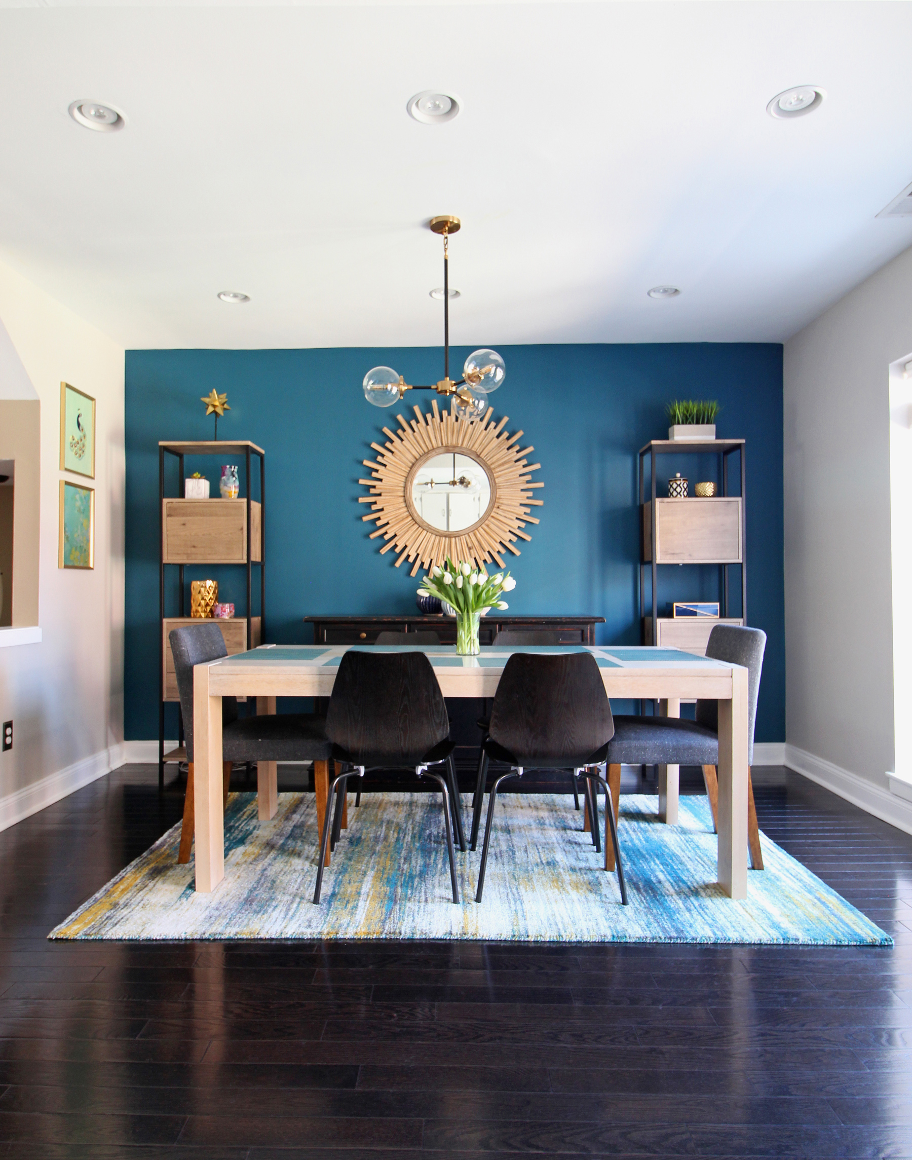
What was once a stalled out dining room project is now a stunning and functional space for a family of four! Your eye immediately goes to that beautiful shade of teal (Benjamin Moore Galápagos Turquoise - 2057-20) on the back wall, but it doesn't take long to begin to notice all the other touches that pull this room together to make it feel like one awesome cohesive place to eat and work.
Let's start with the chandelier. It's a simple and clean mid-century modern design, and its flat shape is perfect in this context - it doesn't block your view of that huge sunburst mirror, but the brass and black combo coordinates really nicely with the bookcases and other pieces in the room.
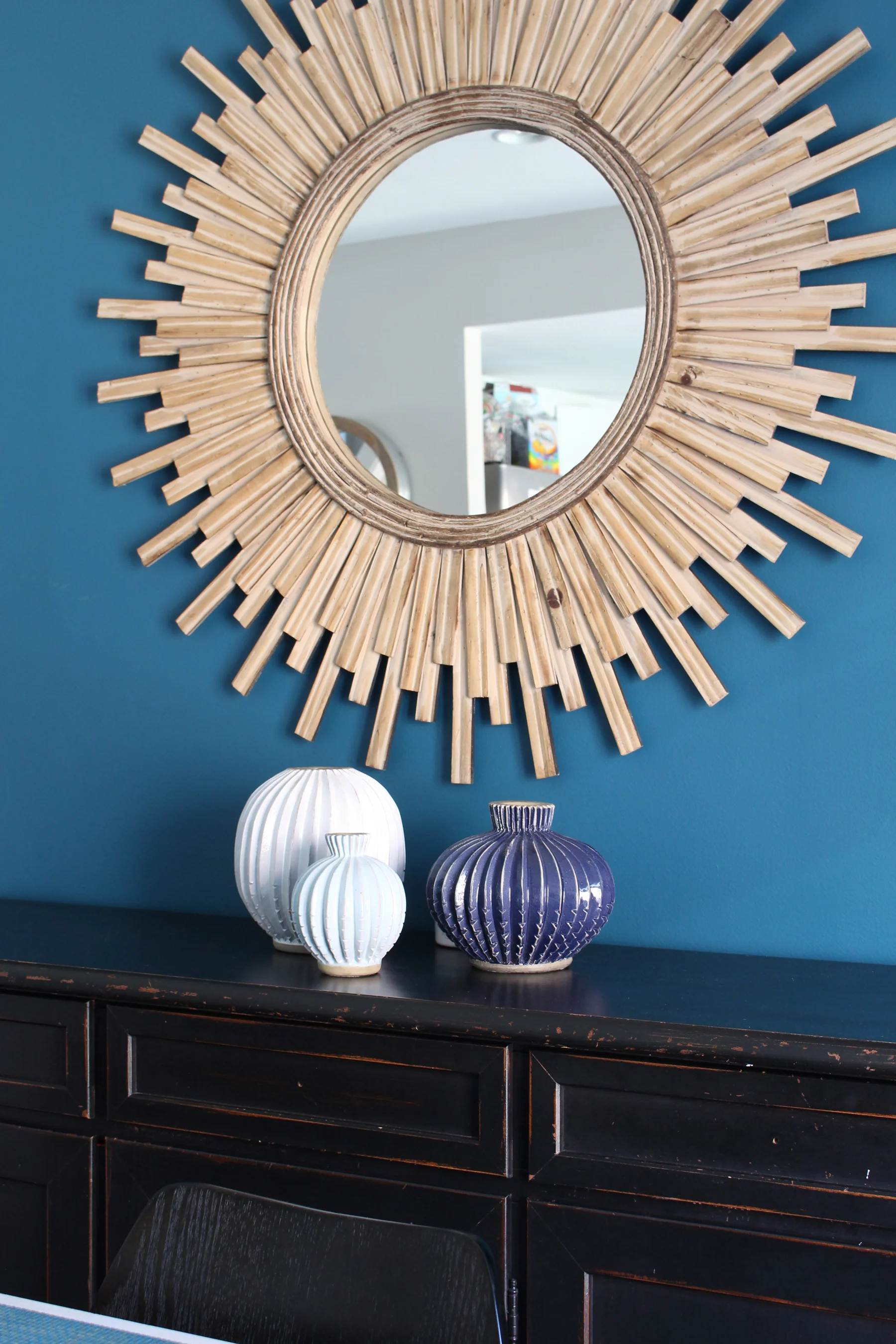
Speaking of the sunburst mirror, it's large and in-charge at 42" in diameter, and was just what we needed above the sideboard. The rectangular black mirror they had there previously wasn't really doing much for the room. It needed something round to soften the hard edges of the rest of the furniture, and a mirror with a simple frame wasn't going to be "enough" if you know what I mean. We wanted the mirror to make a statement, and this one definitely does. It's also a steal for how big it is.
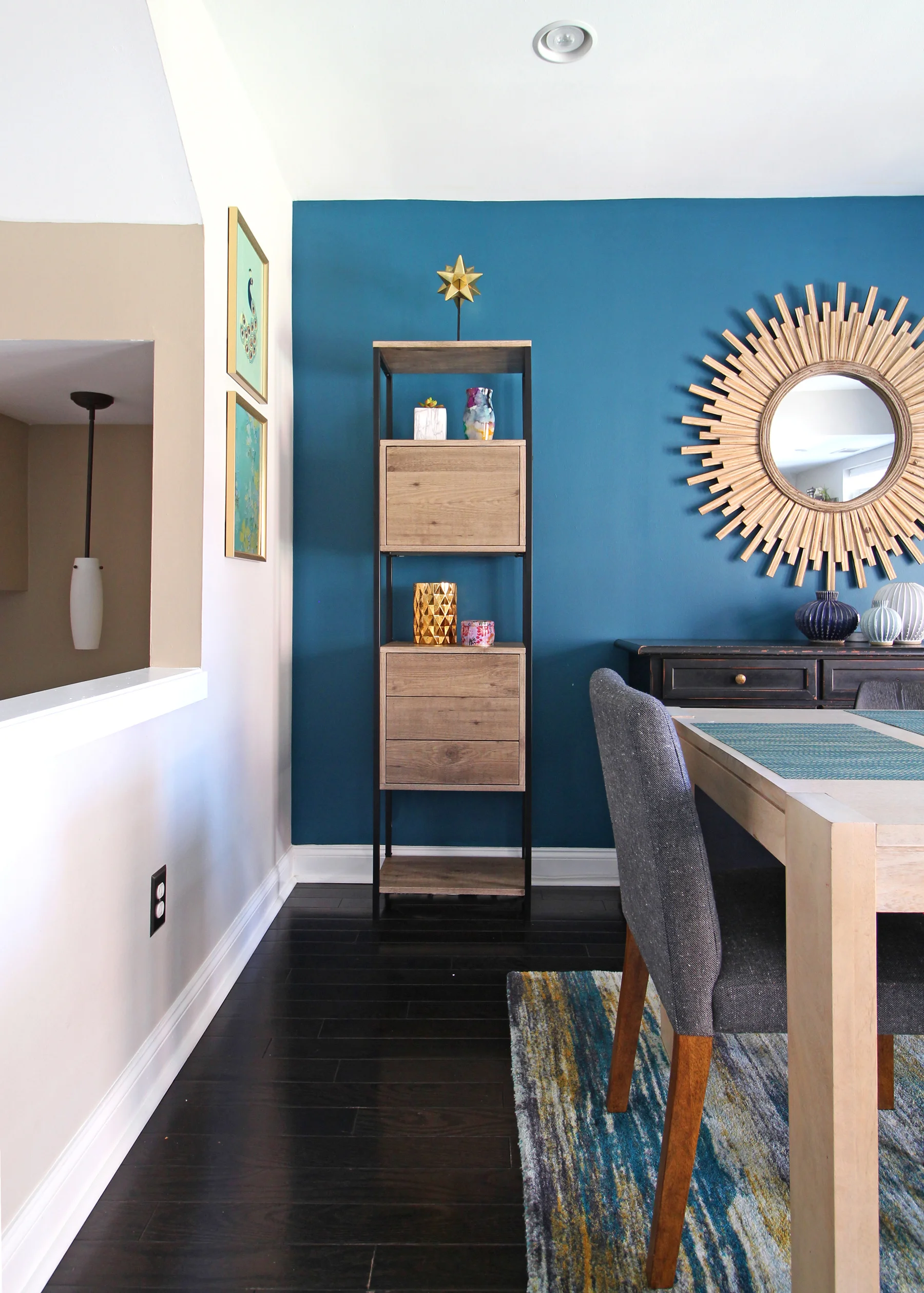
The bookcases are also a favorite part of the room - Lauren found those and as I mentioned earlier, their combo of open and closed storage was just right for their needs and for the space itself. The closed storage you see is a door on top and is three drawers on the bottom. Pretty cool, huh?
Lastly, let's take a look at that rug. I love the organic design and how well it works with the teal wall and light wood finishes we have all over the room. It adds just the right amount of pattern without demanding too much attention.
I am so excited about how this room turned out! E-design is a really collaborative design experience, and these clients were a perfect fit for the process. We worked together to come up with a floor plan and design direction that would fit their needs, and they took it and ran with it! Now they have a dining room they will love for years to come and that feels totally complete. That's a really satisfying feeling and I'm thrilled for them.
Below, you can find all the sources for the pieces you see in the dining room. Since these clients already had several of the pieces, you'll note that some sources say "similar" next to them. I tried to find good approximations, but do know that they aren't the exact ones. :)
If you have any questions or would like to work with Mix & Match on your next project via e-design, don't hesitate to contact me!
SOURCES:
- Paint color: Benjamin Moore Galápagos Turquoise 2057-20
- Dining table (similar)
- Gray upholstered dining chairs (similar)
- Modern side chairs (similar)
- Multicolor rug
- Mid-century modern chandelier
- Light wood and metal bookcases
- Sunburst mirror
- Similar abstract art: one, two


