Before + After: Meredith Street Kitchen Makeover
I’m so excited to share the before and after of a client project I finished up recently with you today! I worked with a lovely family to give their Philadelphia row home kitchen a two-toned refresh without renovating. The cabinets were in good shape and the layout functioned well for their needs, but the brown and yellow-ish color scheme wasn’t their style and the appliances needed upgrading, so they decided to take action and make some changes so they could really enjoy it. With some fresh paint, and new hardware, appliances, and countertops, their kitchen went from blah wood-on-wood to a gorgeous combo of navy, white, and brass!
Let’s take a look at the before photos:
(Photos: Nate Photographic)
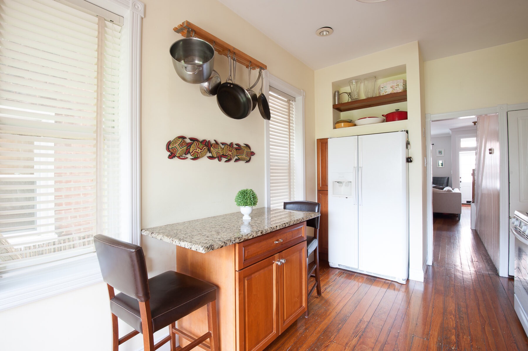
It wasn’t terrible, but there sure was a lot of brown that made the kitchen feel sort of flat and boring. Having stained wood cabinets also competed with the beautiful original wood floors in this old house - changing the cabinet color would allow them to stand out instead of fading into the background.
These e-design clients already had a good sense of the general look and feel they wanted to go for, and I absolutely loved their ideas and inspiration. They knew they wanted it to look fresh and a little more modern, but weren’t exactly sure how to pull it all together. Painting the cabinets was on the list, but they were torn on what colors to use and whether to go with a single color or dark lowers with white uppers. They also mentioned they were fans of using brass for the hardware and accents, which is one of my favorites - I was definitely on board with that!
With those thoughts in mind, we came up with a plan together for navy and white cabinets, brass hardware, and marble-like quartz countertops. Here’s where I ultimately landed with the design board:
Pretty, right?
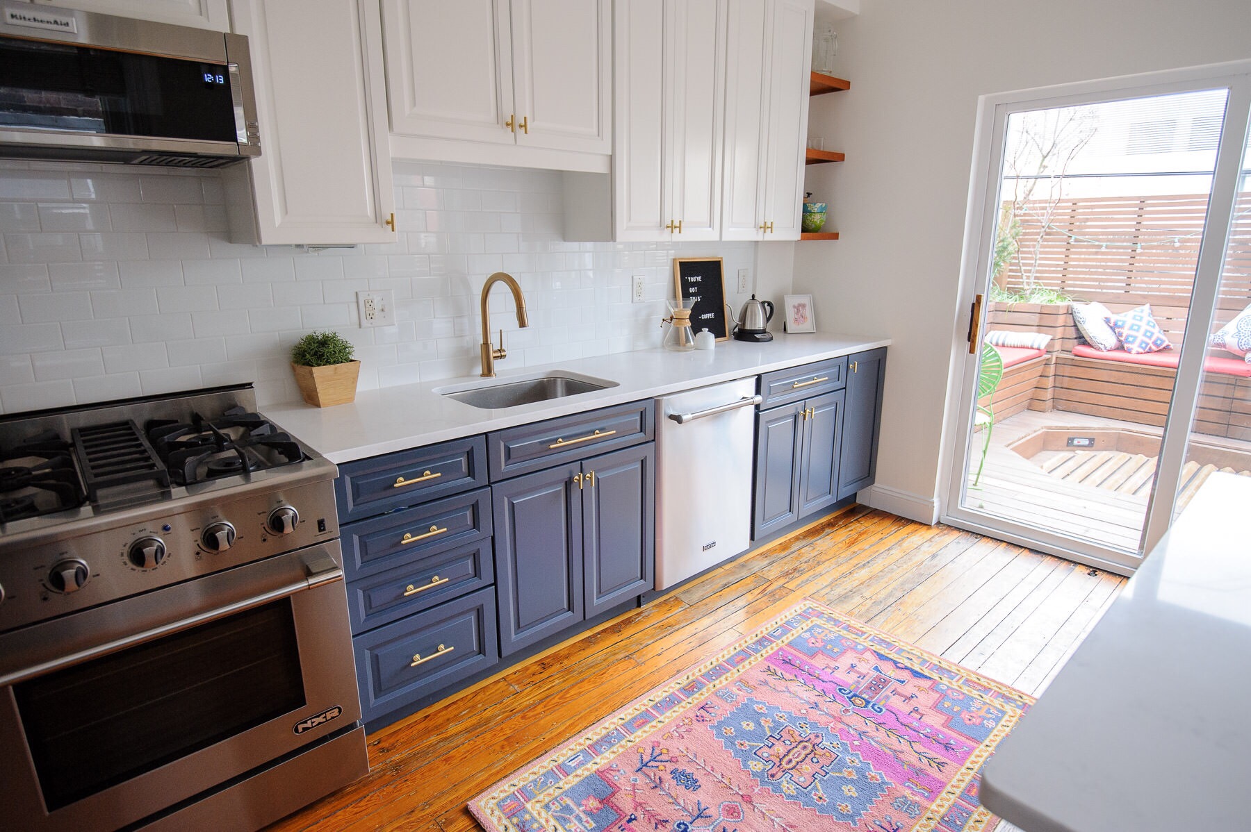
The navy lower cabinets are a perfect complement to their warm wood floors and the white uppers keep things feeling light and airy. Since their kitchen is on the small side, going with white on top kept the kitchen feeling open. The white quartz countertops with gentle gray veining also add to that light and airy look. For the backsplash, we went with a classic white subway tile (it’s hard to go wrong with that!).
As a final touch to bring in a little bit of color, we added a vintage-style rug. We debated whether to go on the hunt for a true vintage rug, but ultimately my clients fell in love with this one from Anthropologie, which is gorgeous! It also ties in subtly with the navy cabinets and modern brass cabinet pulls, making this kitchen feel tied together and polished.
I think I fell head-over-heels for this kitchen design almost as much as my clients did - let’s take a look at how it all turned out! (As a side note, a big thank you to my client for sharing these before and after photos. It certainly is a bonus when your client is also a great photographer!)
The After: a navy, white, and brass kitchen makeover
(Photos: Nate Photographic)
Isn’t the power of paint amazing? We certainly made some other updates as well, but man those navy and white cabinets really are the star of the show. Also, don’t underestimate how much of an effect a new wall paint color has on brightening up a space. Goodbye yellow-ish beige and hello warm white!
My clients are planning to add a few more finishing touches on the back right wall by the sliding glass door, but otherwise, this kitchen is complete. They are truly enjoying this space now and spend a ton of time in here as a family of three. I’m so grateful I got to be a part of the process and I’m thrilled for them to finally have a kitchen that they love.
Get the look:
Lower cabinet paint: Benjamin Moore Hale Navy
Upper cabinet paint: Benjamin Moore Simply White
Quartz countertops (Prizma Quartz “Carrara Thassos”)


