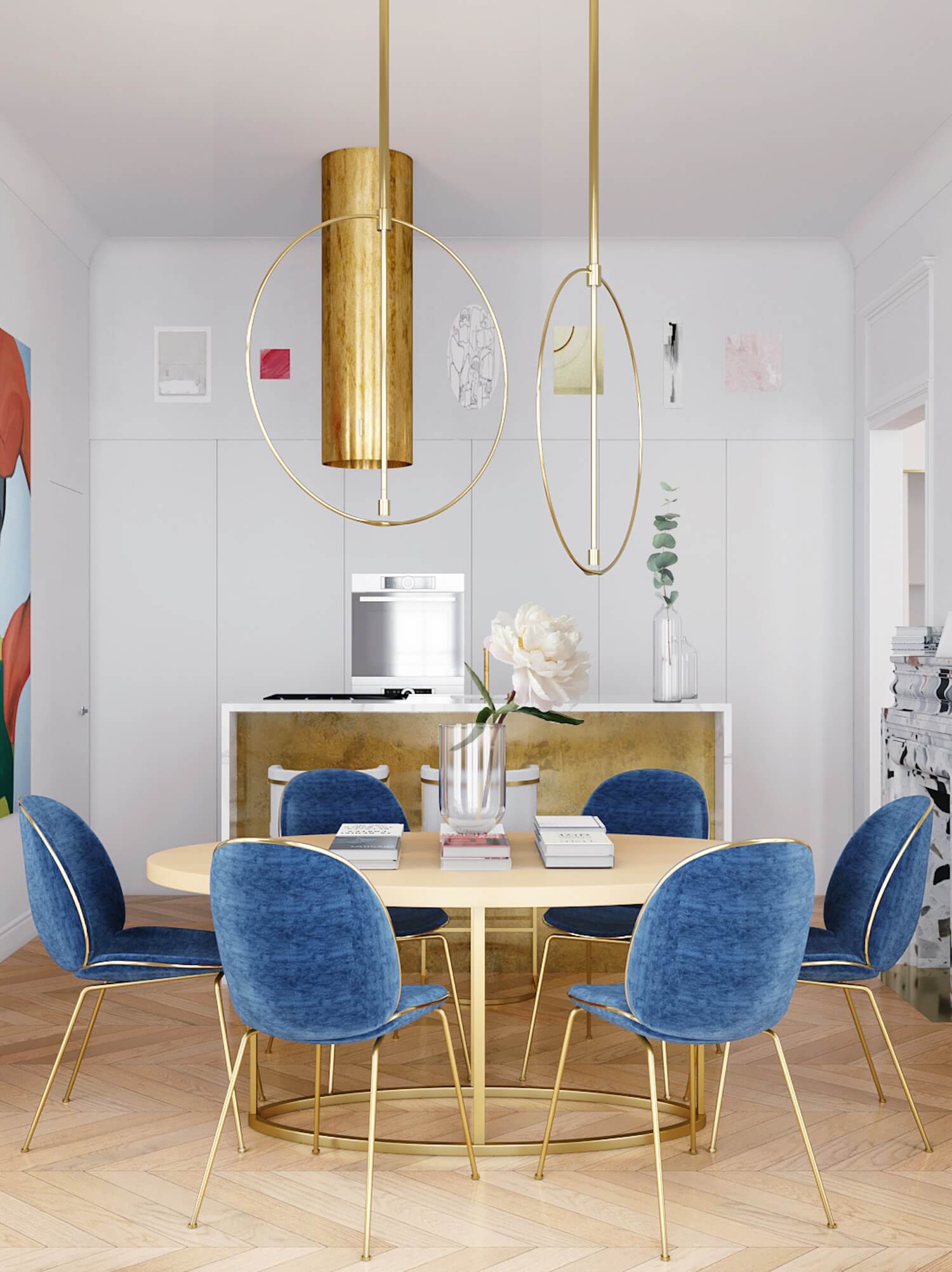
Get the Look: Fresh Classic Dining Room
Scroll down to the bottom for all of the sources for this Fresh Classic room!
These Get the Look posts are so fun for me to put together! It gives me a chance to go wild and put together a look with no strings attached and no expectations (other than it'll be awesome!). Don't get me wrong, I LOVE working on client projects, but I also like having the opportunity to be as creative as I want to be and push the limit a little bit.
This time around, I designed a dining room that I've deemed a fresh classic style, but that doesn't seem to do it justice. It's definitely fresh and it definitely has some classic aspects to it, but it also has a touch of glam, a bit of mid-century, and even some coastal. How do you go about describing a room like that in just a couple of words? 😜
Anyway, I had a lot of fun with this one and my inspiration photos each touch on some aspect of the look I was going for - clean lines, warm brass metal finishes, a fresh take on a traditional rug, etc. Take a look below:
via Domino (Courtesy of: Homepolish)
via Design Mom
via Est (Design: Crosby Studios)
Now let's put the inspo together with the final fresh classic dining room I designed! You can shop the look using the links below. If you'd like, you can Pin the image for later by hovering over the image and clicking the little red Pinterest button. If you're on a feed reader or reading this in your email, you may need to click over to the full site to save it.
"Drift Away" Abstract Art Print* | "Exhale" Abstract Art Print | Brass & Marble Dining Table | Blue Modern Dining Chair | White With Woven Door Credenza | Wood and Brass Octagon Mirror | Modern Brass Chandelier | Tribal Style Rug | Rubber Tree Plant | Mid-Century Planter with Stand | Off-White Gourd Table Lamp | Brass Decorative Object
Let's start by talking about those two pieces of abstract art in the top right. If you've been around for long, you know that I love supporting independent artists, and Society6 is a great place to find them. Both of these prints come from the same artist - Alyssa Hamilton. At Society6, each artist has their own shop and you can purchase their art in a ton of formats like framed prints, posters, and canvases. It's awesome!
The dining table I chose is pretty unique and unexpected I think - it has brass legs and a marble top - which is definitely a departure from your typical wood dining table. The chairs around it are a nod to clean-lined mid-century design, but still feel classic. This seating area sits on top of one of my favorite rugs - this orange and blue tribal-inspired rug. I love how the colors are a little more faded and less in-your-face than a lot of rugs in that style.
Over on the other side of the room is a very snazzy (if I do say so myself!) sideboard that provides loads of storage. From the white lacquer to the woven textured doors, this piece checks all the boxes for a fresh classic piece! Above it hangs an octagonal brass and wood mirror that fits right in with the rest of the look.
Finally, I can't forget about that brass chandelier! Five arm chandeliers are nothing new, but this angular one with exposed bulbs definitely feels more modern.
So what do you think? Is this a look you could see having in your own home?
*This post contains affiliate links, which means Mix & Match Design Company earns a small commission from your purchase at no cost to you.


