Get the Look: Small Modern Breakfast Nook
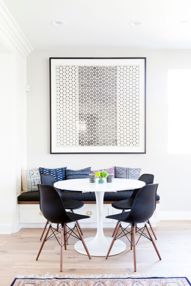
via Veneer Designs (photo: Amy Bartlam)
There's something about cozy little breakfast nooks that's absolutely charming, isn't there? I've always had a soft spot for them - they make great use of a small space and you can have a lot of fun with them design-wise. So when I was deciding what kind of space to tackle next in the Get the Look series, I decided now was a great time to try my hand at designing one of these casual dining spots.
I think I also have breakfast nooks on the brain thanks to a space I've been working on for a client over the last couple of weeks. Hers is a little larger than a true "nook," but it definitely has the same sort of feel. We're using a dining bench on one side and chairs the rest of the way around - I'm absolutely loving how it's turning out!
In today's post, I'll be going after a modern look with a tiny bit of boho thrown in for fun. You'll see that echoed in the inspiration images I pulled - the furniture definitely has clean, modern lines, and the patterns and textures of the textiles that are layered in add a touch of bohemian. Let's take a look, shall we?
via Veneer Designs (photo: Amy Bartlam
I love this space that Jacquelyn Clark designed (above). It feels so cozy and inviting, but also doesn't have a lot of frills, which is perfect for a dining area. The built-in bench has great storage underneath and it provides seating as well. That collection of indigo and mudcloth pillows lining the back of the bench is gorgeous, isn't it?
You'll notice that this space, along with the other three inspiration images, has a round pedestal table. Going with that particular type of table is a really great choice for these dining nooks since they maximize seating!
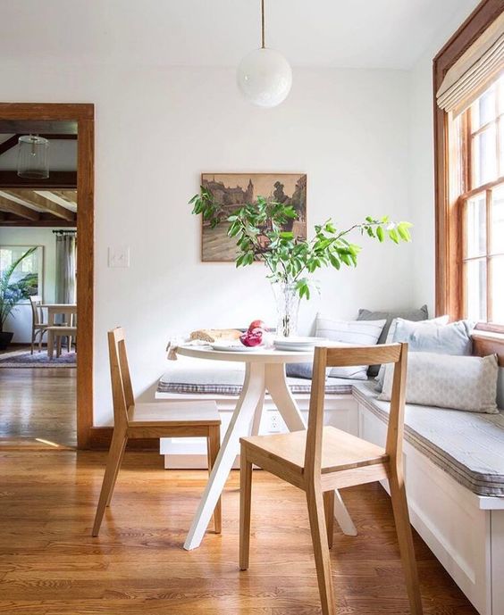
via @azford on Instagram
The built-in bench strikes again in this space from @azford! This time, it's an L-shape, which is a great option if you have a natural corner. The softer color palette has a relaxing feel to it, and I'm a big fan of the simplicity of the chairs and modern globe light fixture above the table.
via Katie Hodges (Photography: Amy Bartlam)
I love the addition of the leather chair cushions in this space from Katie Hodges. Overall, it has a more eclectic style with bright colors and several different patterns mixed together. Notice the round pedestal table here too - there's currently seating for about four people, but you could easily add two more chairs if needed. Isn't it awesome when you can maximize function and style in a room?
via @crystalanninteriors on Instagram
And lastly, we have a dining nook with a slightly different look to it with a small leather bench/Windsor chair combo. If a built-in bench isn't the right fit for your home, consider this instead! A bench works best when it's paired with an oval pedestal table, rather than round.
You have seating for four to six people with this setup, and it tucks away beautifully into a corner. Who says you can't have a dining room in a small space?!
So! With all of those little tips, tricks, and design ideas in mind, I designed a small modern breakfast nook that I'd happily have in my own home! Scroll on down to see the furniture and decor I chose, and then read a little bit about why I decided on these particular items.
You can also Pin the graphic below for future reference if you want to come back to it later.
White Round Pedestal Table | Mid-Century Modern Dining Chair | Long Bench (Sliding Doors) | Bench (Drawers) | Globe Pendant | Abstract Art #1 | Abstract Art #2 | Shibori Diamond Dot Pillow | Gray Throw Pillow | Green Throw Pillow | Pink Mudcloth Pillow
My take on this small modern breakfast nook packs a lot of punch into a little bit of space. I can just imagine this dining area adjacent to an all-white kitchen - it would bring in so much color and personality! As I mentioned in the intro, I wanted it to feel a little bit boho too, and I think I achieved that!
The pedestal dining table has a unique look to it thanks to the wire base, and some simple mid-century modern wood chairs add a nice sculptural element to complement the table. The bench seating is actually three modular pieces from Crate & Barrel (this one and this one). I like how there is a mix of drawers and sliding doors to give you some nice storage options.
Since benches aren't the most comfortable to sit on, I added plenty of fun throw pillows to create a nice spot to lean against. I pulled the colors from the artwork above, but kept the patterns pretty simple so they didn't compete too much.
To finish it off, I added a minimalist brass globe pendant to light up the area and define the space - I love a hanging light over a dining table, even if it's a small one!
So what do you think? Would you make this your breakfast nook? I'd love to hear your thoughts!
Psst! Want more Get the Look series posts? You can check out the whole collection here!
*Disclaimers: Affiliate links were used in this post, which means Mix & Match Design Company earns a small commission from your purchase at no cost to you. Note that these pieces are intended to mimic the look of the inspiration photo shown, but before making a purchase, always be sure to check that the piece will fit in your home!


