One Room Challenge Week 1: The Before and Inspiration
Welcome to the One Room Challenge, y'all! Twice a year, Calling It Home puts on this event where participants have six weeks (!) to give a room a total makeover, and after following along for years with the stunning transformations, I decided it was about time for me to join in on the fun as a guest participant. So what room am I taking on? My home office! A.K.A., the Mix & Match Design Company headquarters. :)
If you're new here (heyo!), I'm Chaney, and Mix & Match Design Company is my online interior design business. I offer affordable and approachable one-on-one e-design services along with lots of free decorating education, inspiration, and project reveals on the ole blog. I'm based out of Philadelphia, but work with clients all over the country helping them transform their houses into homes they love - one room at a time. Want to hear more about my story? You can dive right in on these posts here and here.
Each week during the ORC I'll be sharing about how the room is progressing until the grand finale on May 11th, but there's a long way to go before we get there! Today we need to begin with where this room started, where we are now, and talk about the inspiration for where we're headed.
The Before:
These photos are from the day we closed on our little 1200 square foot 1930s row house in the fall of 2015. This is the back bedroom, and the previous owners had painted half the room a bright maroon red and the other half was a stark white (I think it was just the primer!). My theory is that they intended to paint the whole room red, got it up on a couple of walls, and decided whoa, that's a little much, and ran out of steam to repaint. The room is also oddly shaped, with a lot of little nooks, so the paint job wasn't helping make it feel like a cohesive space.
In case you couldn't tell by the photos (you should see the rest of the closing day pictures!), the house was a bit of a fixer, and my father-in-law, my husband, and I did a crazy 30 day renovation to get it livable before we moved in. For starters, we ripped out the carpet that covered every bit of flooring, including the stairs, laid new hardwoods, and gave the whole house a fresh coat of paint. I wanted it to feel fresh, clean, and bright, and that's what we got! We recently renovated the kitchen as well, which you can read about more in this post.
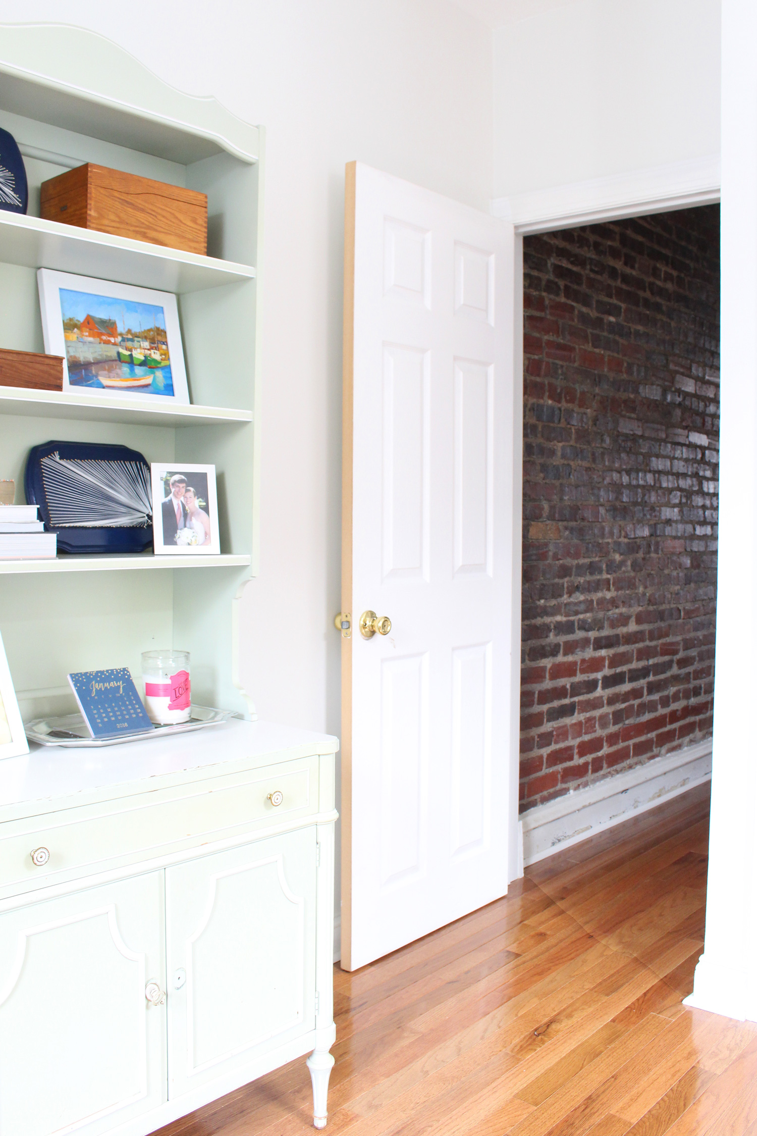
Here's how things were looking in the office once the new floors were in, and the room was painted (Winter White by Benjamin Moore in case you're curious).
I basically moved everything from my office in our old house right in, and didn't spend a whole lot of time thinking about it. I had a desk, chair and bookcase - what else could I need? :) At that time, I was still working full time from home in healthcare (Mix & Match was my side gig), and this setup worked just fine for that. Once I transitioned to running Mix & Match full time last summer though, I knew I'd need to make some changes, but my efforts were mostly focused on growing the business, and fixin' up my office fell to the bottom of the list.
I've now finally turned my attention to making my office into a space I love, and what better way to get it done than to give yourself a six week deadline and shout it from the rooftops (ok, maybe just shout it through the blog)? Thanks, ORC, for giving this girl some accountability!
The goal for this space is to turn it into a pretty and functional spot for me to work all day, and also carve out a small lounge/TV watching area. We don't watch much TV in our house, but we do own a small one, and for the past year, it has basically been sitting on the floor. That's obviously not a good long term solution!
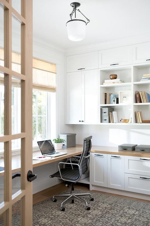
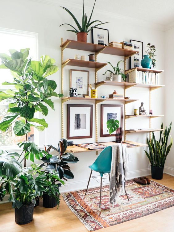
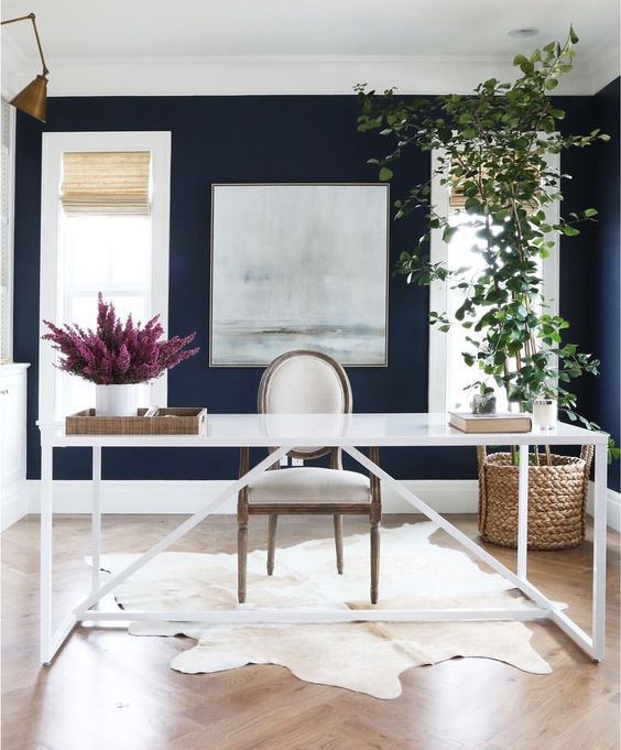
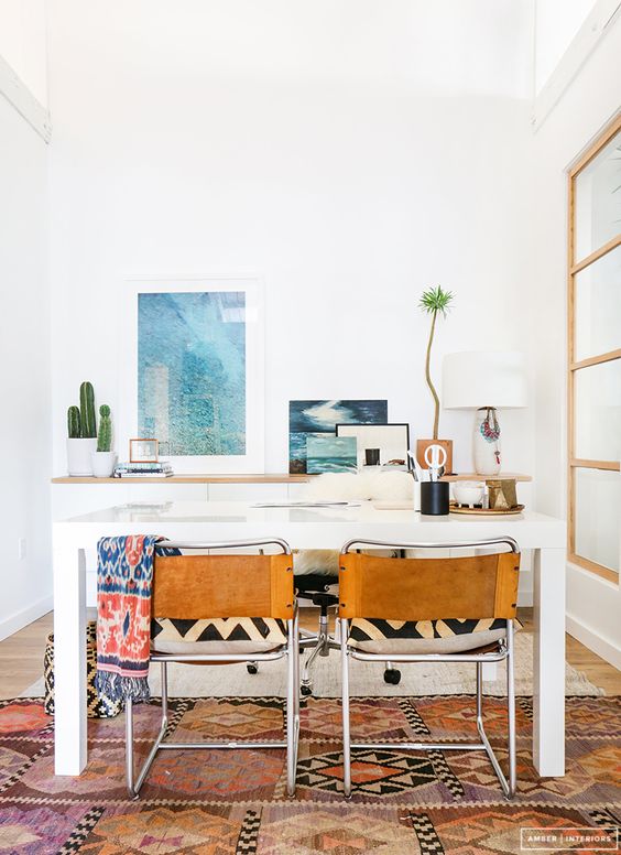
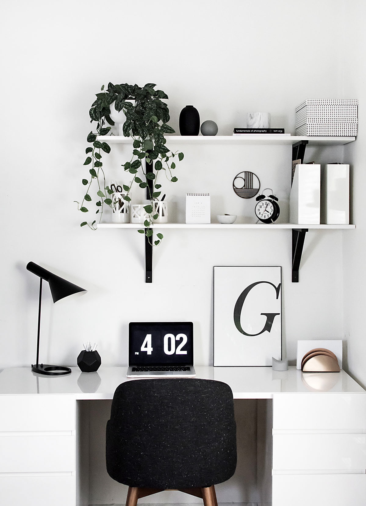
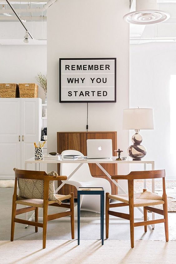
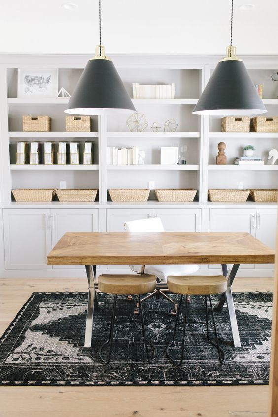
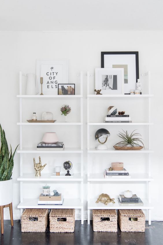
Here are some photos I've pulled for inspiration. These are helping guide me as I go through my design process (because inspiration photos are always a good idea, remember?).
Sources: Kelly Deck Design, Old Brand New, Studio McGee, Amber Interiors, Homey Oh My, Waiting On Martha, House of Jade, Design*Sponge
As an interior designer, it's been really hard to nail down what I want because there are so many looks to love out there. Sometimes being your own client is the hardest, but I'm beginning to make some decisions, and I'm thrilled with how things are shaping up so far!
Next week, I'll be back with the plan that will include a design board and the floor plan for this strangely shaped space. Exciting things are in the works! I hope you'll continue to follow along on this makeover journey. You can subscribe to the blog below if you'd like to receive the posts right in your inbox!
Lots of other folks are playing along too - make sure to check them out!


