Before & After: A Teeny Tiny Powder Room Makeover
In January, I finished up a powder room project for some awesome clients, and they were kind enough to share the "after" with me after the install - everything turned out absolutely beautifully! My clients happened to be local, so I asked if I could come by and snap some photos to share with y'all, and they said, "yes!" My goal in sharing this project with you today is to show that sometimes, small changes can make a huge difference in the look and feel of a space - even if it's not a big one!
To give you a little backstory on this project, my clients live in a really cool one bedroom condo in an historic building in Philadelphia, and they've been slowly working on making it their own over the past several years. They're excellent DIY-ers, and have great instincts for what good design looks like, but wanted some guidance from a designer on how to bring everything together to achieve the look they had in mind. They also wanted to make sure that whatever they did improved not only their personal enjoyment of their condo, but also increased its resale value if/when they decide to sell down the road. After coming across Mix & Match in Philadelphia Magazine, and hearing about the concept of e-design, they thought that kind of service might be a perfect fit for them, and they were right - it turned out to be a great match!
BEFORE
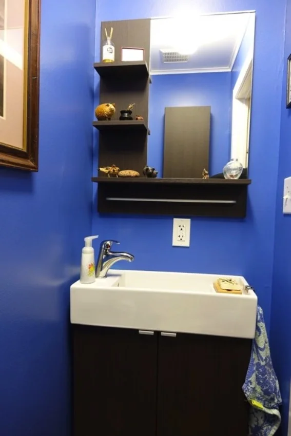
Their small, but mighty, powder room (it's a luxury to have a half bath in a one bedroom apartment!) was the first of several projects they wanted to work on over the next couple of years. Here's what it looked like before I jumped in to help with the redesign:
The bright blue paint was a little overwhelming, so we decided to tone things down with more neutral colors. Their builder-grade toilet wasn't working very well anymore, and they were ready to replace it with one that had a modern style that would fit in well with the look of the rest of their home. They also wanted to replace the mirror above the vanity and the fluorescent light fixture. Needless to say, I was excited about the idea of giving this small half bathroom a more modern, customized upgrade that didn't break the bank!
DESIGN
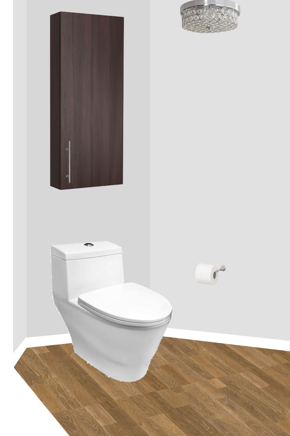
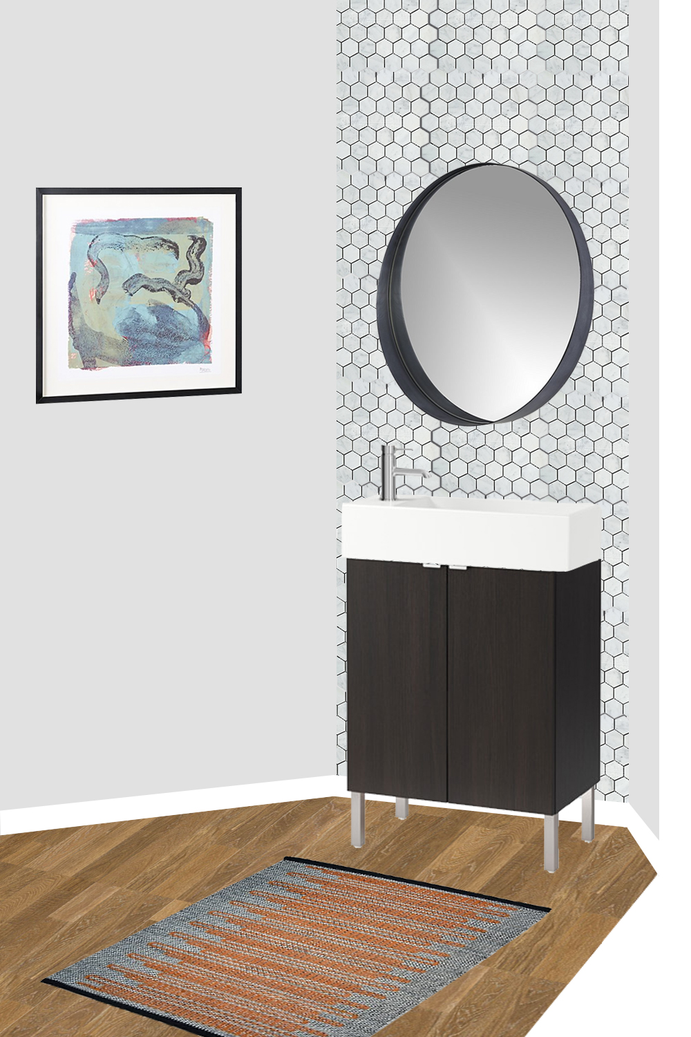
The plan was to give the space a fresh start with gray paint, and add visual interest back in with an accent wall of tile behind the vanity. Since we were keeping the dark brown vanity and cabinet over the toilet, we wanted to balance those pieces out with some lighter elements. We chose a large, round mirror with an asymmetrical frame to compliment the square edges of the vanity and cabinet, and a new ceiling fixture with some bling.
Here's a look at the finalized design board for the space that includes both the toilet and vanity sides:
We toyed with a few tile options, but ultimately landed on a 2" polished Carrara marble hex tile* with light gray grout. It's so pretty in person, and the clients loved it so much, they ended up tiling the wall behind the toilet as well, which looks fantastic (told you they had great design instincts!). And because people always want to know grout color, we went with Polyblend #115 Platinum Non-Sanded Grout - it works beautifully with Carrara marble.
The mirror is from CB2, and at 24" in diameter, it's a great size for this small space. The black crescent shaped frame adds just the right amount of whimsy.
We actually did a last minute switcheroo with the toilet, and ended up with this one, which is very similar, but has a taller back piece. It looks awesome in there though, so if you're on the hunt for a modern-looking, dual-flush toilet, this is a great option!
The last piece we changed was the light fixture - we swapped the not-so-awesome fluorescent one for this blingin' crystal flushmount. It's such a fun, unexpected element, and I give the homeowners all the credit for that inspiration! They had shared a photo of a fixture with a similar style when we were in the initial planning phase, and I'm glad we went that route.
That's the story about how we came up with the design, so let's get to everybody's favorite part - the "after" photos! This room was quite a challenge to shoot since it was so small and didn't have any natural light. Thanks to my trusty assistant (a.k.a. my sweet husband, who came with me on photoshoot day), we got it all lit up though, and I was quite happy with how it all turned out. My preference is always to shoot with natural light, but sometimes you have to make do when that's not an option! :)
AFTER
Such a change from where we started, right? Goodbye, bright blue, hello marble hex tile! I'm thrilled with how it all turned out, and so are the clients (which is the most important part anyway!). This bathroom is a prime example of how a few simple changes can make a big difference - you don't always have to do a gut renovation and start over completely. Another great part about this design is that it has mass appeal. If they do decide to sell down the road, this powder room will be a nice feature that many buyers will love.
SHOP THE LOOK
If you'd like to "get the look" of this little powder room redo, you can shop many of the items below. If you have any questions, or would like to work with me on a room in your home, send me a note - I'd love to help you out!
If you're on a feed reader or receiving this in your email, you'll need to click over to the full website to use the tool below.
*This post contains affiliate links, which means Mix & Match earns a small commission from your purchase at no cost to you.


