Before & After: Our Kitchen Renovation
I'm excited to share a really fun before and after with you all today. This one has a special place in my heart because it's in our very own home. If you've been following along on Instagram, you caught a sneak peek of the kitchen renovation we just completed, and now it's time to spill the beans on the whole thing!
Before I get into it, here's a little backstory about our house: we purchased our 1200 square foot 1930s row home in Philadelphia a year ago and have been hard at work renovating it to make it feel more like us. It was in pretty sad shape when we first looked at it, but I knew it had a ton of potential (it took a little bit of convincing to get my husband on board, but he came around!). We did a "30 day blitz" renovation of much of the house before we moved in to get it livable, but held off on doing the kitchen until we had some time to think about exactly what we wanted to do.
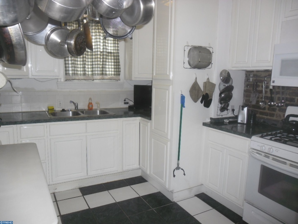
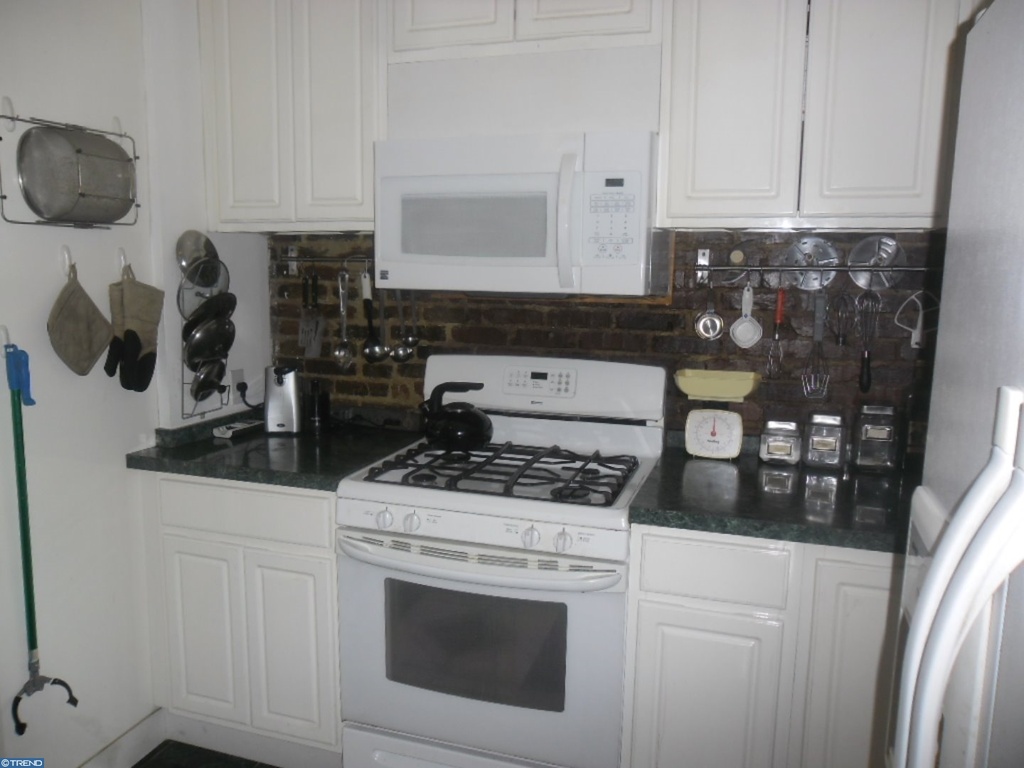
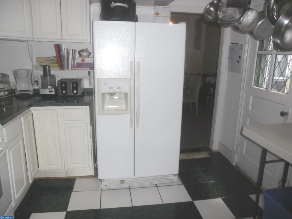
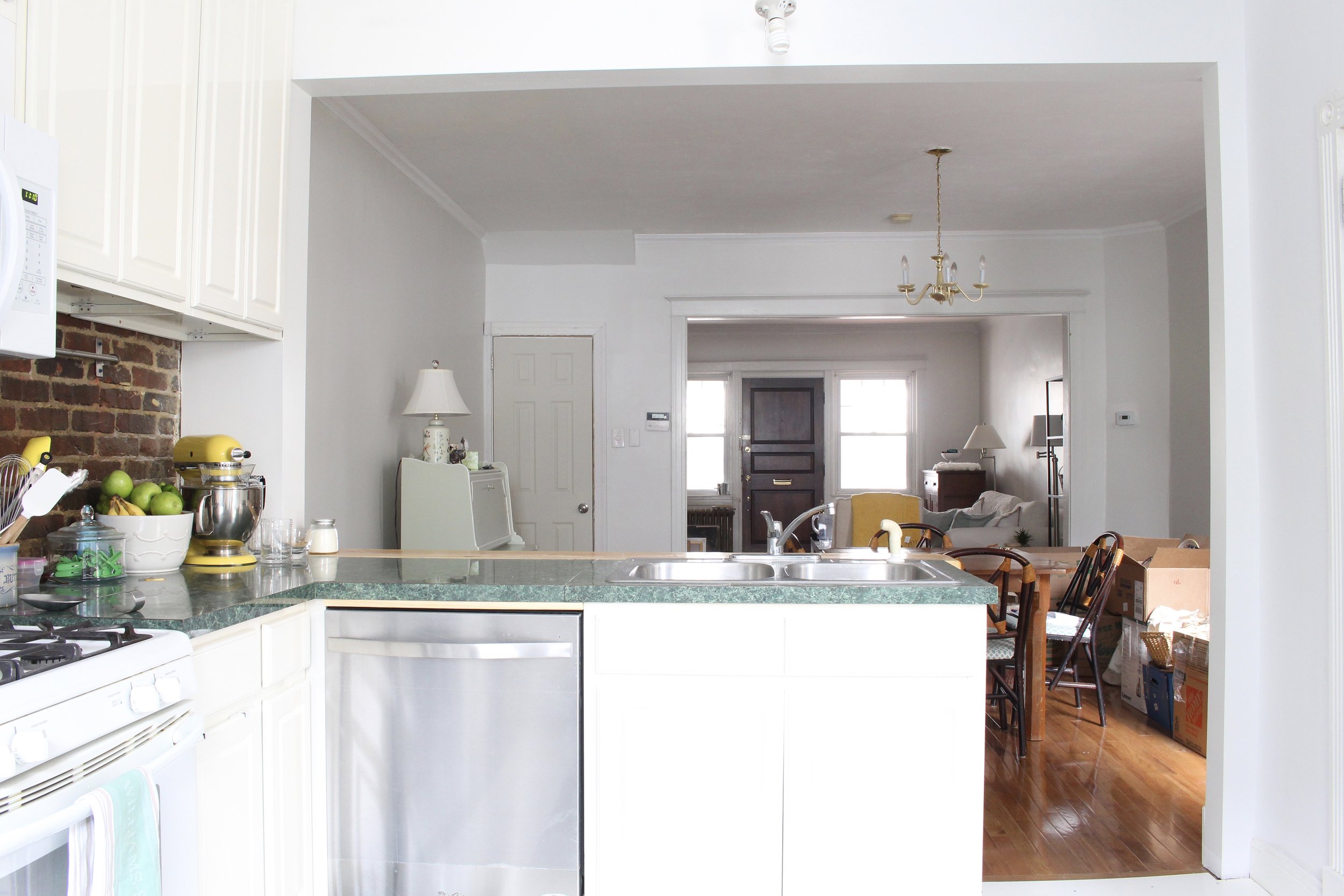
Let's start with some before, shall we? Here are the real estate photos of the kitchen:
Hello cabinet overload! Though we certainly weren't lacking in storage, it felt really cramped in there with every square inch covered and it felt completely cut off from the rest of the house. Also, the floors were uneven, which meant that many of the floor tiles were cracked or missing all together. Though some had been replaced over the years, they didn't always match. The green laminate countertops weren't my favorite either. :)
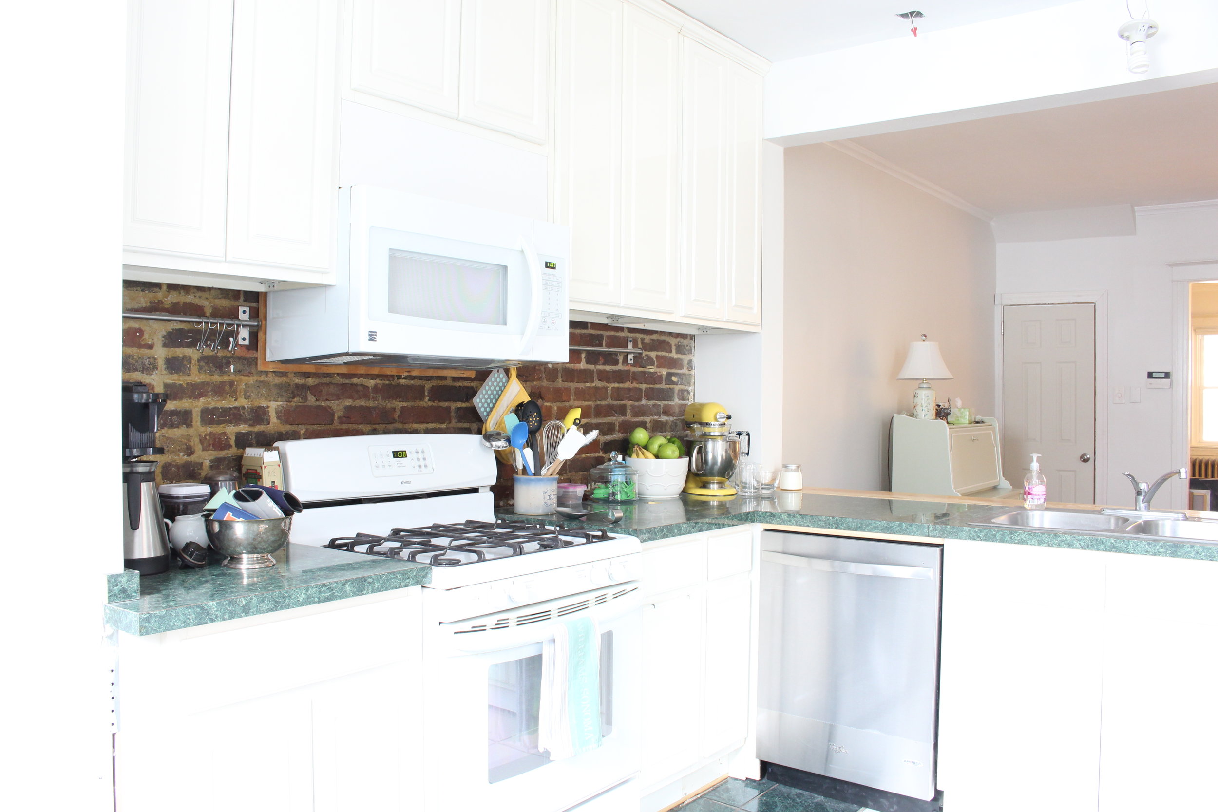
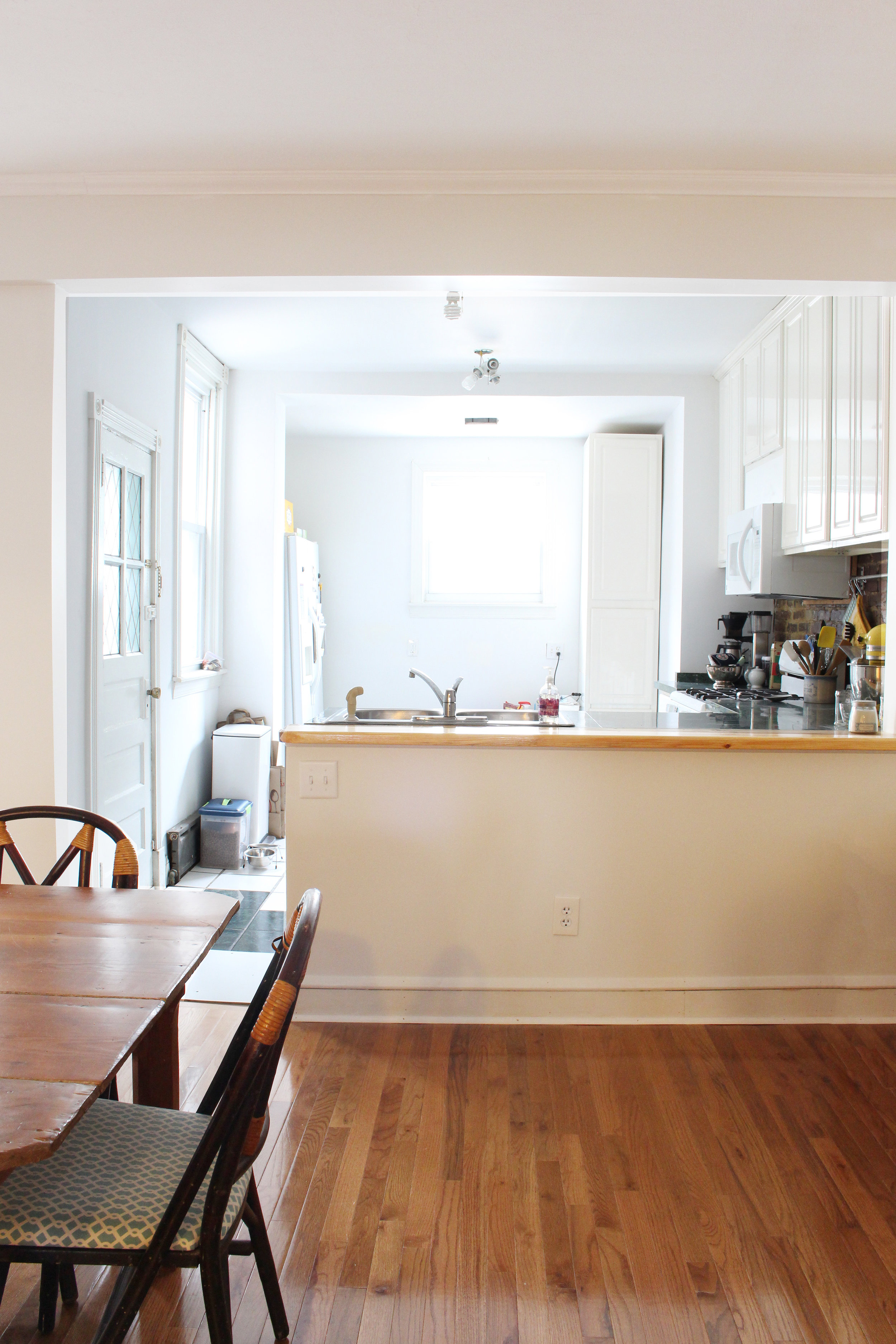
The kitchen sits at the back of the house adjacent to the dining room. To make it feel more open and connected to the house, we decided to go ahead and take down the wall between those two spaces in our "round one" blitz renovation. We also removed and rearranged some of the existing cabinets, and shifted the location of the sink and refrigerator at that time.
We lived with our kitchen in that state for about eight months. Here's what it looked like:
Removing the wall and doing some rearranging definitely made the kitchen feel much better, but we couldn't wait to get going on the full renovation. My father-in-law (a contractor) and I took on the entire project together from demolition to cabinet installation (We went with the IKEA Sektion system and love it!) to tiling. It was quite the bonding experience! The only thing we didn't do was install the quartz countertops. That's definitely a job for specialized pros.
Now let's get to to the good stuff - the finished product. Get ready for major photo overload!
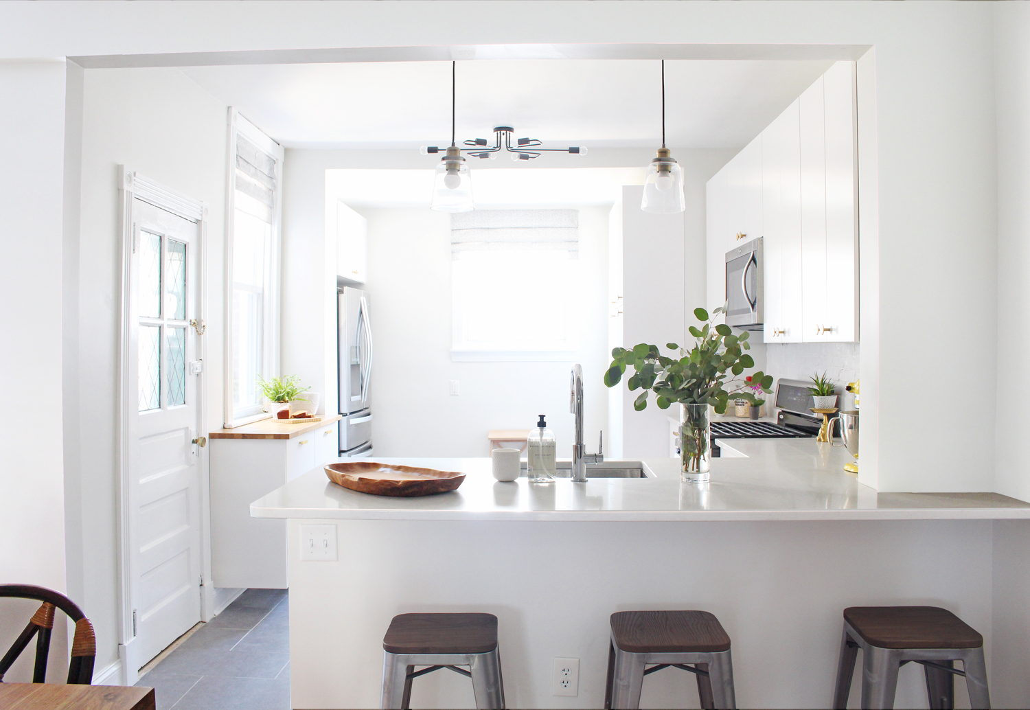
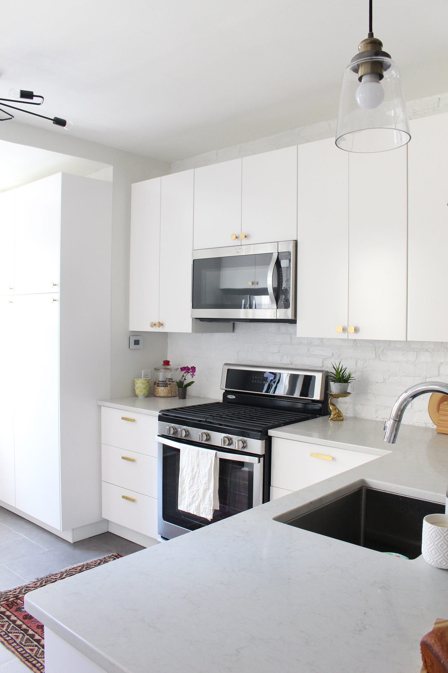
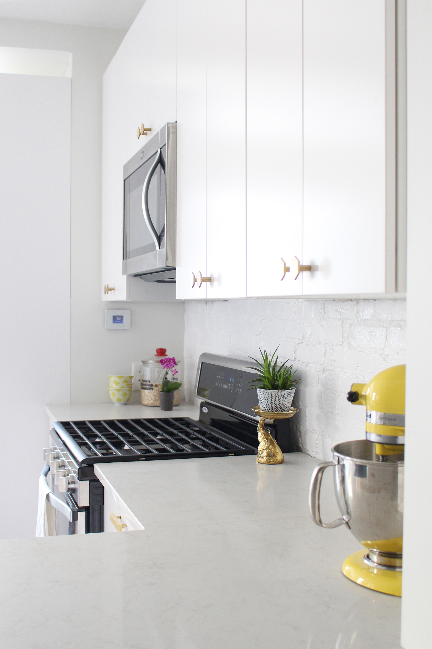
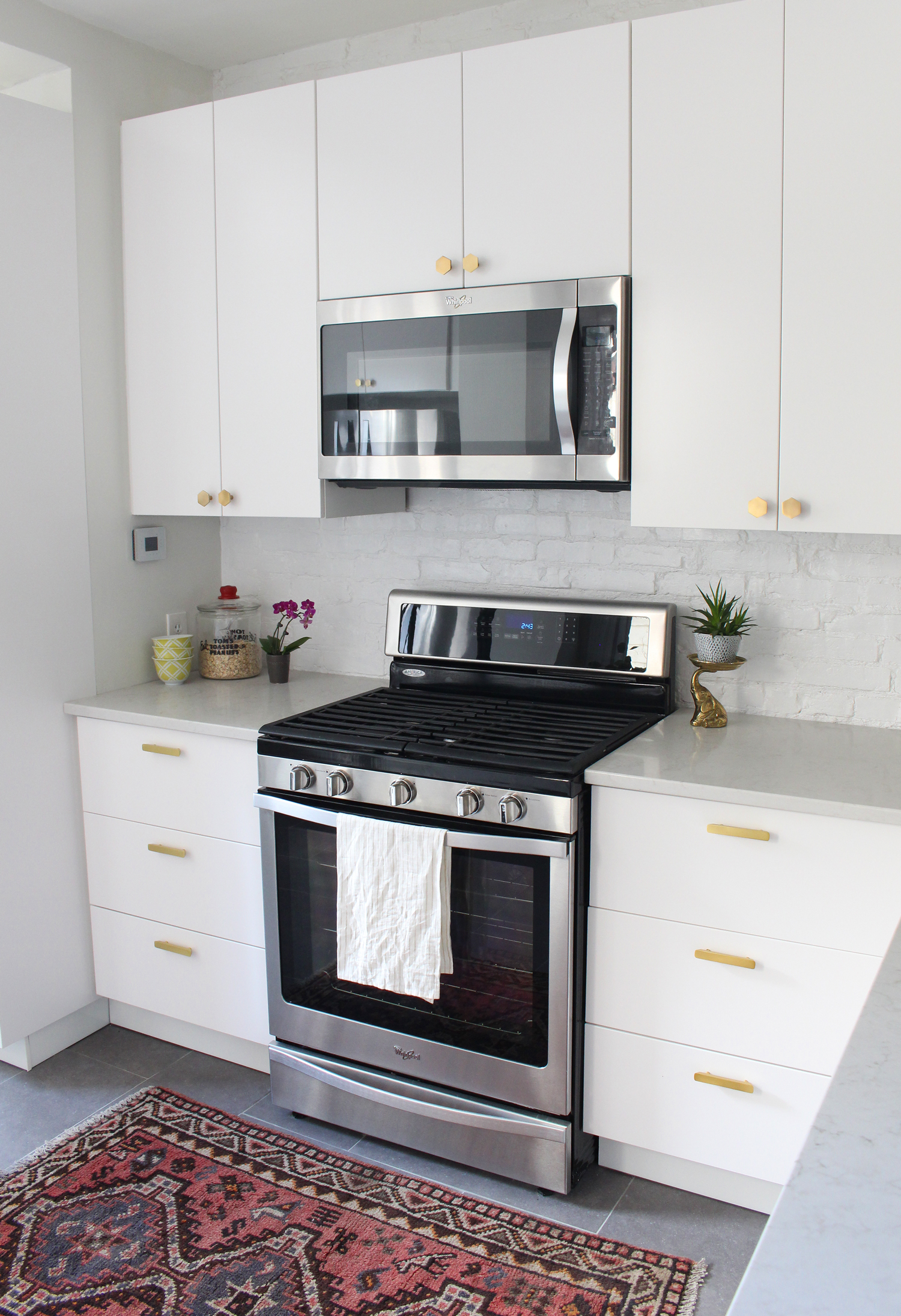
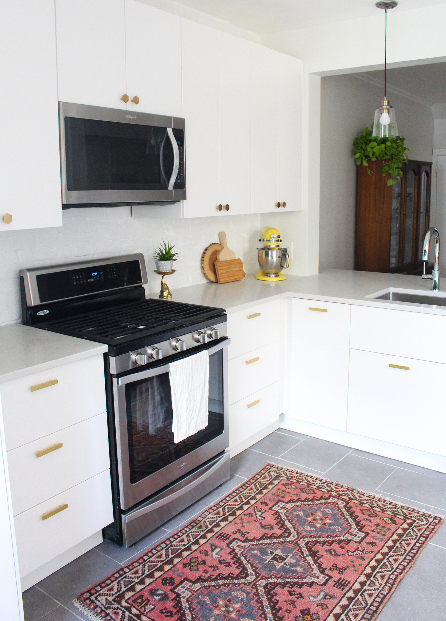
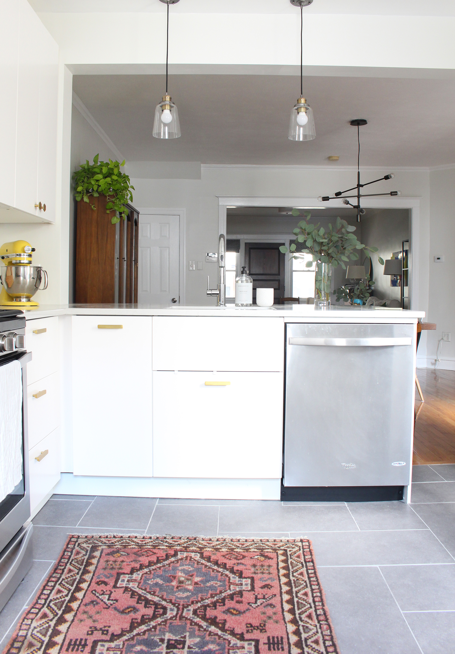
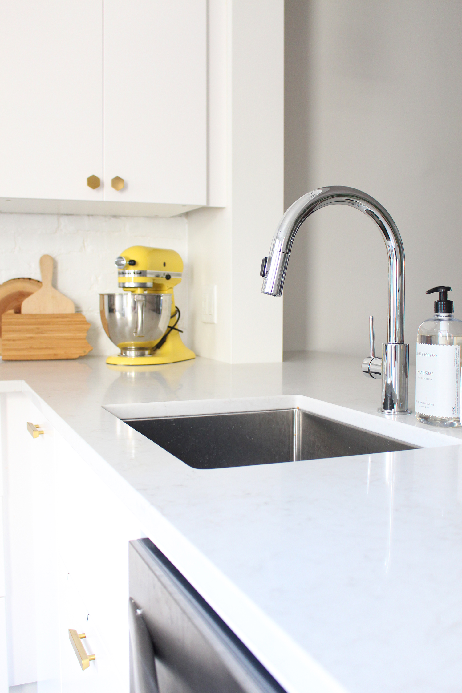
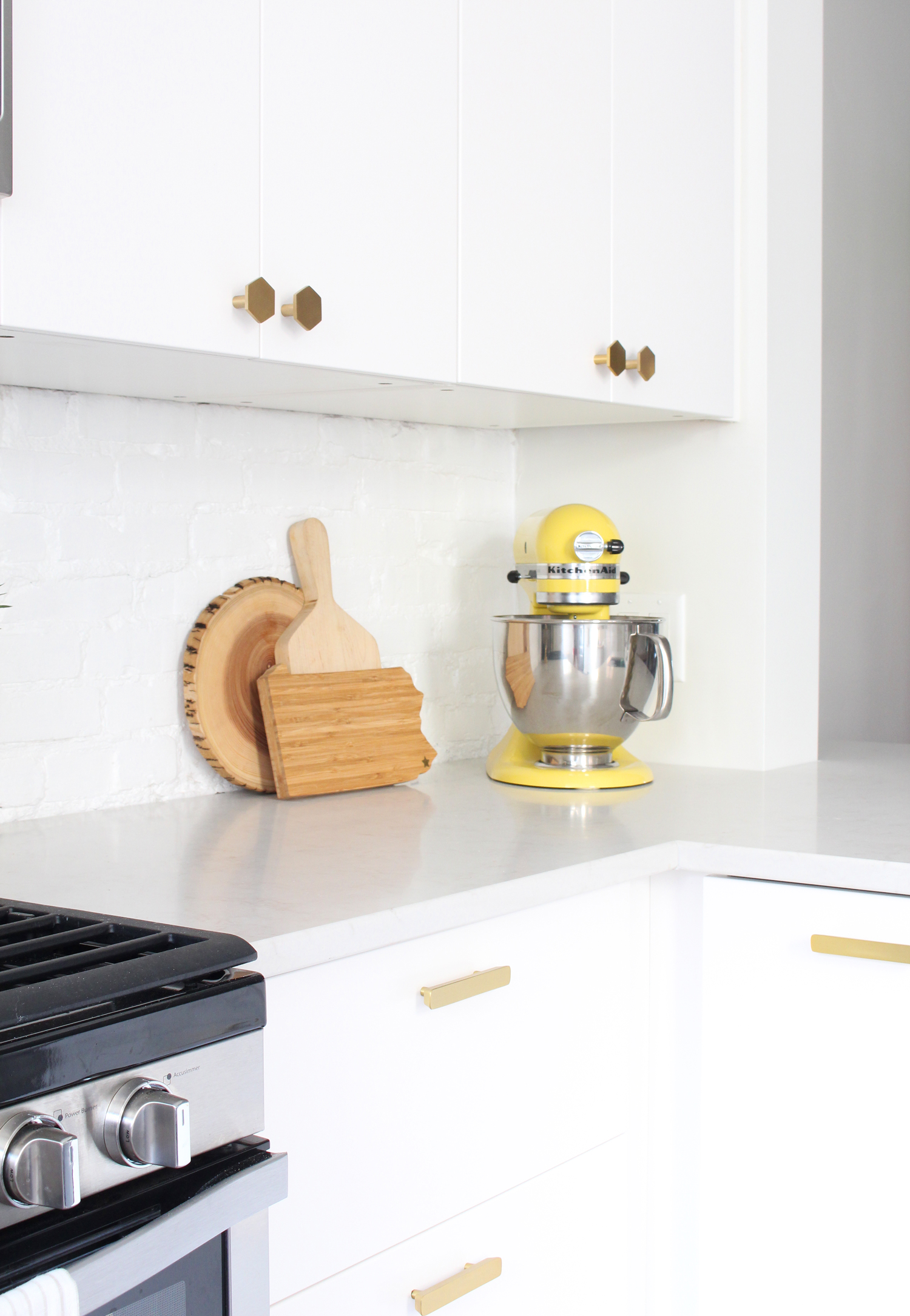
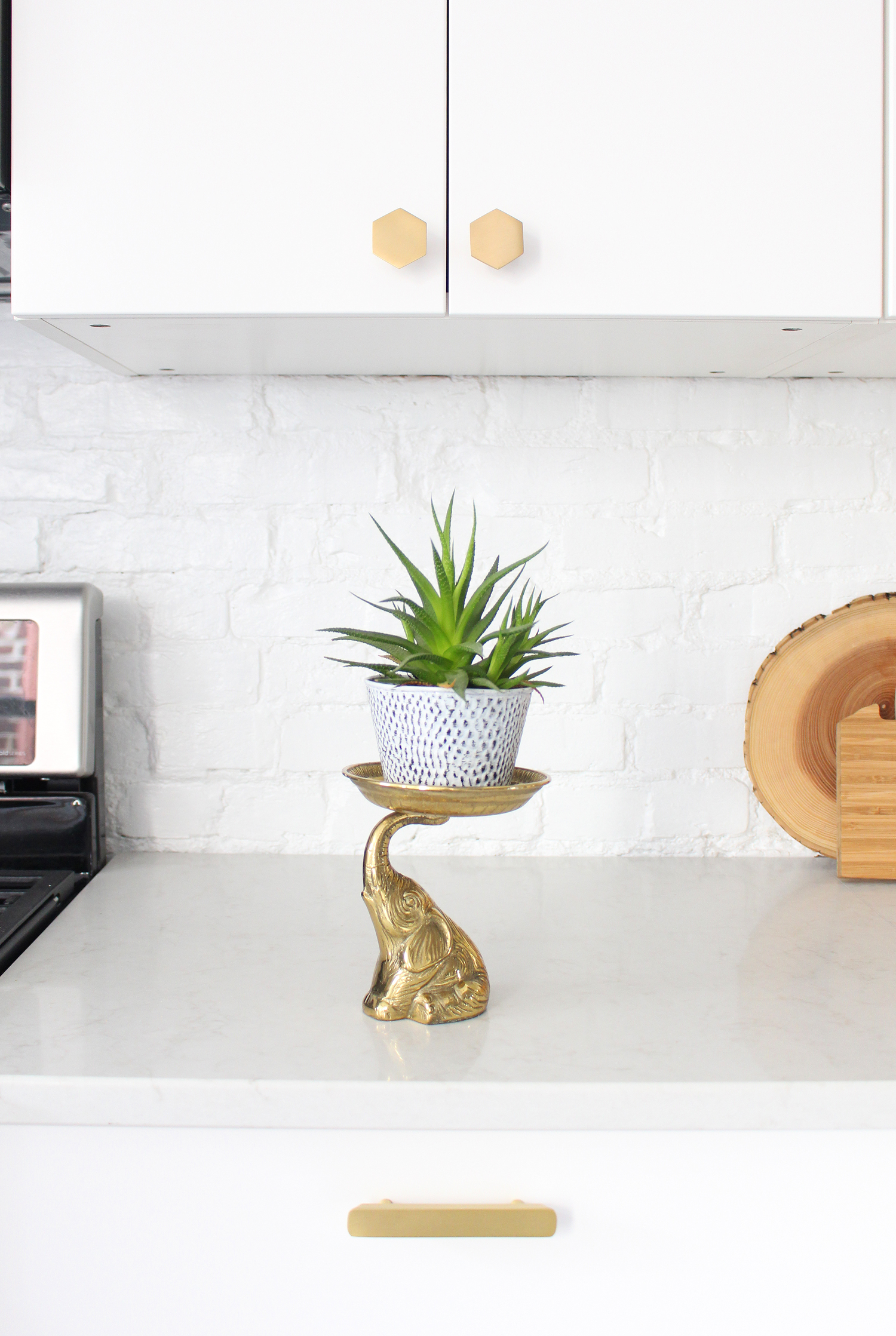
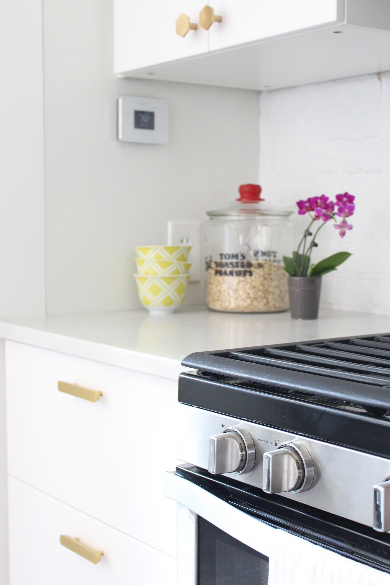
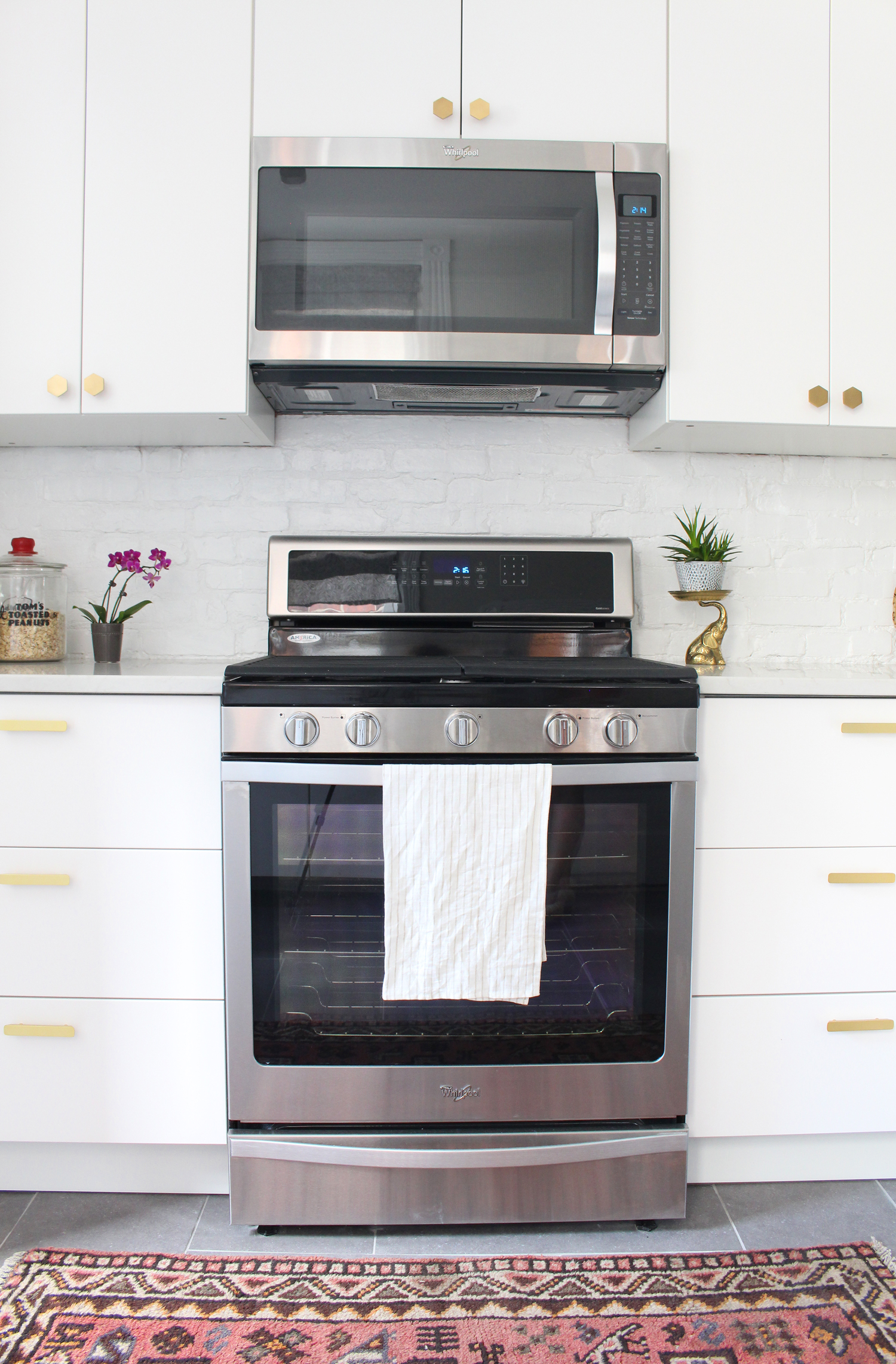
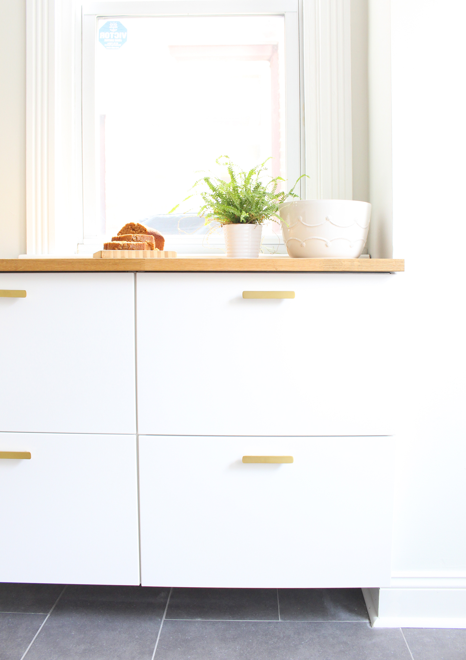
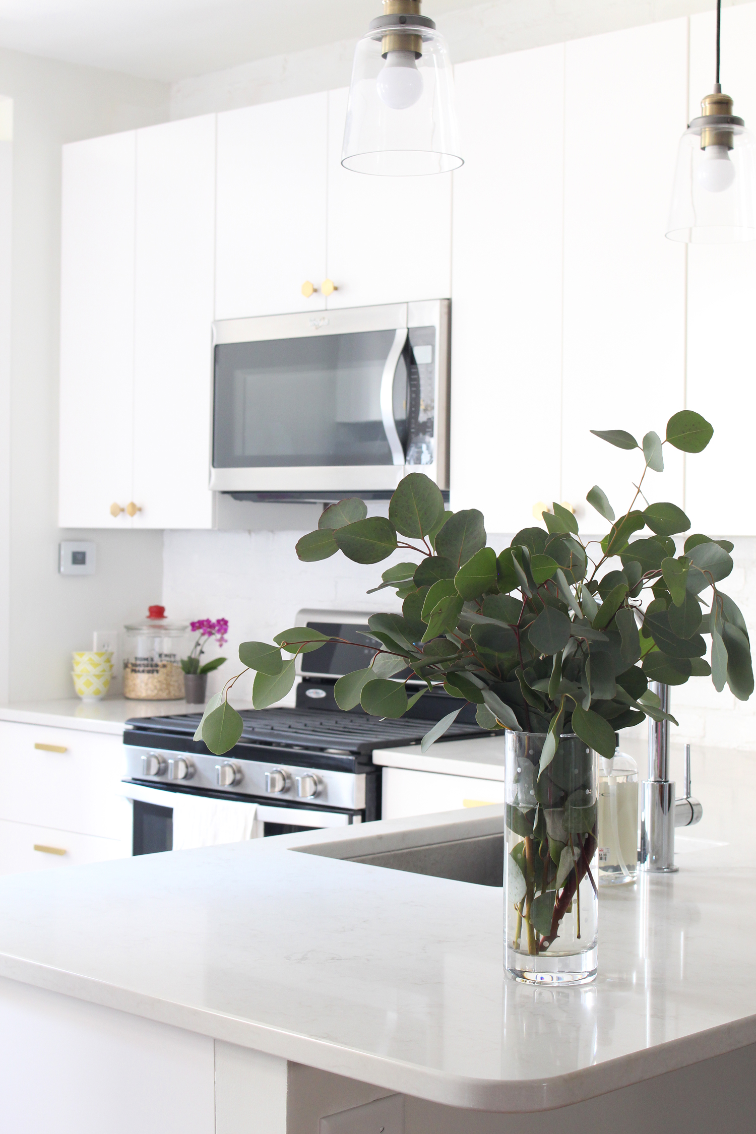
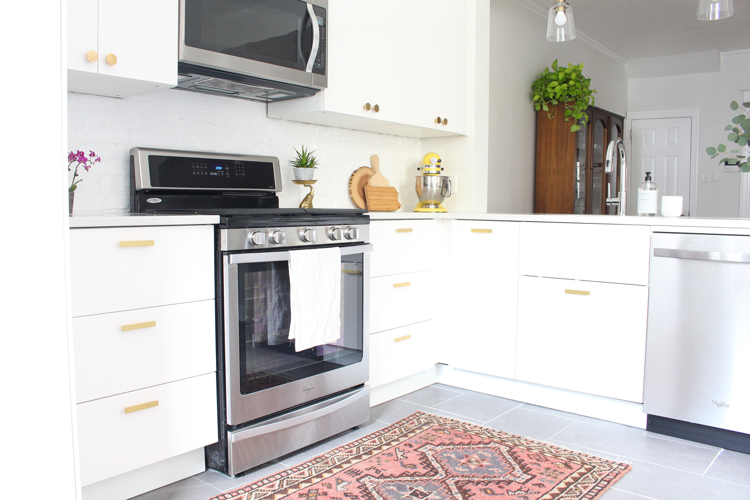
We're thrilled with how the kitchen turned out. The simple, modern, flat front cabinets (the Veddinge line from IKEA) are the perfect backdrop for the matte brass hardware. We went with longer pulls on the bottom cabinets (which are all drawers - best decision ever!) and hexagon-shaped pulls on the top half for the doors. We love the white and brass combination!
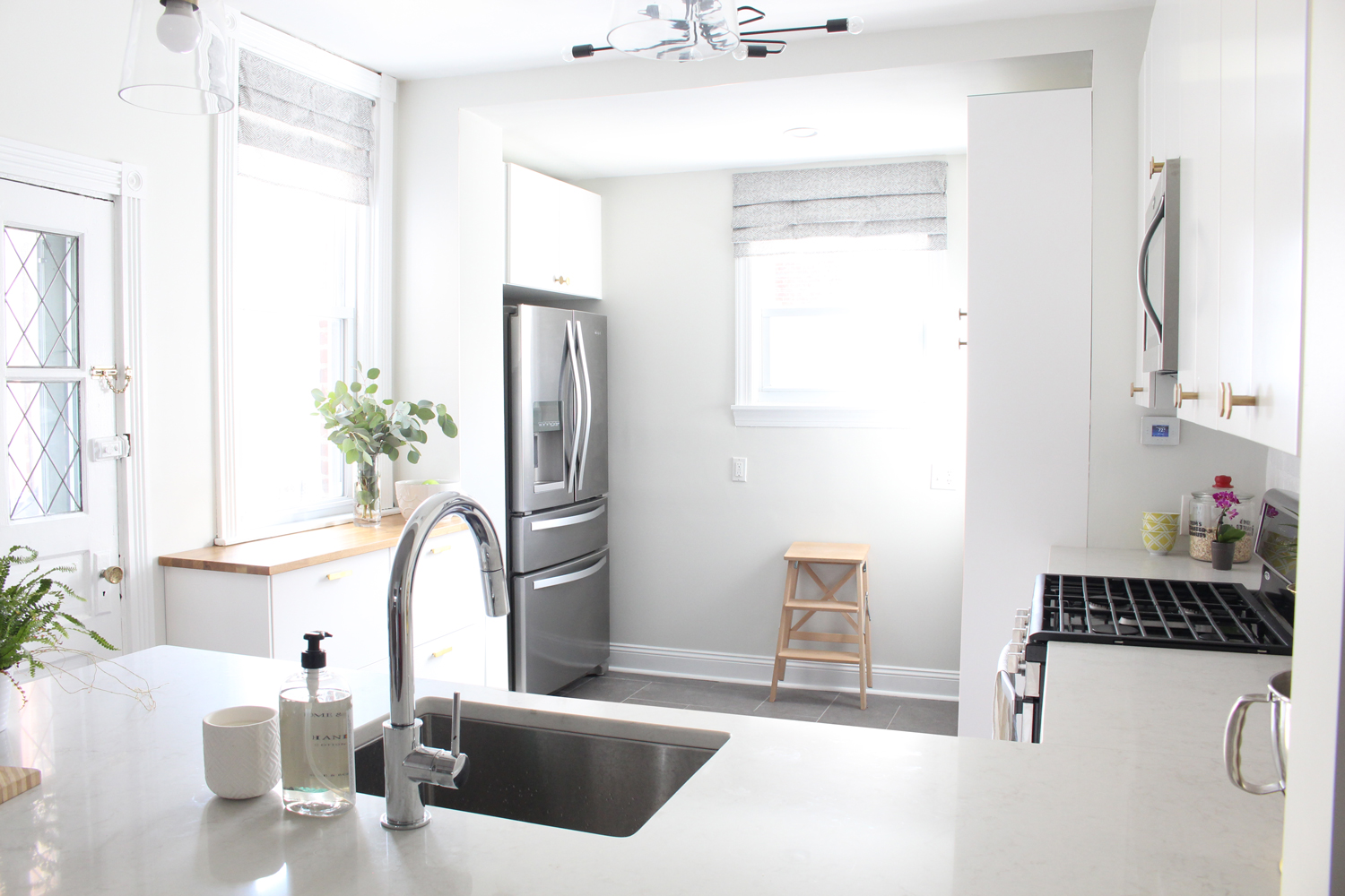
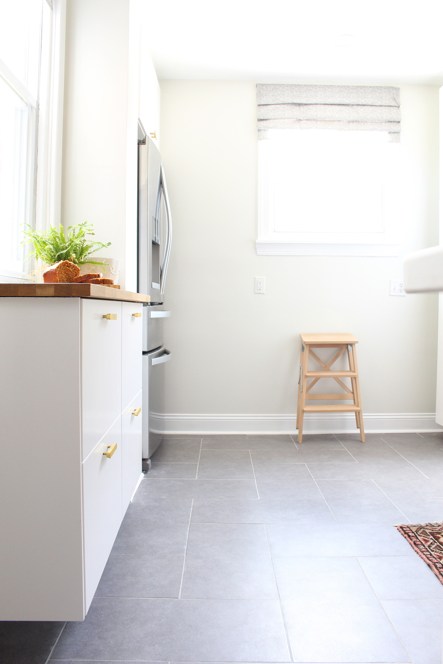
The main part of the kitchen is the L-shaped area with the sink, range, microwave and dishwasher, and we have another bank of floating, shallow depth cabinets under one of the windows. Two 24" wide floor-to-ceiling pantries near the back are amazing for dry food storage and small appliances (including our coffeemaker that has its own station!). Our main work area is topped with Quartz (Caesarstone London Grey) and the shallow bank of cabinets has a butcher block top.
I have so many favorite parts about this kitchen, but one that sits at the top of the the list is our radiant heat floors. Our kitchen hangs over our garage and the great outdoors, so the tile floors are freezing in the winter. No more! We'll have toasty toes from now on. :)
To give the oversized gray tile a little more visual interest, we laid it in a herringbone pattern. I'm so glad we did - it's more unexpected than a staggered brick pattern, but still classic enough to stand the test of time.
Another favorite part is the IKEA Sektion cabinets. Y'all. These cabinets are an engineering marvel in my book! They were simple to assemble, and the organization options (hello drawers in drawers!) are unbelievable. Oh, and I don't think I'll ever be able to go without soft close doors and drawers again. #spoiled
Completing this kitchen renovation was like the icing on the cake for our home. We love hosting, and the open floor plan of the first floor is super conducive to having folks over. People love to saddle up on the stools at the big peninsula and chat with whoever is cooking in the kitchen. That peninsula is also a great breakfast, lunch and dinner bar - my husband and I hang out there often!
I think I'll leave it there for today. If you have questions about our kitchen, fire away!
I'll list the sources below if you're curious about where everything is from.
SOURCES:
Cabinet frames, door and drawer fronts: IKEA Sektion with Veddinge front
Matte brass hexagon knobs: CB2*
Matte brass drawer pulls: Target*
Quartz countertops: Caesarstone London Grey
Butcher block countertop: IKEA Hammarp in oak
Floor tile: Style Selections Mitte Gray
Radiant heat system: Warmup loose cable
Refrigerator: Whirlpool
Range: Whirlpool
Microwave: Whirlpool
Dishwasher: Whirlpool
Sink: Kraus
Faucet: Delta
Wall color: Benjamin Moore Winter White
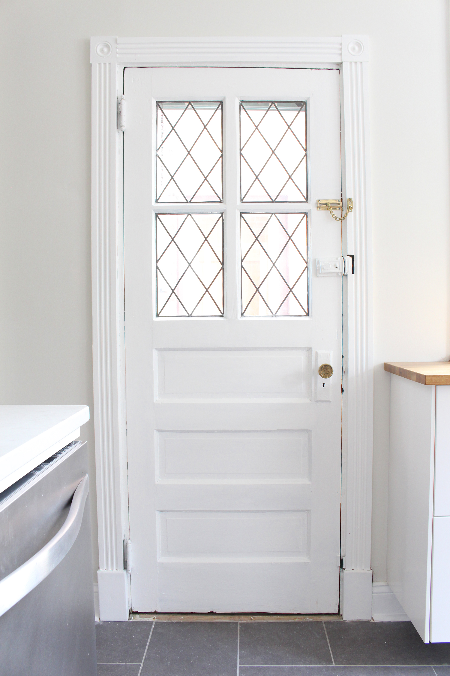
Trim Color: Behr Ultra Pure White
*Denotes an affiliate link, which means that I may make a small commission from your purchase (at no cost to you). Thanks for supporting Mix & Match Design Company in this way!


