
BIG Before & After: Laburnum Park Bathroom Project
I’m so excited to share today’s big before and after! Allow me to introduce you to the Laburnum Park Bathroom project. This was a total gut renovation in an historic home that took an almost non-functional Jack-and-Jill bath and turned into a modern-meets-traditional dream primary bathroom for my e-design clients.
When my client came to me, she had some great ideas and general direction, and had selected her contractor, who was ready to dive in once we got our plan in place. When it comes to renovations and e-design, partnering with a great contractor is a super important part of the process since I’m not on site to provide guidance and project management!
My goal is always to provide a ready-to-go design that the client can take to the construction team and implement seamlessly - it takes good communication and a solid plan to bring the project to life.
Let’s take a look at the before photos, shall we? It’s a pretty incredible transformation once you see what we had to work with before the renovation!
Before
As you can see below, it was an awkward space with a small vanity, a very visible toilet, and a clunky radiator made for a tight walkway. Since it was attached to one of their kid’s rooms, it also became the default “family bath” - something my client was more than ready to move away from!
The two big keys to making this bathroom more functional were closing off that door you see straight ahead to the right of the vanity and stealing a little bit of closet space from the bedroom that’s through it. That allowed us to have space for a 60” vanity along that wall, which was foundational to make it a bathroom that worked well for two people to use seamlessly at the same time.
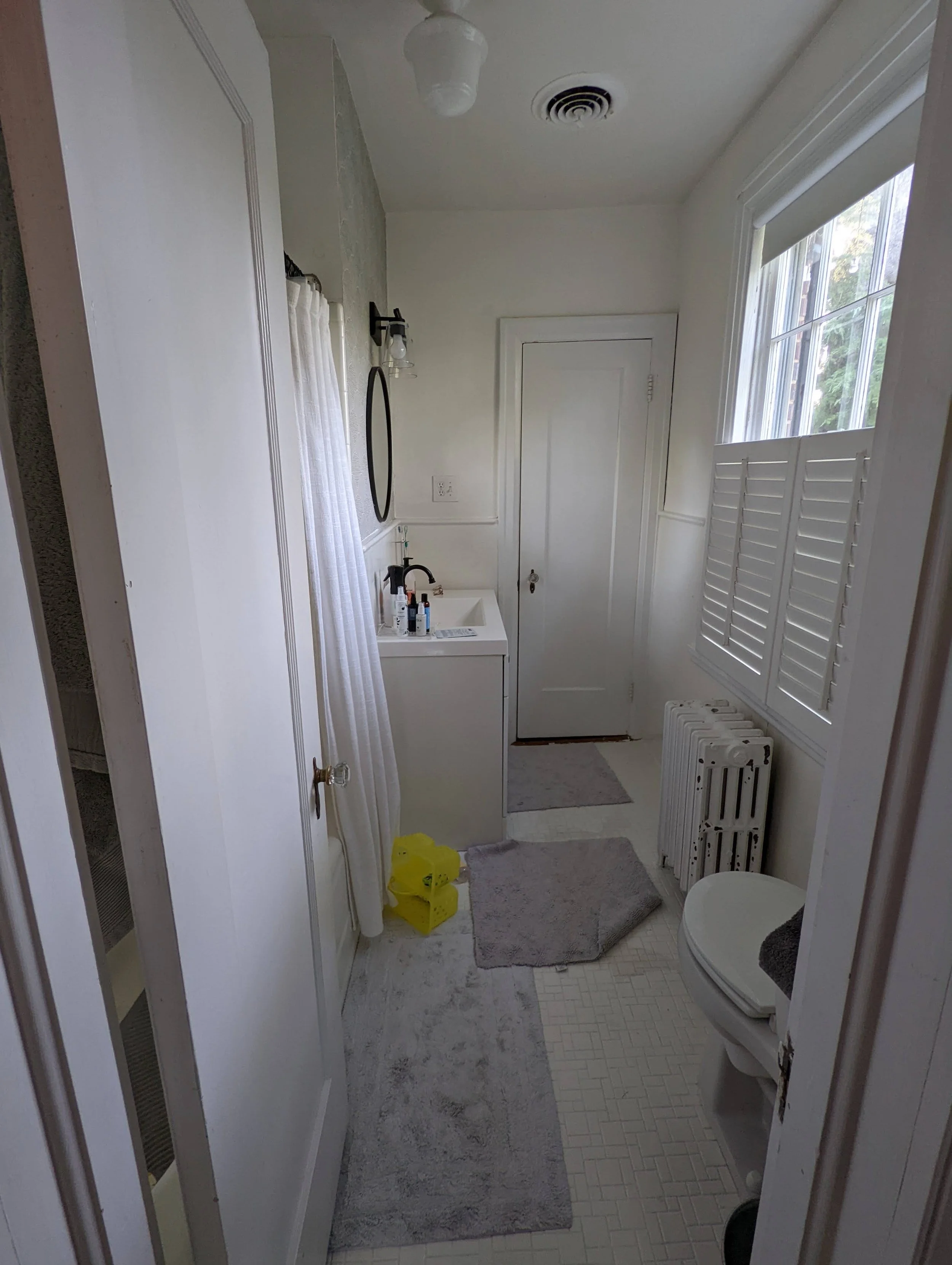
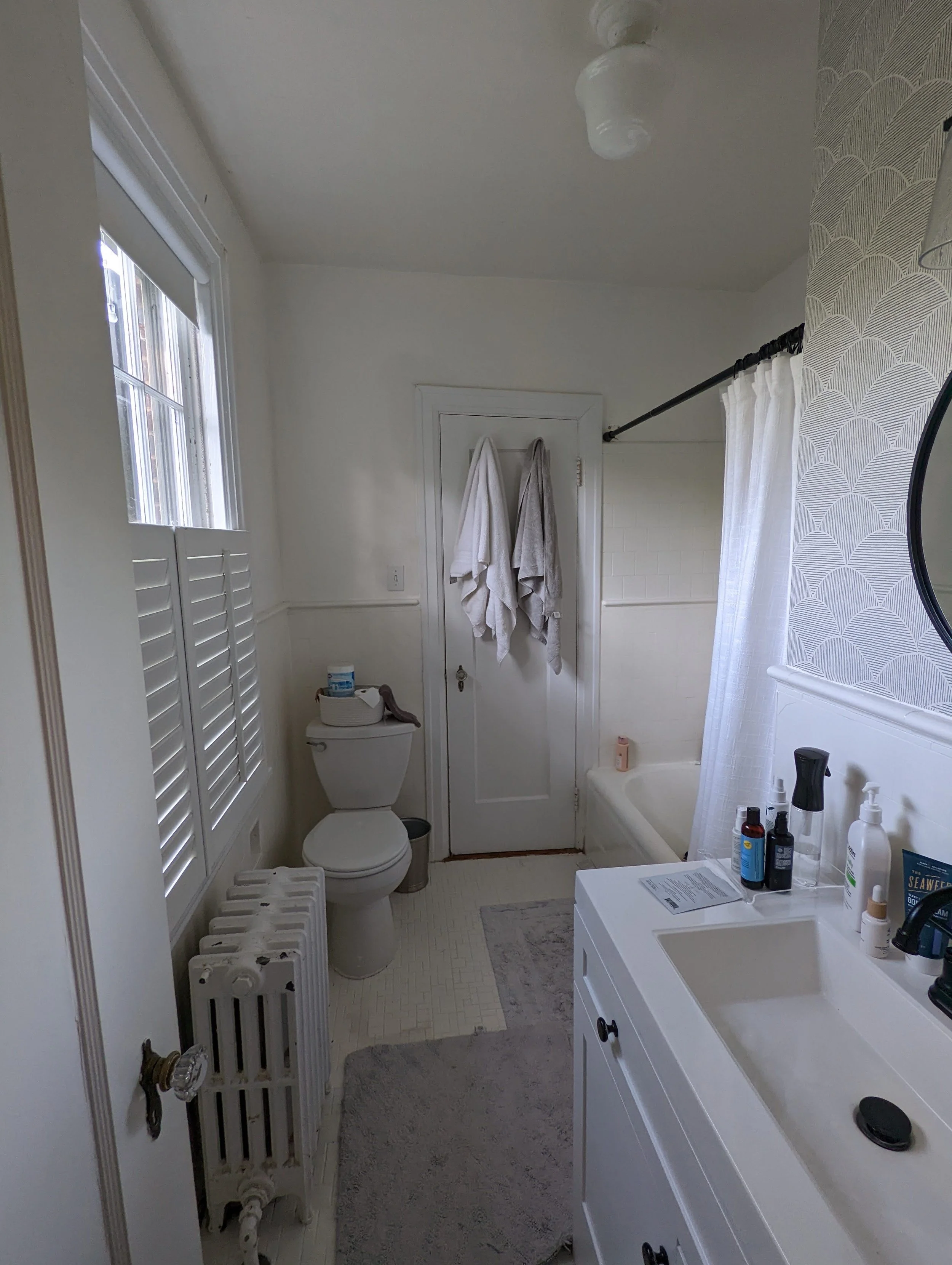
Turning 180 degrees, this is the view back toward the primary bedroom. The toilet needed to stay in place, but to make it feel more private, we decided to flip the door swing so that it opened the opposite way so that it created a wall of sorts for the toilet upon entering.
We also decided to sacrifice a shallow closet on the other side of the tub to gain a little bit of breathing room for the tub. Recessing the tub a little farther to the right (if you’re looking at the photo below) made a huge difference in how open the bathroom felt!
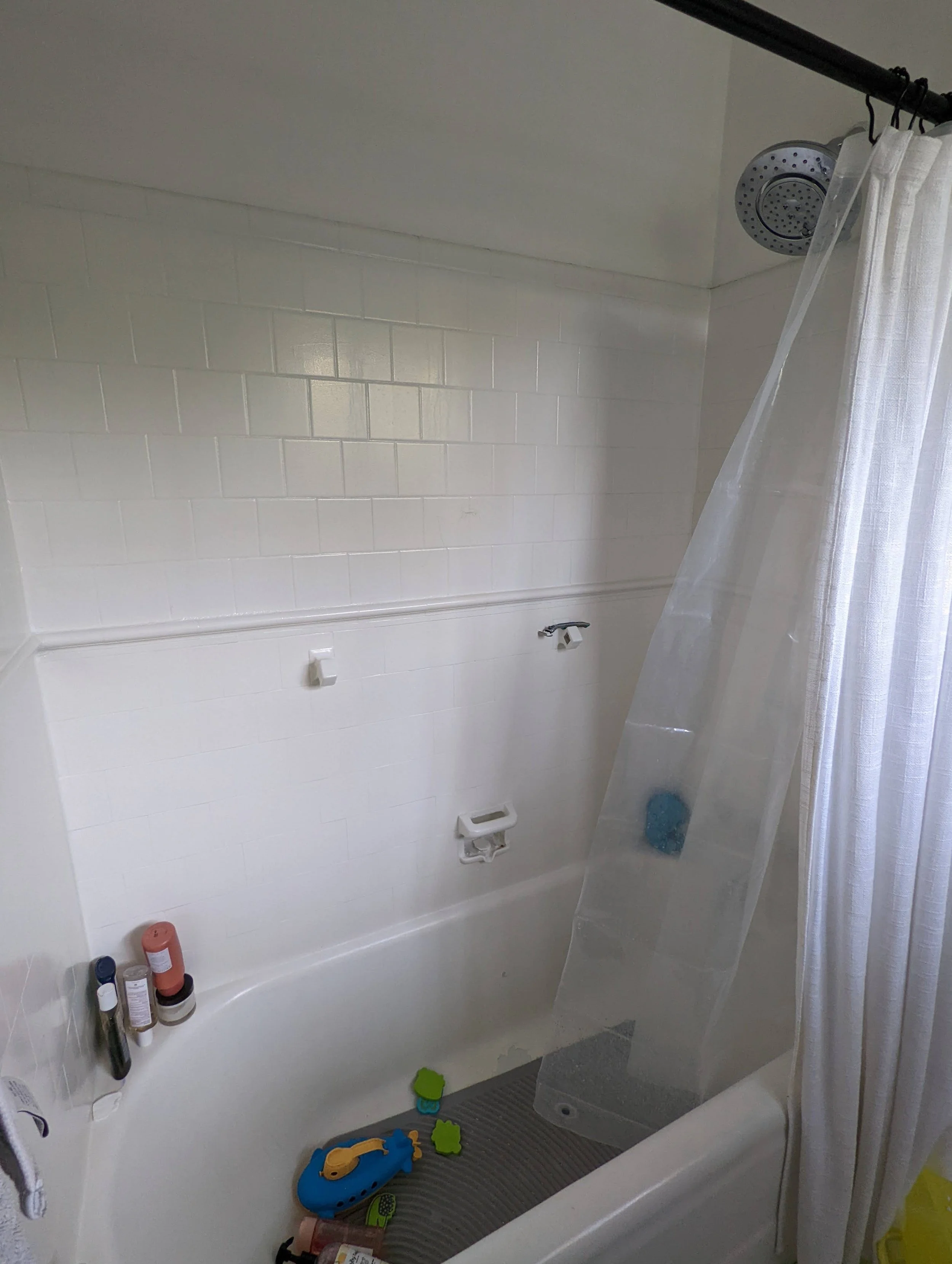
Finally, here’s a quick look into the tub nook. It was in a bit of a sad state and was ready for a makeover!
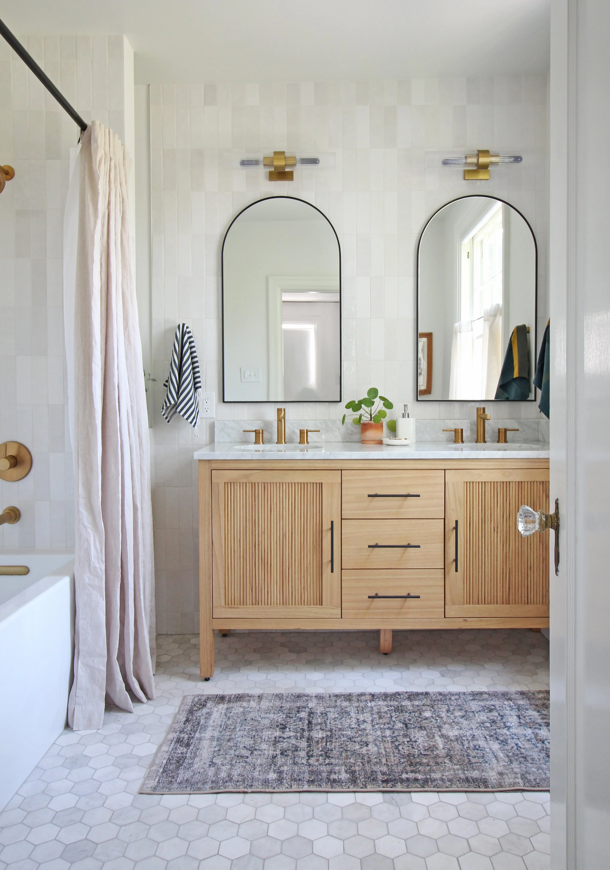
After
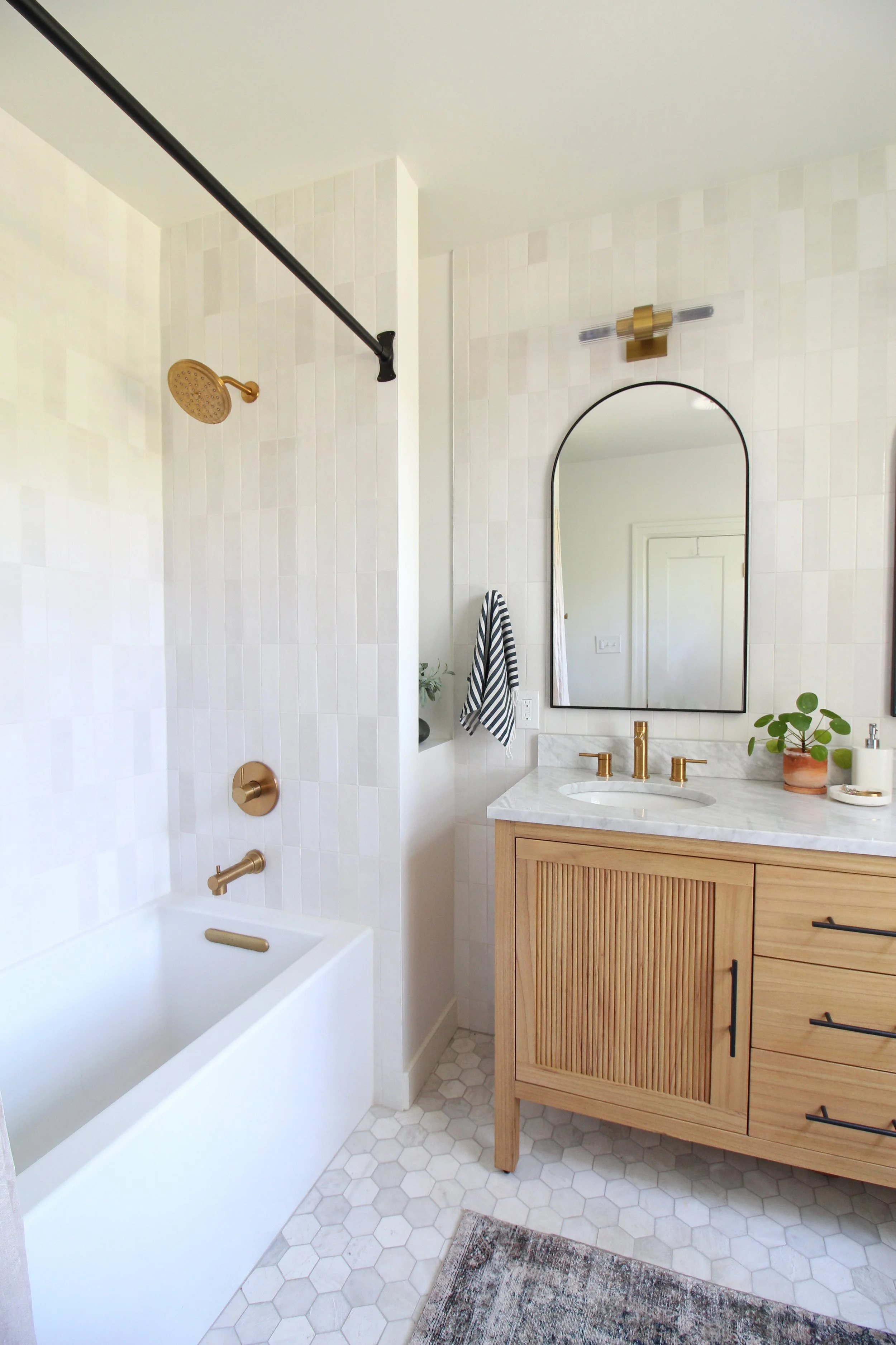
Welcome to the new modern-meets-traditional primary bath!
It feels a bit like a breath of fresh air, doesn’t it? It has a collected look with its mix of warm wood, gold fixtures, and black metal finishes, along with modern takes on classic shapes like subway and hex tile.
I love how it honors the historic nature of the home while incorporating my clients’ more modern style. The rest of their home has a mix of mid-century, modern, and more traditional pieces, so this fits right in!
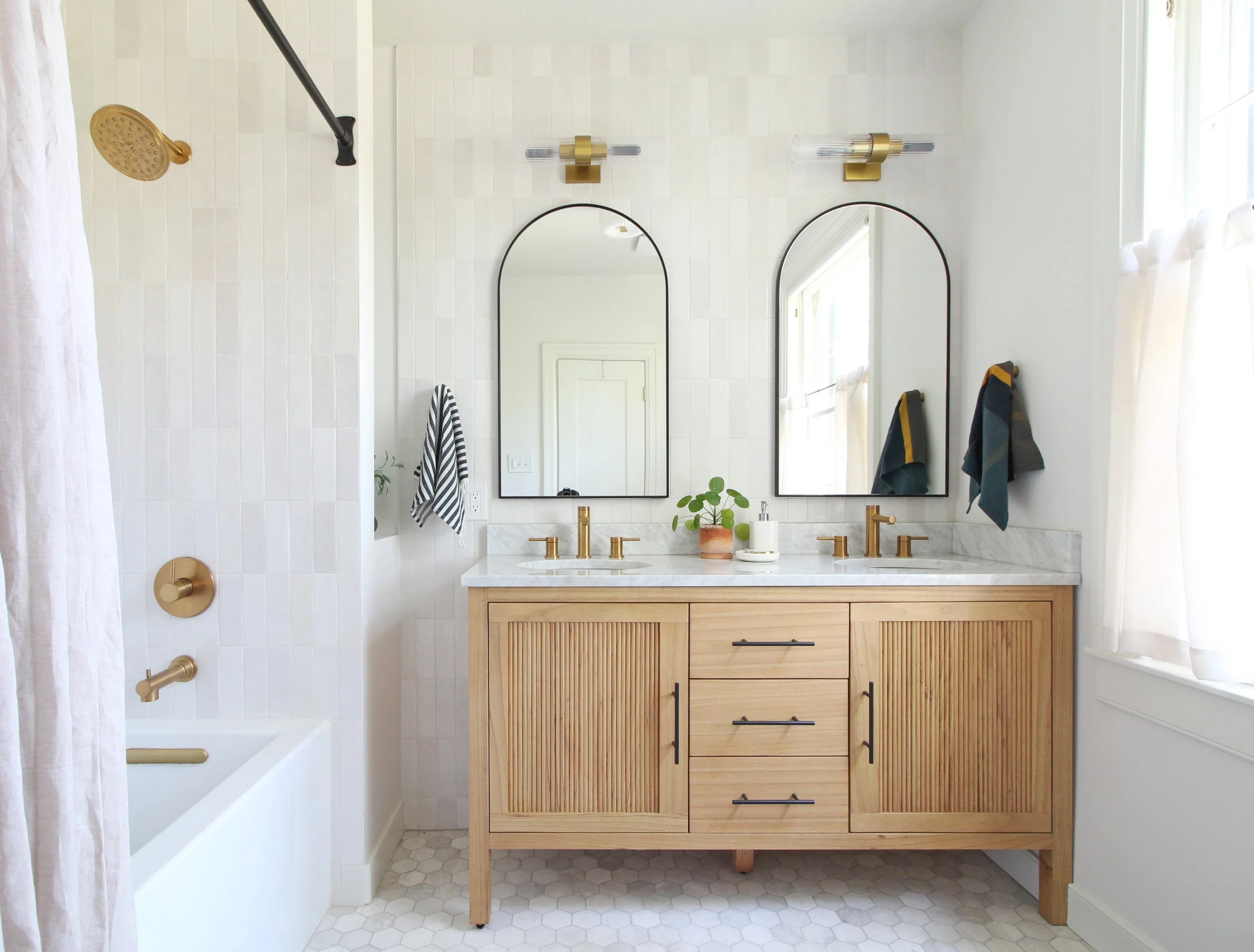
The natural wood vanity with reeded doors definitely steals the show. We echoed that reeded element in the sconces that have fluted glass shades in the sconces above the arched mirrors, as well as in the flush mount on the ceiling - you can just see it in the mirror’s reflection on the left. I love repeating design elements to bring cohesion into a space.
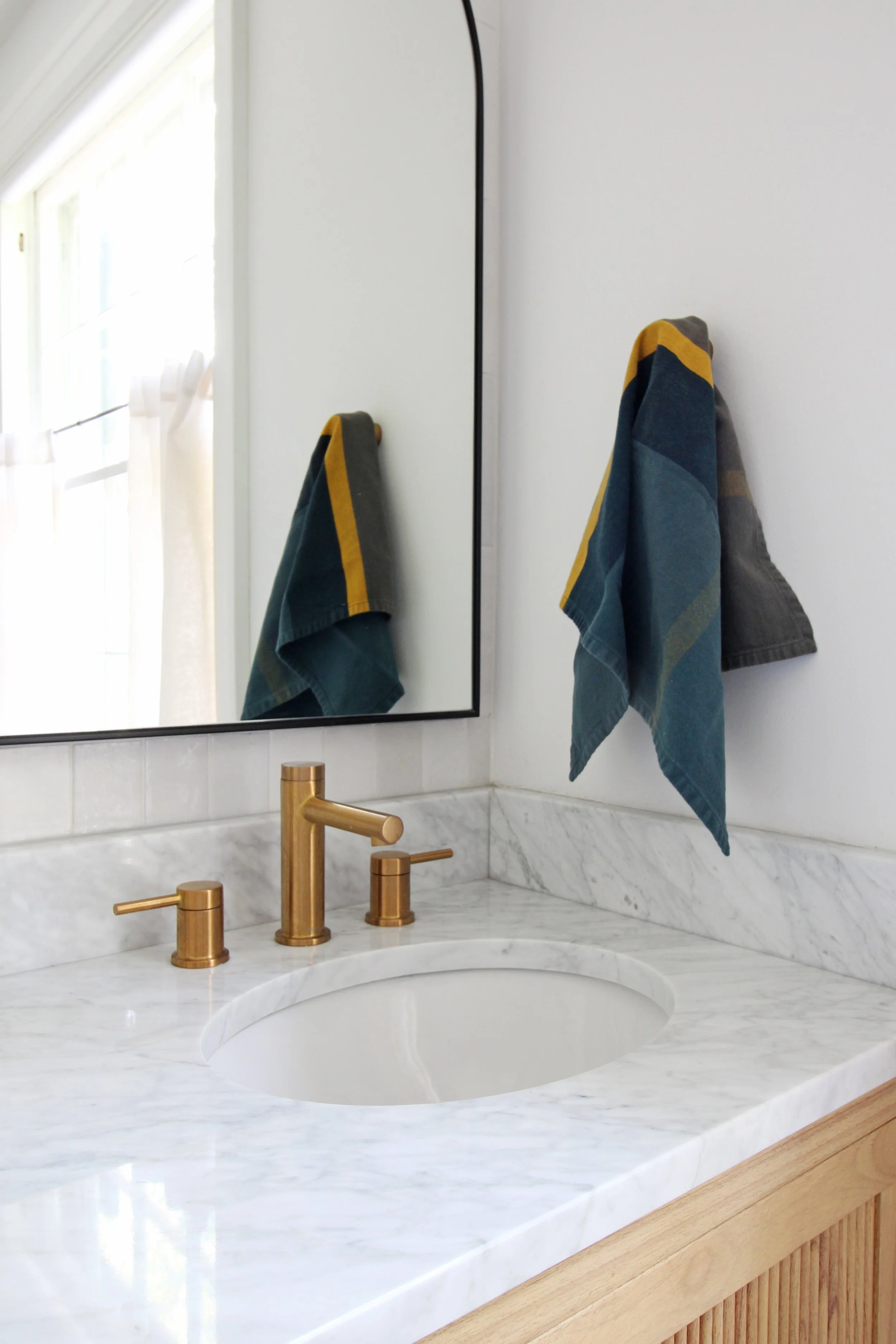
The same idea goes for mixing metals. A lot of folks find it intimidating to do that, but the key is just to make sure you repeat that finish at least once in a space; otherwise, the “rules” are pretty flexible! So here, you see gold/brass in the plumbing fixtures and lighting, and then we added in black with the vanity hardware, mirrors, and shower curtain rod.

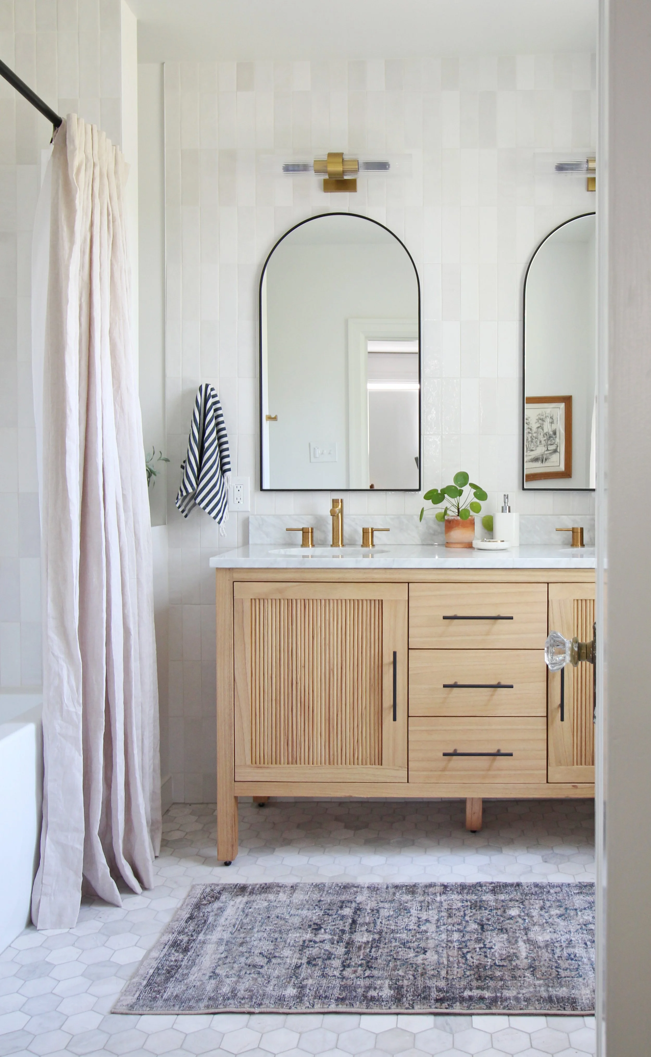
Because of the configuration of the vanity and tub, we were left with a little bit of a nook here, which the clients plan to add shelving to down the road. They wanted to live with the space for a bit and see what they might need to store here before making a final call on those. For now, it’s a pretty spot to tuck a little greenery!
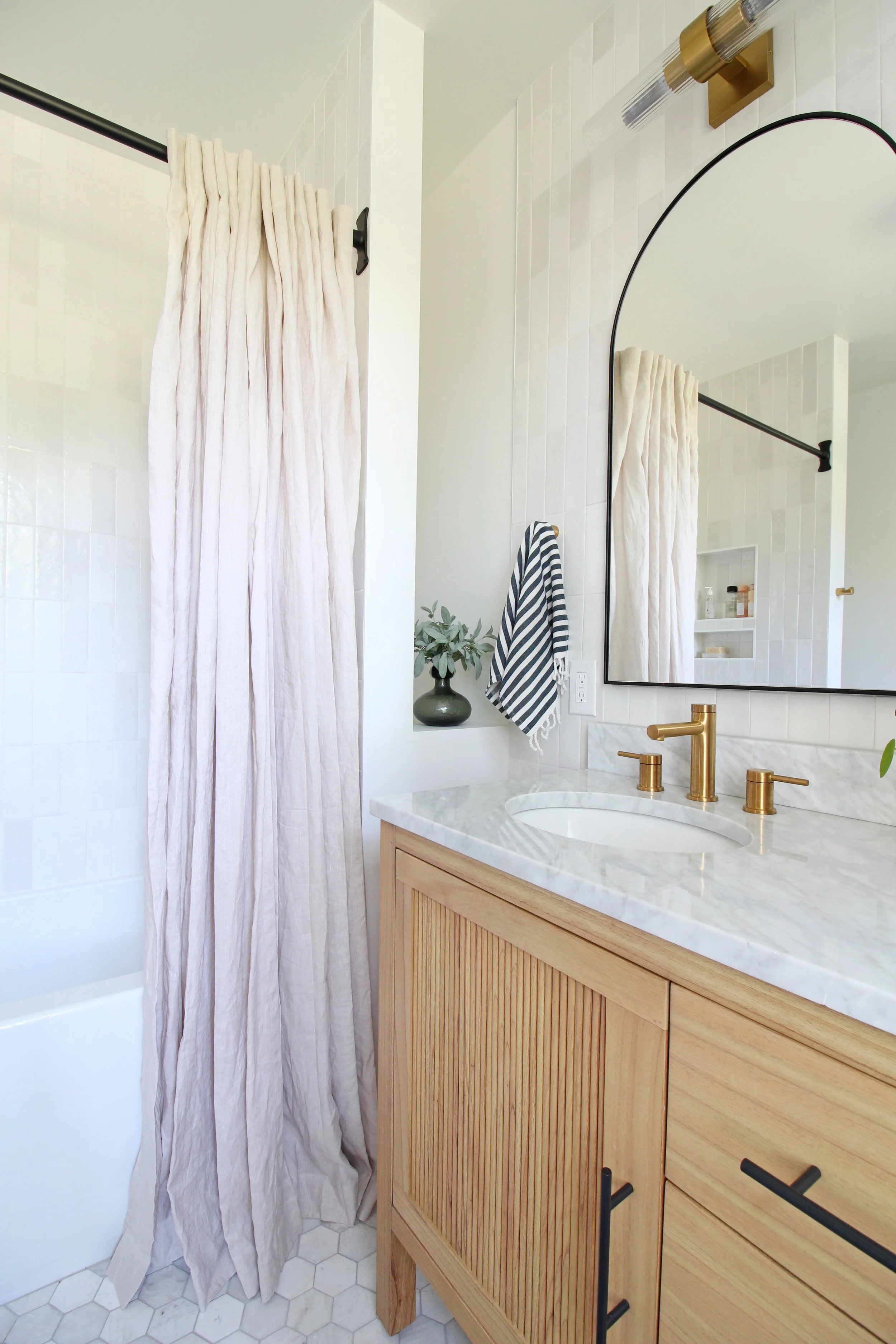
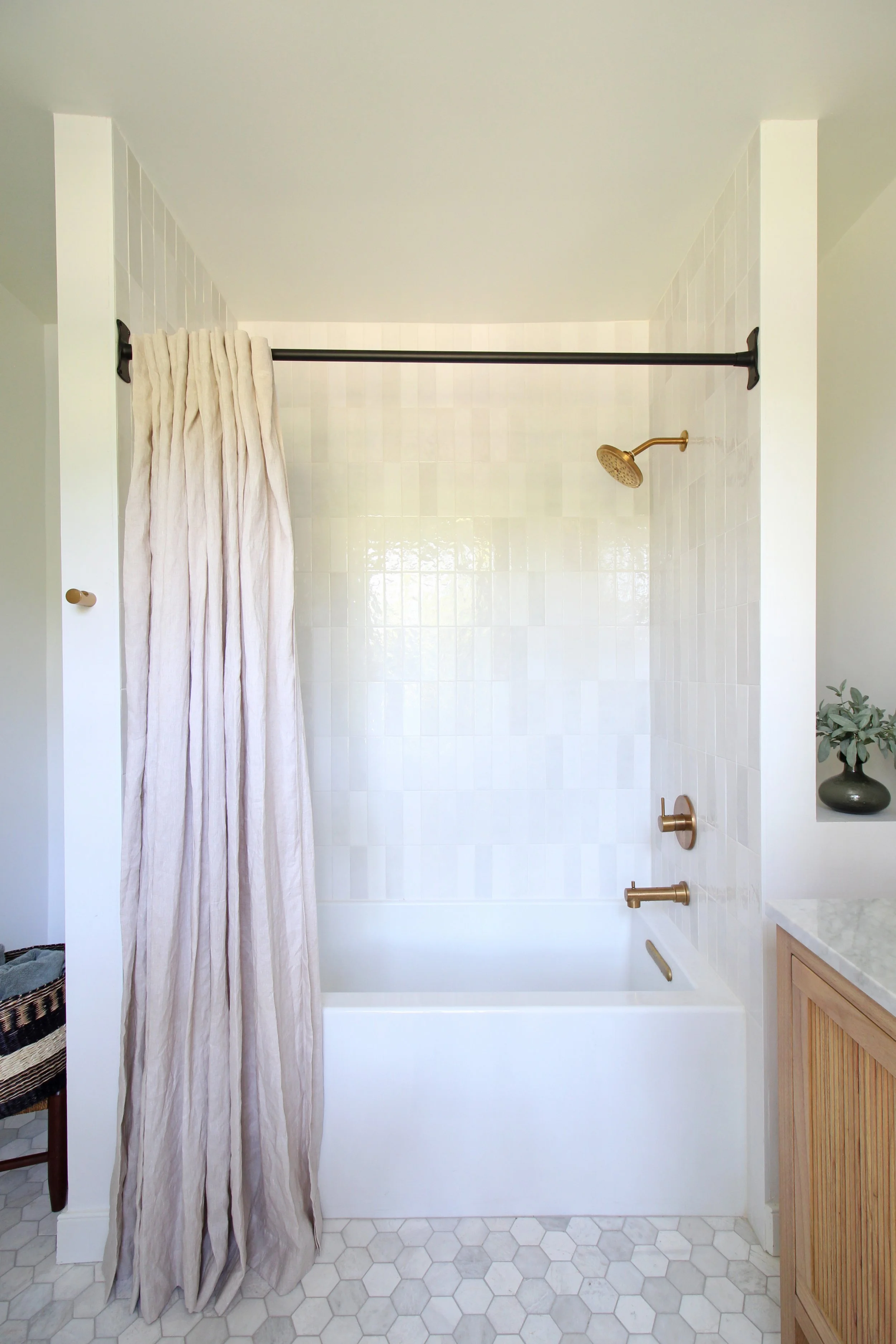
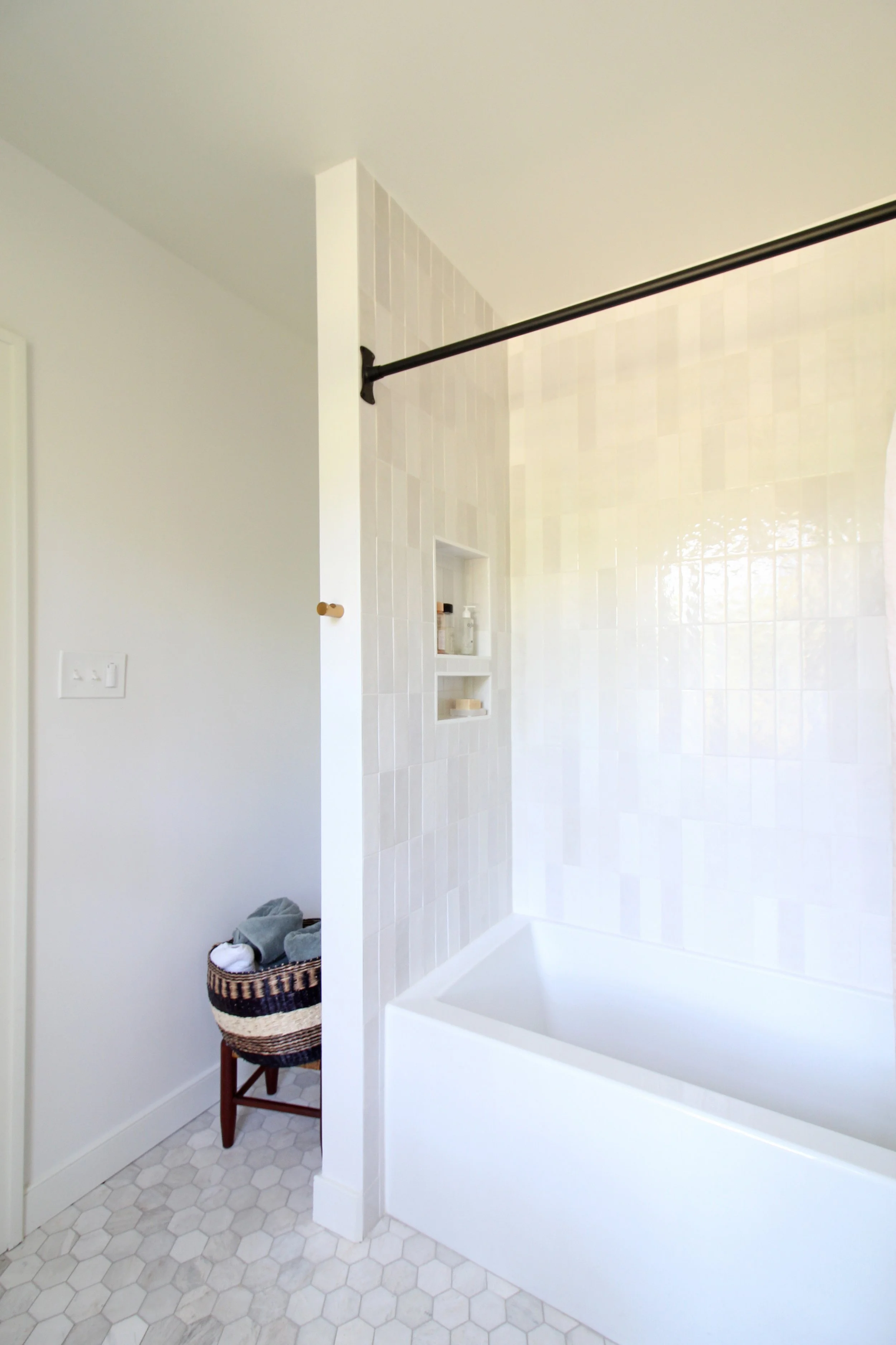
This bathtub space is now a star thanks to the vertically stacked white zellige style tile! Laying it this way gave a traditional tile shape a modern twist, which I absolutely love. We carried that through to the wall behind the vanity, which made it all feel cohesive. The vanity wall feels extra special too.
The marble
Another finishing touch to this space will be the addition of shelving in the nook to the left of the tub as you can see in the photo below. Because this layout offered unanticipated extra storage, again my clients wanted to live with the bath for a bit before deciding on how to lay those out exactly. I am all for taking your time in that regard - especially with these more permanent decisions! Floating shelves can easily be added down the road and configured in a way that makes the best of use of the space for their needs.
Here are a few more shots to round out the before and after tour of this lovely bathroom! Thanks for coming along. You’ll also find all the sources for this space at the end of those post, so don’t miss those!
Have questions about this project? Curious about working on your home with me? Let’s be in touch! You can also find out more about my e-design services using the button below.