City Studios at the Philly Home Show
Raise your hand if you're a small space dweller or have been in the past! I think we've probably all lived in tight quarters at some point in our lives - even if it was just in a dorm room in college. When you find yourself short on square feet, it can be a challenge to make it functional and stylish all at the same time.
Well, creating a functional and stylish space was the challenge I was issued at this year's Philly Home Show, which is happening right now at the Philadelphia Convention Center! I was invited to be a part of a new feature called "City Studios" where I was tasked with pulling together a space that would be, in essence, a studio apartment. I was assigned a blank 10'x20' space and the only requirement was that I had to have places to eat, sleep, and hang out. 200 square feet is tight, but I do love designing small spaces, so taking on this challenge was right up my alley!
Since I know most of you don't actually live in Philadelphia, I wanted to share my City Studio space here on the blog today. I hope that it'll give you some small space living ideas if you happen to live in a studio or small apartment now, or you can tuck these away for the future. :)
Before I dive into the photos, I do want to mention a couple of things. First, since this was for a big ole home show, the look is a little more over-the-top than I would normally design - it had to be eye-catching as folks walked by! Second, I partnered with Restore Decor Design House, who runs a home staging company here in the city, so the furniture came from their warehouse (that means I won't have any furniture sources for you, unfortunately). Restore Decor Design House and I melded our styles together to come up with the design, and it came together quite nicely. Third, the lighting in the Convention Center made taking pictures really challenging, so please excuse the quality of these!
Ok! So let's get into it.
The look we ended up with at the end is what I'm calling modern glam. We used a lot of warm metallics, which popped beautifully against the navy walls (Sherwin Williams "Naval" is the wall color, by the way), and incorporated a lot of gray and white as well.
As you can see, we divided the space up into zones - the lounging and eating areas are on the left, and the bedroom area is on the right. The sofa acts as a natural divider in the space, and gives the sleeping area a bit of privacy. If this were a real studio apartment, I could even picture hanging some curtains from the ceiling behind the sofa and giving yourself the option to create some true separation if you wanted it.
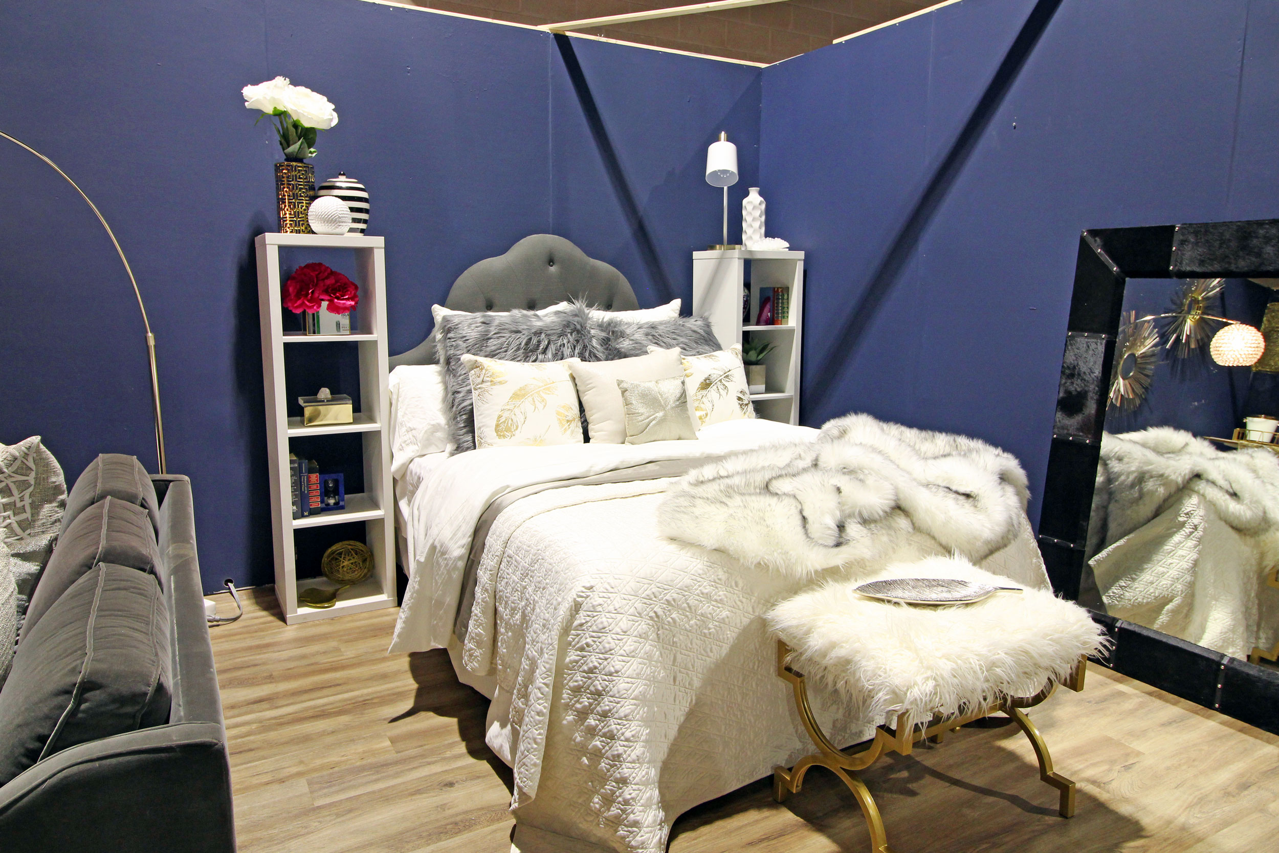
We managed to fit a queen size bed in here and flanked it with matching bookcases to act as nightstands. While we styled them up, you could just as easily use them for more functional storage. Throw some baskets on those shelves and you've basically got yourself a dresser!
Also, don't forget that you can use the space under your bed as extra storage space if you need it.
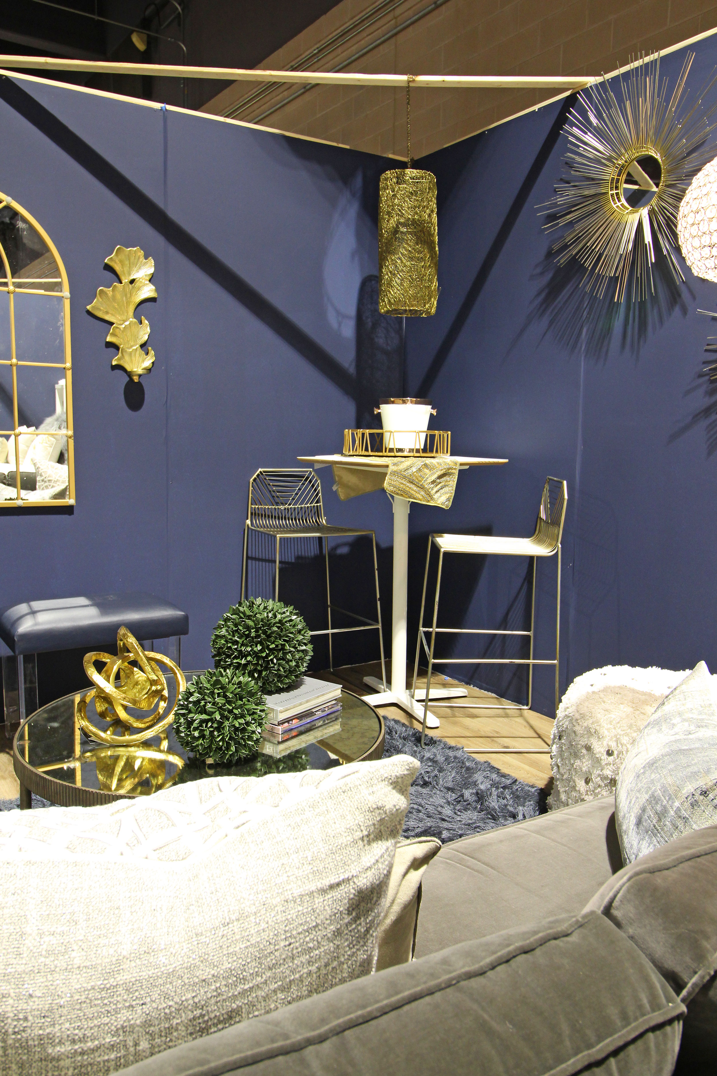
The living space has seating for five if you really wanted to cozy on up in there, which is pretty nuts considering how small of a space we're dealing with here. The sofa is petite and doesn't have a lot of visual weight, but it still provides a nice comfortable spot to hang out, and the two stools opposite it offer extra seating.
A high top table with a couple of bar stools in the corner gives you the option of eating at a real table, which is a pretty sweet deal for a studio. I feel like true dining space often falls to the bottom of the priority list when you live in such a small space! Aren't those bar stools fantastic, by the way?
And finally, you'll notice we used quite a few different types of mirrors in this space, which help make it feel larger than it is. I love using mirrors for that reason in just about any room. One alternative for that large mirror in this last photo is that you could also hang a TV there - it would be the perfect spot right across from the sofa.
All in all, our goals for this City Studio were to make it all look cohesive, pretty, and incredibly functional - and I think we accomplished those. (High fives to us!) By limiting our color palette to mostly navy, warm metallics, white, and gray, it made the whole space feel pulled together. I'm so proud of what we accomplished!
If you DO happen to live in Philadelphia and want to catch the last weekend of the show (January 19th-21st), let me know - I've got some free tickets with your name on them!


