Get the Look: Coastal Modern Dining Room
We're headed to the coast for this week's Get the Look! Since August is a time of year when lots of folks head for the beach, I decided to use that as my jumping off point for this fun and playful dining room design!
I've dubbed the style of this design "Coastal Modern" - the mix of clean lines with beachy vibes adds a slightly unexpected twist to a classic look. I stuck to my beloved color palette of blue and white, and mixed it in with light and medium toned natural woods.
There's a lot to look at in this space, but we'll chat about the actual furniture and decor I chose a little later. First, let's take a peek at the inspiration images I found to kickstart my design process!
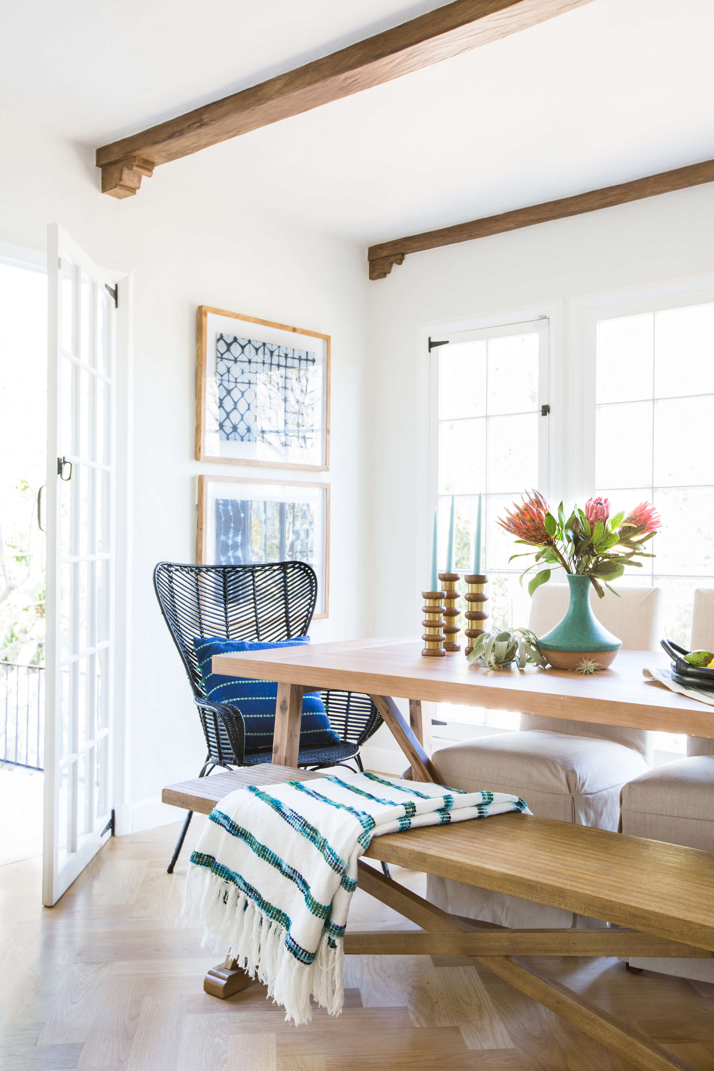
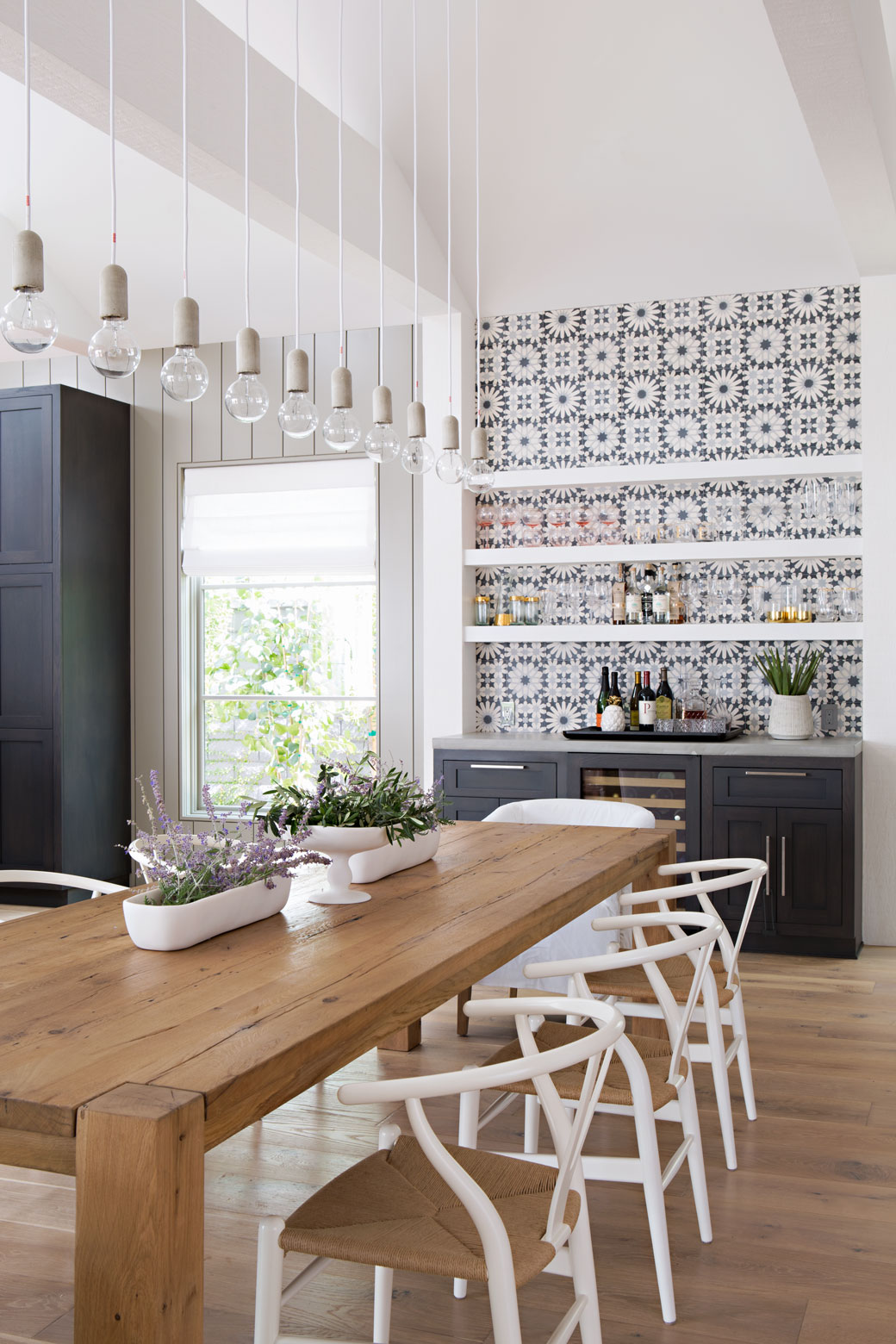
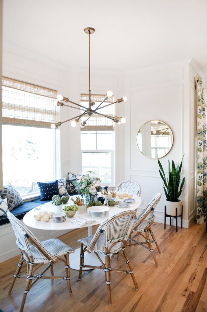
The big things to note in these images are the colors, textures, and of course, the mixing of the coastal and modern styles. I was drawn to spaces that had an eye-catching, modern chandelier, unique chairs, and organic pieces that had a little bit of a whimsy quality to them.
Take a look!
Coastal Modern Dining Room Inspiration
via Emily Henderson (Photo: Tessa Neustadt)
via RailiCA Design
via Suburban Bees
There's a lot of beauty to behold in those dining rooms, wouldn't you agree? I'd happily transport any one of them right into my home.
Scroll on down to see how I put my own spin on this style!
You can shop the look using the links below. If you'd like, you can Pin the image for later by hovering over the image and clicking the little red Pinterest button. If you're on a feed reader or reading this in your email, you may need to click over to the full site to save it.
Coastal Modern Dining Room
As I mentioned in the introduction, there's a lot to look at in this dining room! We'll start with the most eye-catching thing in the room - that beautiful blue wallpaper. Oddly enough, this was the last item I found for the space. I actually had a blue vintage-style rug in here originally with no wallpaper, but it didn't feel right. After sleeping on the design overnight, it hit me - this room needed a bold wallpaper! Design is definitely a process, and I find that sometimes it's important to step away from a design for a little while to figure out what a room needs. I'm so glad I gave it time to marinate, because I'm now completely in love with how the final design turned out. That wallpaper is stunning, and it's the perfect nod to the coastal idea, but feels fresh and modern.
And guess what? That wallpaper is removable! (Renters and fear-of-commitment folks rejoice!)
Continuing on with the blue theme, let's talk about the bench next. To give this dining room a more casual feel and mix things up, I chose that modern indigo bench for one side of the table rather than two more chairs. The color ties in with the wallpaper and I love the mid-century lines. Speaking of benches, did you catch my post about three places to use them in your home earlier this week?
The dining chairs are ones I've had my eye on for quite awhile now. I find them popping up in dining rooms all the time, and for good reason! Those strappy white leather seats and iconic elbow style back make for one heck of a good-looking chair.
Even though it's hiding back there behind the dining table, I wanted to highlight that open shelf console table. It has simple lines, but it's actually a really unique piece with its two different wood tones. It's the perfect complement to that bold wallpaper and - bonus - it's also quite affordable!
I flanked that console with two mid-century brass wall sconces. Again, they're pretty simple so they don't take too much attention away from the wallpaper, but they're standouts on their own as well. They'll add some nice additional light to the room with two bulbs apiece and they don't take up any room like a table lamp would.
So that's my take on the Coastal Modern dining room look. What do you think? Is this a look you'd bring into your home? What are your favorite pieces?
*Affiliate links were used in this post, which means Mix & Match Design Company earns a small commission from your purchase at no cost to you.


