
Kensington Transitional Kitchen Refresh {E-Design Project Reveal}
I’m excited to share the before and after of the Kensington Kitchen today! This was a local e-design project here in Richmond that wrapped up in the spring and I was thrilled to have a chance to go see it in person last week. After I delivered the design plan, my client did an amazing job managing the construction and installation to give her white kitchen a fresh new look that matched her classic, transitional style!
When I go in to shoot a space, I like to keep it real. While I often do a little styling and clearing, I also like to show how this space looks on a pretty normal, day-to-day basis. I think this helps make it feel attainable and livable - good design doesn’t mean it has to be magazine-perfect all the time! We’re all about approachable design at Mix & Match Design Co., so I hope you enjoy today’s “real” kitchen tour!
Similar to the kitchen refresh we completed in our own home last year, we kept the bones of this space including almost all of the cabinetry (I’ll explain more about that in a bit), island, and a couple of shelves, but changed up the countertops, sink, faucet, cabinet hardware, and lighting.
The biggest change though was on the range wall, which got almost totally redesigned to make it more functional and intentional. Let’s take a look at what that wall looked like before!
This home is nearly 120 years old and the kitchen is tucked into the back room, which is a common setup with many of the older houses here in Richmond. Usually it means there’s not a lot of space to work with and there are some quirks that make it tricky to lay out a functional modern kitchen.
In this case, the previous owners had plopped a range on a wall that’s almost part of the hallway to the back door, then flanked it with cabinetry and left it at that. There wasn’t a hood or backsplash, and you can see on the left side that there’s a very narrow cabinet that didn’t offer much storage!
The design plan I crafted reworked that entire wall - you can see the mockup I created on the mood board below…

The plan was to have a handyman build a new cabinet for the left side that matched the cabinet on the right to add symmetry, a bit more counter space, and more functional storage for pots and pans. Then they were ready for their new marble-look quartz countertops!
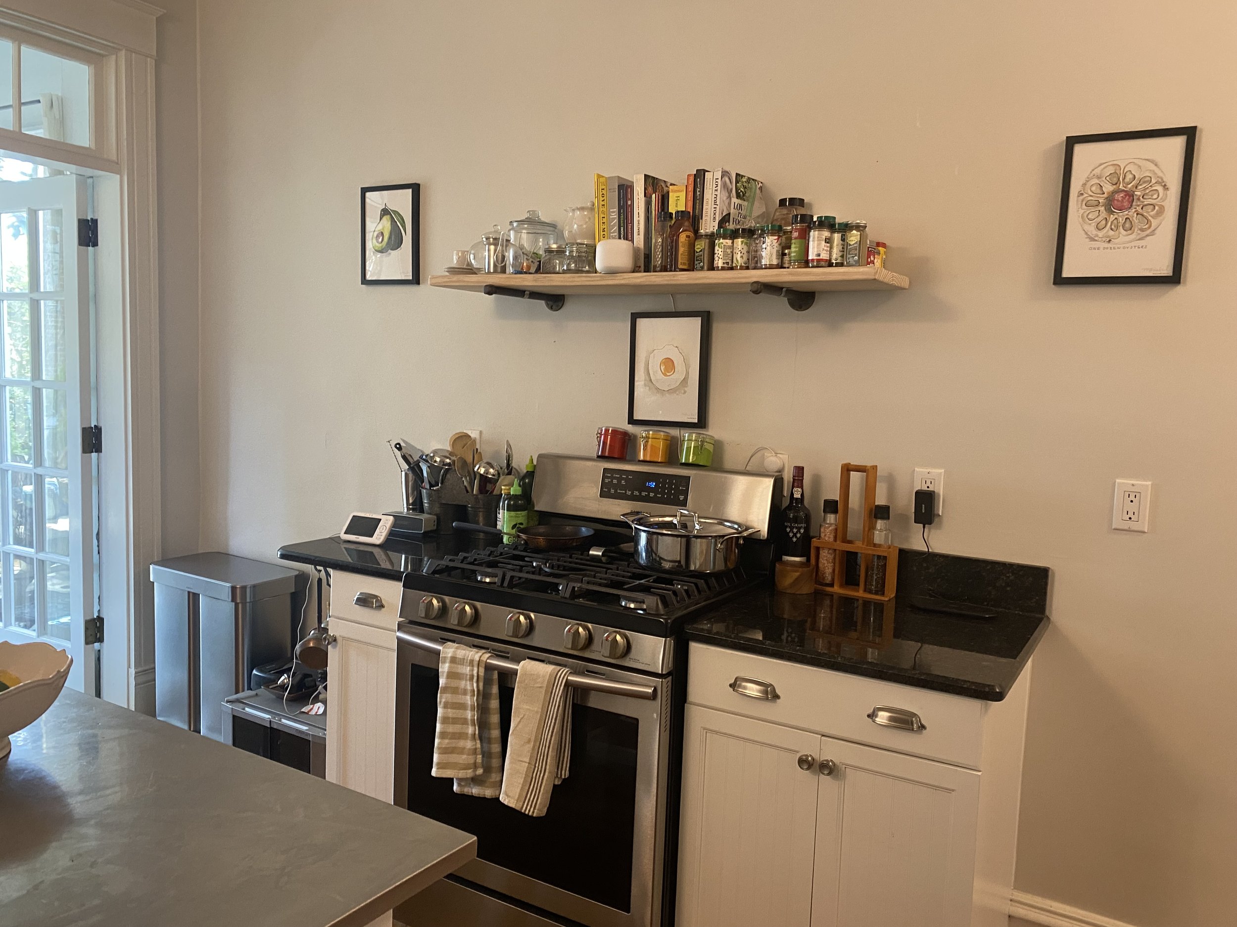
On the wall, we added a backsplash and a simple tapered vent hood painted white to match the cabinets. My client is thrilled to not have the scent of food linger in the house every night when they cook! Flanking it on either side are two pairs of floating natural wood shelves that offer a great spot for displaying favorite pieces and additional storage.
I absolutely love how this wall turned out!
Then turning toward the other side of the kitchen, let’s take a peek at what the main “L” of the kitchen used to look like:


This hard-working corner of the kitchen was due for an upgrade! My client was ready to ditch the double bowl sink and fan, and update the blah lighting. Since we were adding a range hood, they no longer needed a fan for circulation, which meant we had a great opportunity to add a pretty polished nickel island pendant. The triple light sconce over the window needed to go too, so we changed that out for a pretty polished nickel sconce with a white metal shade.
Here’s what it looks like now!
It feels so much brighter and airer in here, doesn’t it? The white marble-look quartz countertops definitely make a huge difference overall, but it’s all the pieces together that make it feel like a breath of fresh air.
Mixing metals is one of my favorite ways to help a space feel collected, so we decided to use brass for the cabinet hardware and shelf brackets, and polished nickel for the light fixtures and kitchen faucet. The warm undertones work beautifully together.
The new white single bowl sink is a workhorse. It has a small inset lip to it that offers a spot for a roll-up drying rack and cutting board, which are great space savers in a smaller kitchen like this one. The white granite composite material feels seamless with the surrounding countertops as well.
Finally, we added a couple of new counter stools that tuck under the island for seating when needed. The natural wood and leather pads add additional warmth and tie into the wood shelves by the range hood as well.
Let’s take one last look at this pretty white transitional kitchen!
I hope this was a fun tour to see and that it gives you a peek into how big a difference a few purposeful changes can make. I loved working on this project and the client is thrilled with her new kitchen - I’m so grateful she invited me to help her design it!
Select Sources:
*This post contains affiliate links, which means Mix & Match Design Co. earns a small commission from your purchase at no cost to you.
Island pendant light - polished nickel
Single task sconce - polished nickel with white shade