
The Michigan Lake House Project [Design Boards]
I can’t believe we’re over halfway through the year! It seemed like a good time to reflect on some of the e-design projects I’ve been working on over the past several months. In looking back at my older posts, I realized it’s been a year (!) since I last shared one with design boards from a project, so we’re well overdue! These visuals are SO helpful for clients to help them get a sense of what their home might look like in real life. I always try to create a room that looks as similar as possible to theirs with new pieces of furniture and decor.
This year has felt a little bit different with e-design projects since I spent the first three months of the year on maternity leave after our daughter was born in December. It was great to have some time off to spend time with her and get in a rhythm with two kids (let’s be honest, sometimes it was just surviving, ha!), but I’ve also loved getting back into the swing of things with design work.
I’ve had the privilege of working with some absolutely wonderful clients since coming back and today I wanted to share a few of the design boards from one of the full room e-design projects I’ve tackled.
Let’s jump into the project that I’m dubbing The Michigan Lake House Project!
This family just closed on a property in June and we’ve been hard at work designing several rooms in the home to get them up and running. So far, we’ve tackled the main living/dining open concept space, the primary bedroom, and one of the guest bedrooms. We’re pulling a modern coastal style thread throughout with lots of blues, whites, neutrals, and natural woods.
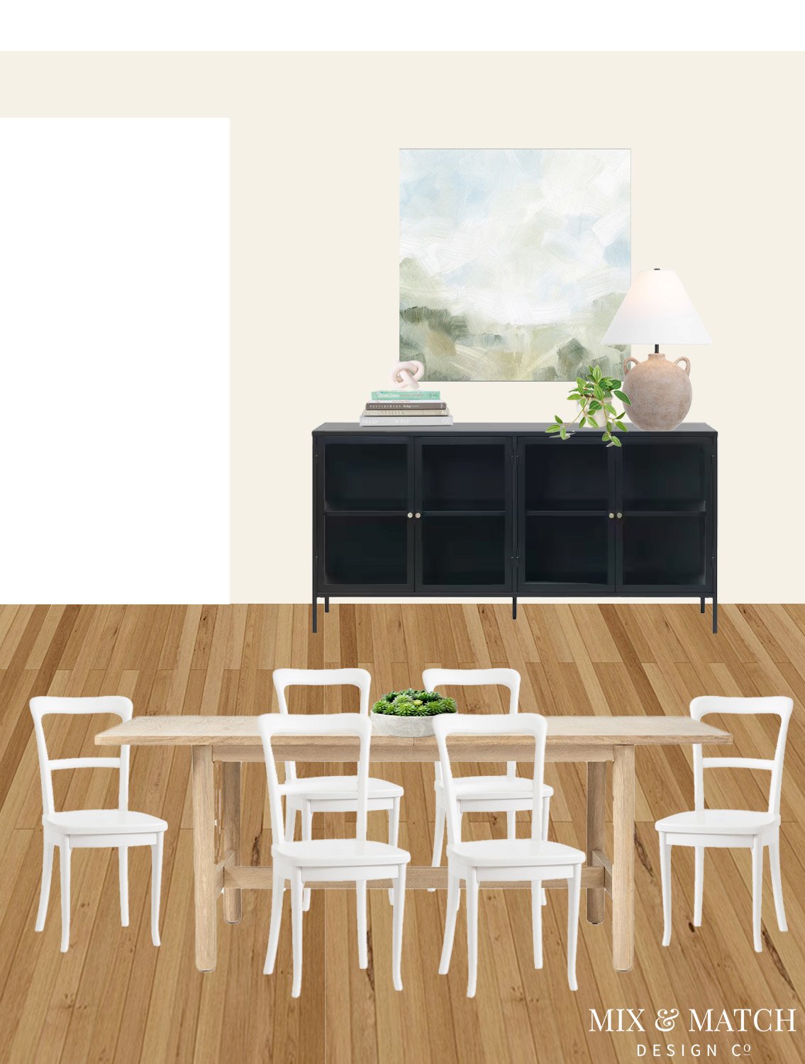
Here’s a look at the main living/dining space:

This will be the main hangout space as it connects with the adjacent dining space and opens up to the kitchen. There are lots of doors, entry points, and traffic flow considerations, so it was important to be thoughtful about the furniture layout here. We maximized seating with a sofa and two swivel chairs, and there are two x-benches flanking the TV (see the design board below) that could be used for extra seating when needed.
Across from the sofa is the TV, which sits on a large wall. Because of the doorways and an open stairwell nearby, we couldn’t add any additional larger pieces of furniture, but we I love the addition of art on either side of the TV to give it some nice “presence” on the large wall!

Behind the swivel chairs is the dining area. It’s a really nice size and with an extendable table, they’ll be able to seat up to 10 people! Plus, there’s counter stool seating adjacent to it, so if they have a really large crowd, they’ll have seating for up to 14.
We included a little bit of extra storage and serving area here with the black cabinet, which I really liked as a grounding piece. It helps it feel connected and in good balance with the larger TV in the living room too. Those big black boxes aren’t always the prettiest to look at, but they’re a key part of many homes and it’s important to integrate them as best we can!
Onto the primary bedroom…
This room is on the main floor as well, so I continued many of the same colors into this space to help it feel cohesive. A mix of blues and white is a classic coastal look, but we brought in some modern elements with clean lined pieces too. That bed was such a fun find with its inset cane headboard and upholstered frame! The blue block print accent pillows add such a nice pattern and coordinate with both the darker blue drapes and the lighter blue striped rug.
Across from the bed is a small work space with a white desk and natural wood chair. Since it’s a bedroom, I wanted to use a dining-style chair rather than an office chair and this one fit the bill perfectly. The leather seat and woven back rest are a perfect mix of comfort and style.


Finally, let’s hop downstairs to one of the guest bedrooms! We changed it up down here with a light blue wall (SW Lullaby in case you’re wondering), but continued same look and feel from upstairs. This is technically the basement, so it has a couple of funky elements like a drop ceiling in one spot, a set of corner windows, and a ledge that runs along two walls. We did our best to add balance and minimize some of those and I love where this landed!
If you have an unbalanced window like this room does, one way to give the illusion of symmetry is to put either a painting or a mirror on the opposite side. We chose a water photograph since this is a lake house (on theme, but not too themed - you know what I mean? ;) ) and I think it works really nicely and blends in with the wall color.
I also love the mix of patterns and colors we landed on with the accent pillows on the bed. A touch of aqua along with neutrals feels so soothing and spa-like! Then the natural wood nightstands, woven bench, and jute-blend rug make for a nice, warm space and add balance to the blues!

It’s been such a fun journey working with these clients and I love sharing some of these boards with you! If you have questions about this project or what it’s like to work with me on an e-design project, please reach out! I’d love to hear from you.