Bellevue Bungalow Kitchen: Before & After
I’m so excited to share a new e-design kitchen project with you today! My clients, Jeremy and Rachel, searched high and low for a home here in Richmond and finally landed on an adorable Bungalow in the Bellevue neighborhood. The house needed a little bit of love, especially in the kitchen. It had some quirks that made it tricky to figure out a functional layout, which is why they brought me in! I can’t wait to show you the before and after today.
This project was focused on space planning, which is one of my very favorite parts of the design process. My clients have a great eye for design (Jeremy is an industrial designer by training and works for La Diff, a premier modern furniture store in town), so once we figured out the right layout for this space, they took it from there! The result? A classic white shaker-style kitchen that honors the age of their 1920s bungalow, but feels fresh and modern.
Let’s take a closer look at the transformation!
BEFORE
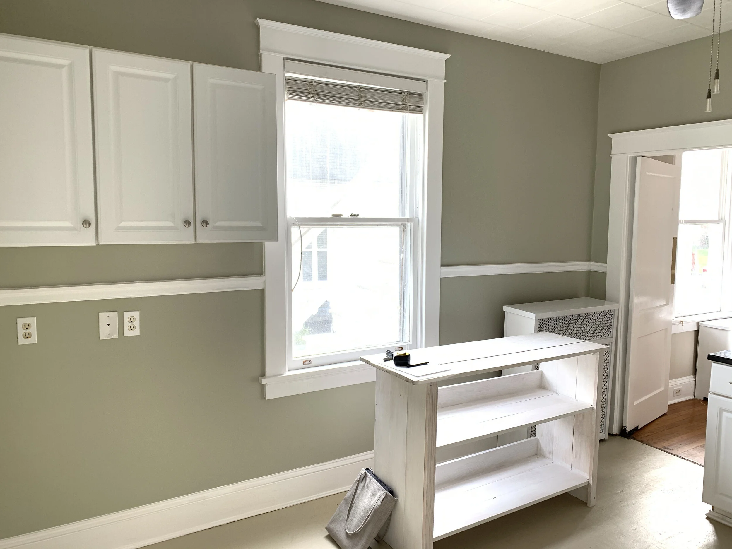
This kitchen struggled in both form and function when my clients purchased the house. There were five doorways in and out of this small space, which made it really difficult to create a functional layout. I can see why the previous owners struggled!
The biggest culprit holding this kitchen back was the doorway into the basement, which is the one you see on the left side of the photo above. The door didn’t open all the way, and the space between the stove and dishwasher was too tight to really access it easily. The most natural way to create good workspace was to utilize that corner to the fullest, but the door made that really difficult. My solution? Move the door! Though it added some additional expense to this project, it was worth it. By relocating the door to the adjacent dining room, we were able to create an “L” shaped run of cabinets, which upped the function of this kitchen a ton.
Over on the opposite wall of the kitchen was an odd set of upper cabinets. The space below it was wasted (maybe they had lower cabinets there before?), but after getting the measurements of the depth of that wall, I figured out that it was the perfect space for a counter-depth fridge and a floor-to-ceiling storage cabinet. It was like it was meant to be! Moving the fridge over to this wall also gave them the ability to center the range and have plenty of counter space on either side.
This kitchen was quite a puzzle, but after a few iterations on space planning, we landed on this:
Moving that basement door made such a difference. I’ve never been so thrilled to see an L-shape run of cabinets!
Once I handed the plan off to Rachel and Jeremy, they worked with their contractor to bring the plan to life. The results are so lovely, and I’m thankful that my clients invited me over to see it in person and shoot it so you can all see the amazing transformation! Let’s get to the good stuff - the after photos!
AFTER
Beautiful, isn’t it? Those white shaker cabinets are class, but mesh with my clients’ more modern style as well. I love how they chose to take the cabinets all the way to the ceiling as well with stacked uppers. Taking advantage of their tall ceilings adds a ton of storage for those lesser-used items.
They chose marble-like quartz countertops as well, adding to that clean, modern look. Quartz is a great way to get the look of a natural stone, but with some serious durability. We used a similar countertop in our home in Philadelphia and loved it.
And can we talk about that gorgeous bridge faucet? It plays so well with the era of the home, and mixing it with the brass hardware was a great choice. It gives the kitchen a really beautiful, collected-over-time feel.
Here’s a closer look:
Here’s the wall that used to have just a set of upper cabinets. It became the perfect place for the counter-depth fridge, freeing up the other side of the kitchen for additional workspace. They squeezed in a little bit of extra storage too with some additional cabinetry surrounding the refrigerator.
I just loved this shot below. That built-in wall cabinet adjacent to the back door is original to the house - I love that they kept it!
Are you swooning over this small-space-maximizing kitchen as much as I am? I’m grateful that I could be a small part of bringing their vision to life to create a functional and beautiful space that serves their family of four well!


