Modern Coastal Office: The Design Board
I’m back with another update on our office addition project! In case you’re hearing about this for the first time, we’re adding on some space to our house out the back that will include a dedicated home office! I can’t wait. Read up on the whole project over here and see the inspiration behind the look I’m going for, then come on back to read about the design plan. The photo you see here is pretty much where we are right now in terms of progress - be sure to follow along on Instagram Stories if you want to see the play-by-play!
We started construction (finally!) at the beginning of last week, and I’m amazed at how quickly they demoed out the old balcony, framed everything up, got the roof on, and installed the windows. It all happened in a five day span! Now we’re into the less dramatic part of the process - HVAC, electrical, and inspections. We’ve definitely got a ways to go, but we’re well on our way.
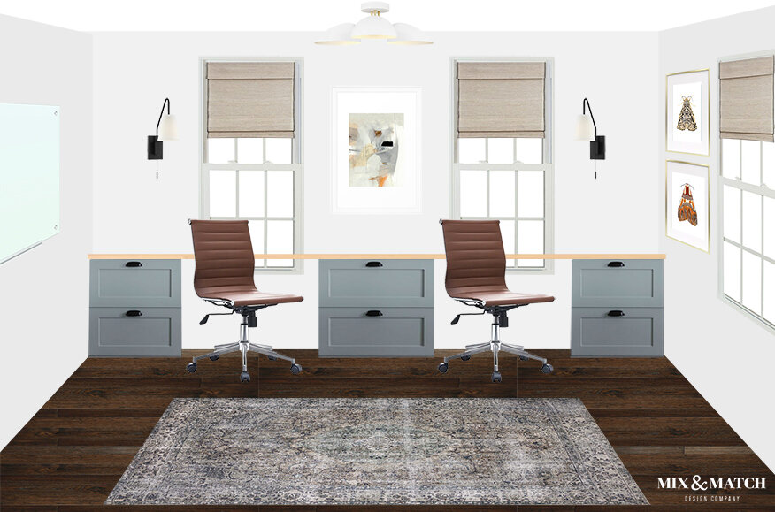
I’m in the “dreaming and scheming” phase for the actual furniture design and space plan, and I think I’ve landed on what I want the office to look like. I’m sure it’s not the final final design, but I thought it would be fun to share where I am right now. Just like I do for my e-design clients, I created a little design board for myself to help me visualize how it might look.
Want to take a peek?
Sources:
As I mentioned in my intro/inspiration post, the style will lean toward coastal modern with a hint of traditional. My goal is for it to feel fresh, but cozy, and for it to be a little oasis away from the rest of the house. I walked out there the other day just to see how it felt, and I don’t know what it is about it, but it felt like I was tucked away in a treehouse somewhere. Maybe it’s being up on the second story with all those windows facing out into the backyard, but I could already feel how great it’s going to be when it’s done.
The space is about 9’x15’, and I want to utilize the long wall to create a long, “built-in” desk with two workstations. Though it’ll just be me in here the majority of the time, my husband does work from home some, so it’ll be great for him to have his own zone.
I’m pretty excited about the blue-gray cabinetry that’ll form the base of the desk - I’ve always wanted to have colored cabinets somewhere in my house! I’m currently working on getting quotes for them, so we’ll see where I end up, but the goal is a simple shaker with either doors, drawers, or a combo of both, and black hardware. For the desk top, I’m leaning toward a light wood butcher block.
I’ve had my eye on that vintage-inspired rug in there for quite awhile, and I ordered it while it was on sale over the weekend! We have one by the same manufacturer in our family room, and I think this one will be a great fit for the office. It’s darker and moodier than I’d typically go, but I’m digging it.
I’ll bring in a little modern, clean-lined design with some of the lighting, including the mid-century white semi-flush ceiling fixture. (It arrived a couple of weeks ago and I love it.) It’ll be subtle against the white ceiling, but after seeing it in Emily Henderson’s kids’ room, I knew it would be the perfect touch of modern style in here.
When it comes to choosing artwork, that’s definitely still a work in progress! I really like the abstract piece between the workstations and the set of moth prints to the right, but I think I’ll probably wait a little while before I commit. Art can really set the tone in a room, and I want to get that part right!
Finally, what I didn’t put in here, but plan to add, is a tall bookshelf. I’ve been eyeing a couple from the newest Studio McGee collection from Target that’s coming out soon. I’m torn between this black one with woven rattan drawers and this curved wood beauty. Hopefully I can snag one of them before they sell out! I do love how the black in the first option would help ground the lighter colors in here and tie into the black metal finishes I’ve got in other places in the room. The lines on the curved one are just gorgeous though!
So that’s where I think I’m headed in here with the office design! What do you think? Leave a comment or feel free to hop on over to Instagram and share your thoughts!
*This post contains affiliate links, which means Mix & Match Design Company earns a small commission from your purchase at no cost to you.


