Styling a Console Table 3 Ways
I get quite a number of questions from folks about styling and I get it! Styling can be tricky and time consuming. Whether it’s bookshelves, a console table, or sideboard, it takes a little bit of an artistic eye and some knowledge about scale, balance, and visual weight to make it look beautiful.
Have no fear though because I’ve here to help! If you’re looking for tips on how to style a console table, you’re in the right place. This is a common surface that needs prettying-up and often you can have some fun with it since it doesn’t always need to be a completely functional piece of furniture.
There are tons of different ways you can go with this, but we’re going to keep it simple today with three different ideas to get your wheels turning. Before we dive in though, here are a few general hints on console table styling:
Think about your two main planes: the wall and console table surface. You’ll need pieces for both and often I find it’s easier to start with the wall - choose a mirror or art to start.
Consider if you need or want lighting. A lamp (or two if your console is especially long!) is a great foundational piece that adds height and takes care of one side of your table all by itself.
Vary the heights. Keeping your eye moving with varied heights is the key to bringing balance and interest to the piece.
Include something green. Whether it’s a plant, branches, or even faux artichokes (I used those below), there’s something about having an organic, natural element that adds that extra something to your styllng.
Now let’s take a look at the three ways I’ve styled this 52” console table! It has such simple lines and is a good size, giving it a ton of flexibility for styling. It’s also a really versatile style - could it be coastal? Yep. Modern? Yes. Transitional? Absolutely.
(Note that this post contains affiliate links, which means Mix & Match Design Co. earns a small commission from your purchase at no cost to you.)
Styling a Console: Version 1
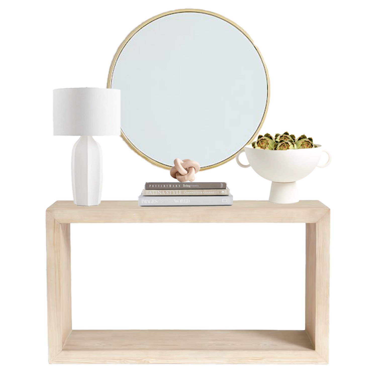
This console table has such simple lines, which gives it a ton of flexibility for styling. With this first version, I started by choosing a 30” round brass mirror to go above it (one of my favorite ways to complement a rectangular table!).
Then it was onto the surface of the console table. I’m imagining this console table being in an entryway, so having a lamp makes a lot of sense for one end of the table. I like a tall table lamp for a console table so that the bulb is about at eye level - this white sculptural one fit the bill perfectly.
To add some variation in the short and medium height ranges, I chose a horizontal stack of coffee table books + cool knot sculpture and then a footed bowl filled with faux artichokes to round out the styling. See how that change in heights moves your eye from one area to another on the table? That’s visual interest right there.
Styling a Console: Version 2
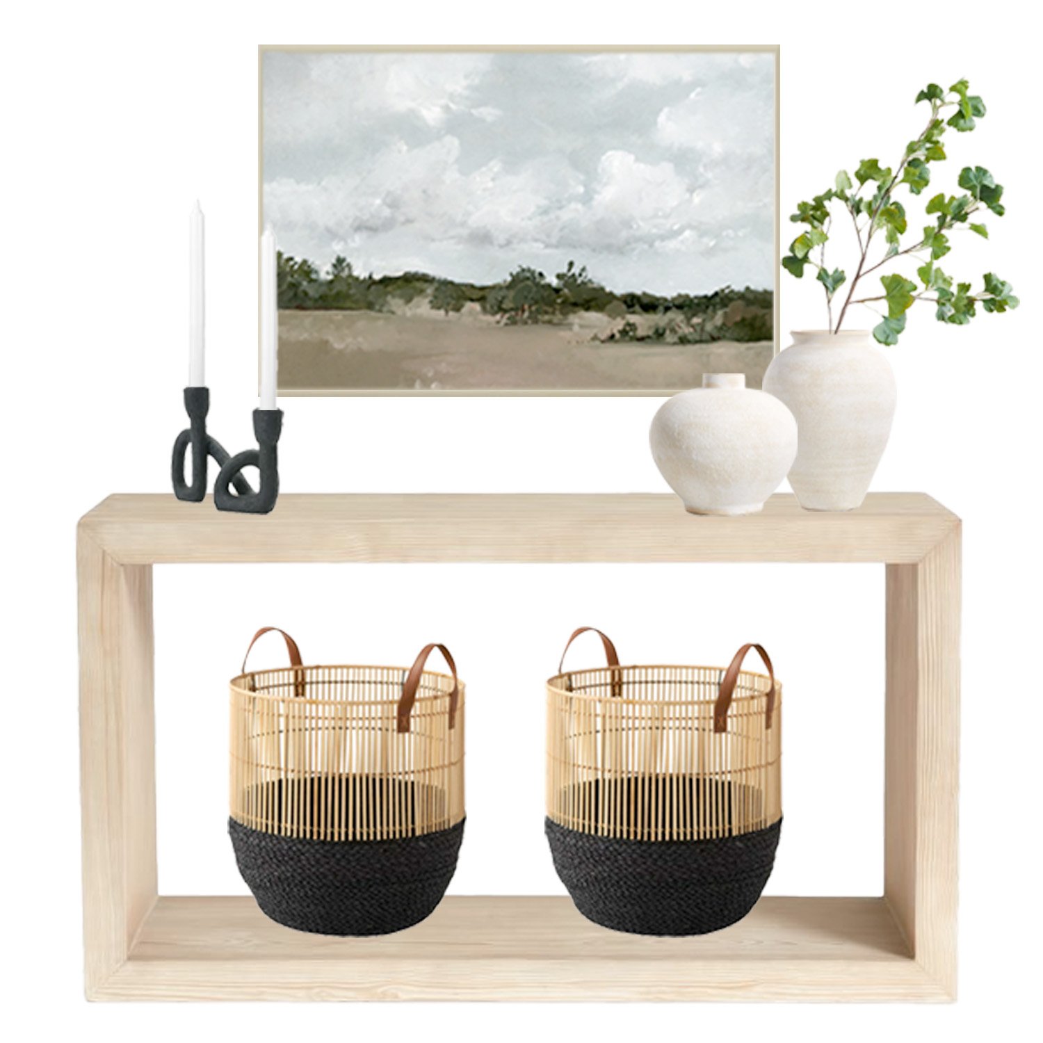
This next version starts with a large abstract landscape on the walls. I’d probably go with a 30”x40” size for this console table and let it be a sizable backdrop for everything else.
To balance it out, I did something a little bit different here - added two baskets on the shelf base below! If you like an open console, but want to have some storage too, a set of baskets is perfect. Stash blankets, shoes, toys…whatever you need to hide away! Depending on your needs, you could go with lidded baskets as well.
Then on the tabletop, I kept things pretty simple: a funky sculptural candle holder on the left and a tall and medium sized vases on the right. Stick a ginkgo branch (or other greenery) in one of those and you’re set!
Styling a Console: Version 3
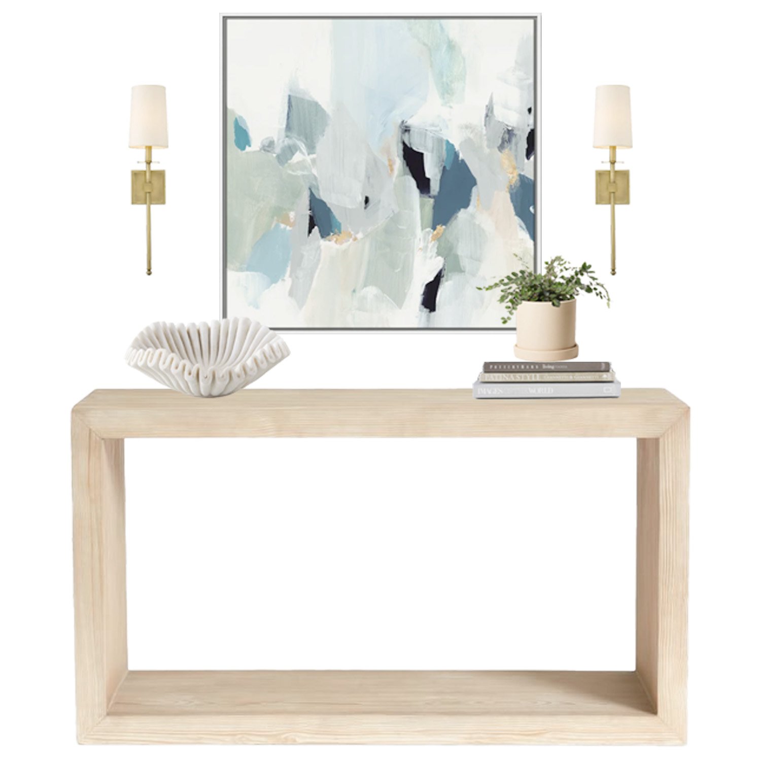
This last look changes things up a bit - instead of a table lamp on the console, I flanked a piece of wall art with sconces! This is also a great trick if you’ve got a longer console table with a lot of wall space to fill above it.
On the console table’s surface, I went for a “less is more” approach. A stunning hand-crafted ruffle marble bowl is a showstopper all by itself on the left. On the right, a horizontal stack of books + plant adds a bit of height, but doesn’t interfere with the art or sconces above.
In conclusion…
You can think of these three looks almost like formulas - put your own style on it, but use the basic formulas I described here to give your console table the perfect look. Have some fun with it and try out some different pieces. Don’t be afraid to move things around, bring in a few options, and try out some different combinations!


