Where to Find Styling Inspiration for Bookshelves and How to Use It
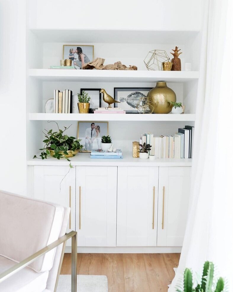
via The Everygirl
Styling bookshelves can feel a tad overwhelming and tricky to get right, can’t it?! All those pretty pictures you see in magazines, and on social media and Pinterest make it look easy, but if you’ve ever tried style shelves in your own home, you’ll know that for most people, it doesn’t come naturally. It’s definitely more of an art than a science, but there are some tried and true strategies for making it easier to create those beautiful vignettes. Today I want to share one specific one with you today: find and study well-styled bookshelves.
Learning how to style shelves takes practice, but you can skip a few steps ahead by looking at how the pros have done it and then applying those methods to yours!
How to find bookshelf styling inspiration
The first place I’d start is Pinterest.
There’s SO much on there, which can be both good and bad, but it’s a tremendous resource if you know how to use it. Before you go searching, you’ll want to create a new board for styling inspiration so you’ll have a home for your inspiration images; then you can get started!
To give you a head start, I’ve already collected a bunch of images for you - here’s a whole board dedicated to styling tips and tricks. You can pin the ones you like from there, and if you want to see more like it, simply click the image, scroll down, and see what Pinterest pulls as similar. I love using that trick - the algorithm is pretty darn smart and it’ll often save you time with your search!
Once you’ve got some photos pinned to your new board, if you go back to your home feed, you’ll find that Pinterest will start showing you more images like those. You also can use the search bar too of course if you’re looking for something specific.
The second place to look is in furniture retailer catalogs.
This might not be a place you’d expect, but it’s one of my favorite “secret” tricks for finding inspiration! Retailers like Crate & Barrel, West Elm, Pottery Barn, and other similar retailers put out some really beautiful images of their products that you can use as inspiration for bookshelf styling. Since they’re professionally styled (hey, they’re there to sell you on their furniture, right?!), you can bet that you’ll find some good ideas there.
I especially love flipping through their catalogs - retailers have become more “lifestyle” oriented with their catalog shoots, so they have the look and feel of a real home, which means good inspo for you!
Don’t get catalogs in the mail? No worries! Did you know that most retailers publish digital versions of their catalogs on their websites? Here are links* to a few:
If you can’t find a digital catalog, almost every retailer has an “inspiration” section too!
Ok, I found some inspiration photos, now what do I do with them?
It’s time to study them! Take some notes on what you see - either in your head, or if you’re a pen and paper kind of person, write them down.
Let’s go through a couple of examples on how to study them much easier to explain what to look for that way!
via McGee & Co.
First up, this beautiful built-in bookshelf that I found over on McGee & Co. It’s a great example of neutrals done right and how to style bookshelves that are filled mostly with decorative pieces.
Take note of…
How much negative space there is. Each shelf has lots of “breathing room” and isn’t maxed out. If your style is more minimalist and you’re focused on form over function when it comes to styling your bookshelves, this is a great look to go for overall.
The scale of the pieces. These are large shelves in a room with tall ceilings, so the decor tends to be on the larger side as well to “stand up” to the scale of the room.
The height variation. The pieces on each shelf vary in height, which keeps your eye moving. That’s one big reason why these bookshelves are so visually pleasing and interesting to look at!
The color palette. These folks clearly had a neutral color palette in mind when they chose what to put up there. It brings a cohesive, peaceful feel to the whole collection.
The repetition of shapes. Each shelf has at least item with some roundness to it. It really softens the look and unifies everything at the same time.
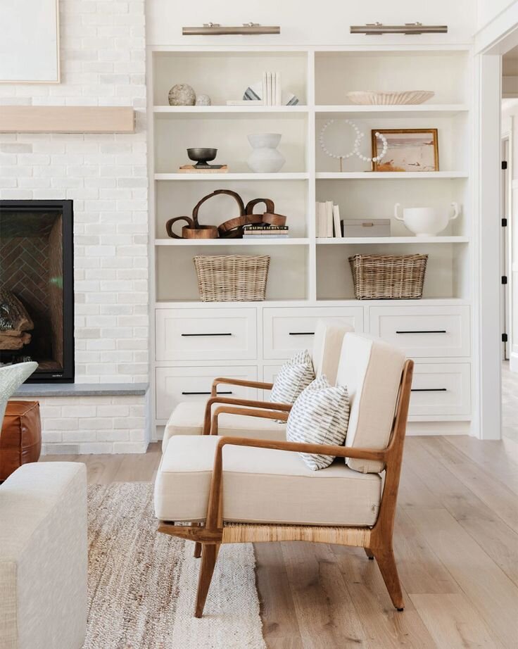
via Amber Interiors on My Domaine (Photo by Tessa Neustadt)
Next, I grabbed a closeup of a bookshelf from Amber Interiors so you can see a few more details on this well-styled vignette!
Take note of…
The actual books! So many bookshelves that you see out there these days don’t actually house books, so it can be hard to find good examples of how to make them look good. I love how she clustered three different sets on these shelves, which gave her space to hold a bunch without it feeling it was dominated by books. Follow her lead by changing up the orientation (horizontal vs. vertical) and using different pieces around them (bookends and plants here) to add to the style.
The eclectic pieces. Add variety to your shelves to keep things visually interesting. Here she included framed photos, baskets, and pretty objects. Also, don’t be afraid of including something that’s a little bit weird or whimsy on your shelves. It’s those things that make it feel like you! The piece that stuck out to me here is the ceramic horns in the bottom left. It’s such a fun piece!
Object placement. Particularly the way she used the whole depth of the bookshelf in different ways. Notice the way a piece leans against the back or sits farther back on the shelf vs. things that sit toward the front. Again, this is a great way to keep your eye moving and make the vignette interesting.
The takeaways
My hope for today is that you’ll walk away with a strategy for how to look at inspiration photos for shelf styling as you come across them. There’s so much you can learn just by taking a few minutes to look at why they work so well! You’ll start to notice patterns and similarities, and then you can take those ideas and run with them.
When you go to style your own bookshelves, start by gathering a bunch of pieces that you think might work and that you know you want to include. You may need to shop for a few things too! Then, use those lessons you learned from your inspiration photos and try them out. Play around! Like I mentioned at the very beginning, it’s more of an art than a science, and it often takes a few tries before you land on a look that you absolutely love. Have fun with it!
*This blog post contains affiliate links, which means Mix & Match Design Company earns a small commission from your purchase at no cost to you.


