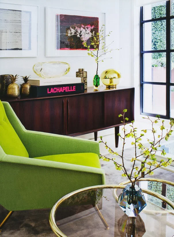
How to Decorate with Pantone's Color of the Year: Greenery
via Style Blueprint
"Greenery bursts forth in 2017 to provide us with the reassurance we yearn for amidst a tumultuous social and political environment. Satisfying our growing desire to rejuvenate and revitalize, Greenery symbolizes the connection we seek with nature, one another, and a larger purpose." - Leatrice Eiseman, Executive Director of the Pantone Color Institute
Can you believe 2016 is coming to an end? In the blink of an eye, we will have turned the page to a new year, and a new year means a fresh start. Pantone's "Color of the Year" for 2017, Greenery, recognizes and celebrates that, and now it's up to us to figure out how to incorporate that color into our homes! While I don't tend to decorate based on trends, it can be fun to play along with them in small doses - especially if it's a color that you already enjoy. I'd love for you to weigh in on whether you're on board with this bold hue in the comments!
I've got some great examples of how I might use this color in the home decor world, but first, let's talk about what Greenery is and isn't. This color is bright and cheery, but can overwhelm a space when it's used in large doses. I'd classify it as somewhere between an emerald and a lime green - like the color of a granny smith apple. It's zesty. It's fresh. It's one of nature's favorite colors - and you know how much I love to bring the outdoors in when it comes to designing a room.
As I've browsed photos on Pinterest, in magazines and on Instagram, I've been taking special note of this color when it pops up, and I've found that I enjoy seeing it as the accent, not as the star. It plays nicely with a lot of other colors, so you've got a lot of flexibility if you're looking to add it into your home.
A great way to ease into it, for example, is through textiles like pillows and curtains.
via HH Architects
via Coastal Living
via Pottery Barn
Another fun way to sprinkle it in is through art. I love adding color to a neutral room with a pretty abstract or landscape.
via Rue Magazine
via The Fox and She
Lastly, if you're open to taking a bit of a risk with this spring green and want to invest in something a little more permanent, another option is a piece of upholstery or furniture. This could take the form of an accent chair, a headboard in a kid's bedroom or a sideboard in a dining room. If you do go that route, I'd probably keep the other pieces pretty neutral - at least that's my style! If bold rooms are more your thing, feel free to add in as much color as you want!
via Eclecchic
via Julia Ryan
Or, if you want to take the name of Pantone's Color of the Year literally, you can always simply bring real greenery into your home, and you'll be right on trend! (See what I did there?) A fern perhaps? Or a cute little succulent? Nature gives us plenty of options. :)
Need help with your home? Take a peek at my e-design services! If you're ready to get started, get in touch with me before 12/31/16 to lock in 2016 pricing!


