My Favorite Rooms from the One Room Challenge
In case you missed it (I'm guessing that's unlikely given the fact that I've practically shouted it from the rooftops!), last week marked the final week of the One Room Challenge, which meant it was reveal day! I've had such fun poring over all the pretty spaces that these talented folks have created, and I knew I'd have to do a round up of my favorites to share with y'all. If you're in need of some inspiration for your next room redo, you're in the right place!
(Psst! In case you missed my ORC reveal of my home office last week, you can find it right here.)
Over the past six weeks, 20 featured designers and over 250(!) guests have completed this six week makeover challenge. That's a lot of rooms, my friends! It was really tough to narrow the list down to just a few favorites, but I managed to choose 13 that made me go, oh wow.
So scroll on down to see my favorites, and if you haven't had enough by the end of that, head on over to the Calling It Home blog using the links below to check out every last one! :)
FEATURED DESIGNERS | GUEST PARTICIPANTS
MODERN VINTAGE BATHROOM | BRE PURPOSED
This mix of black, white and natural wood, along with that gorgeous vintage rug, make this bathroom both perfectly modern and perfectly cozy. The simple windowpane style glass shower door brings some nice contrast and you've got to click over to see the mid-century vanity on the other side of the space!
PALM SPRINGS INSPIRED LIVING ROOM | MICHELLE GAGE
If you want to see a super fun and colorful living space, look further than this room designed by Michelle Gage, who is not only a super talented designer, she's also a friend here in Philadelphia. She designed this space for Arsenic Lace, and I'd say they were the perfect pair! One thing you don't want to miss? The amazing wallpaper on one of the walls in this space, so head on over to the full post to gaze at it's beauty.
COZY MODERN BREAKFAST NOOK | PLACE OF MY TASTE
I've followed Aniko of Place of My Taste for awhile now and I love her style, so it's no surprise that I was smitten with her new breakfast nook. She nails that that cozy modern vibe - just look at that window seat full of beautiful indigo and tribal-style textiles.
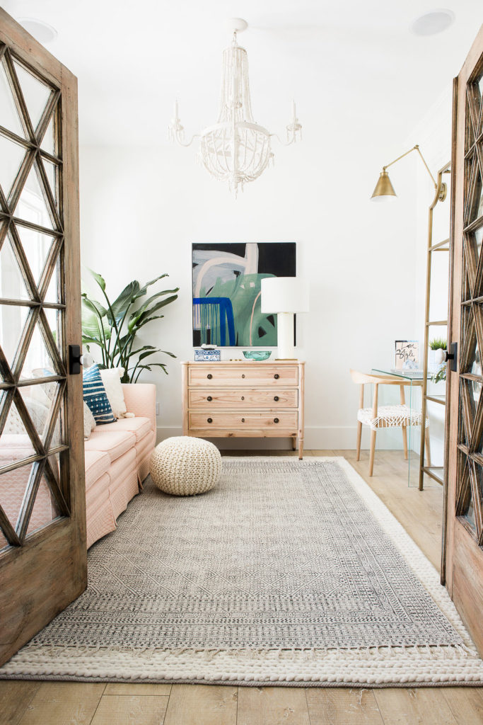
LIGHT AND AIRY HOME OFFICE | DESIGN LOVES DETAIL
This home office is simple, elegant, and airy. I love how the room has space for both work and relaxation, and that three drawer chest area works as the perfect focal point to draw your eye into the space. Large scale abstract art #ftw.
TWEEN BEDROOM | SUBURBAN B'S
How fun is this tween bedroom? There's a lot of pattern and texture mixing going on (hello cactus wallpaper!), but all of the white space keeps it from feeling too overpowering. I'm a huge fan of the combo of those bedside table chests with the navy blue lamps, and I think this space is also a great example of how sometimes the perfect spot for a bed is right in front of the windows. A full post on that is coming soon!
ELEGANT AND MODERN MASTER BATHROOM | HOUSE UPDATED
Apparently I'm into bathrooms right now, because this is the second one that I'm including in today's roundup! ;) This room used to be a closet, and now it's a dreamy master bathroom. Can I move in? That herringbone marble in the shower and the whole vanity situation are most def on point.
SOPHISTICATED SANCTUARY LIVING ROOM | LARK & LINEN
Jacquelyn wanted to create a living room that would feel like a sanctuary, and I'd say she pulled it off beautifully, wouldn't you? It's elegant and sophisticated, yet still feels like a place you could put your feet up and relax on a slow Sunday afternoon. That chaise is calling my name!
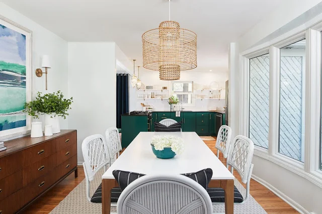
MODERN ECLECTIC KITCHEN AND DINING ROOM | ABBY MANCHESKY
This amazing lady conquered not one, but two spaces for her ORC: her kitchen and dining room. Pulling off a gut renovation of a kitchen in six weeks is no joke - add in the dining room and you've got quite the project on your hands. She pulled it off beautifully. One of my favorite parts is how the art above the buffet ties in perfectly with the dark green lower cabinets in the kitchen.
GUEST HOUSE DINING/LIVING SPACE | ERICA REITMAN
This little dining/living room is a part of Erica's AirBnB guest cottage, and I love how cozy and inviting it is! Those rich blue hues are repeated throughout the space, which make it feel high style, but still completely approachable. Also, you've got to go read the whole post for yourself - Erica's sense of humor is amazing, and she had me giggling to myself throughout!
AIRY AND ORGANIZED MASTER BEDROOM | GLITTER GUIDE
I basically took notes as I read through this master bedroom makeover post from Glitter Guide and I'm filing them away for both my master bedroom and for future clients. This room may be on the petite side, but it's packed with style and functionality. You'll want to see the closet too - it got a major organizational facelift!
FUNCTIONAL AND PRETTY HOME OFFICE | DECOR HAPPY
Let's all take a minute to gaze at this incredible built-in desk. I mean, just imagine how much you could store in it! There's room for everything and tons of workspace. I also like the choice of black hardware here - those pulls work perfectly with both the navy lowers and white uppers.
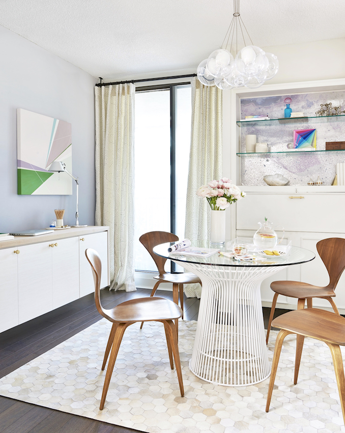
SERENE AND EDGY DINING AND OFFICE SPACE | DESIGN MAZE
This dining space also functions as an office, making it quite the hard-working space! There are some subtly bold design choices in here like the marbled wallpaper, and the hexagon hide rug (did you catch those?) that really make the room unique and pretty.
PREPPY TRADITIONAL LIVING ROOM | RAMBLING RENOVATORS
Though more traditional than I tend to go, I found myself totally drawn into this living room from Rambling Renovators. Maybe it was the blue slope-arm chairs, or the pops of gold, but it pulled me in right away. Wouldn't you love to hang out in here?
To wrap things up today, I wanted to mention a few themes that emerged as I meandered my way through the hundreds of ORC spaces:
- Wallpaper is BACK and better than ever. The patterns, colors and styles I noted were all gorgeous. I hope this "trend" is around for awhile - it's a fantastic way to up the ante on a room's look and feel. Installing wallpaper is definitely more expensive than painting a room, but if you find the right one, you can always just use it on an accent wall if it's cost prohibitive or too bold to do the whole room.
- Darker, moodier rooms are in. Although I think I will always gravitate more toward a light and bright space, rooms painted in dark colors like hunter green and deep navy have me intrigued. I love their cozy feel.
- Vintage tribal/kilim/Turkish rugs are here to stay. They work in SO many spaces and have this magical ability to mesh well with just about any style - from traditional, to boho, to mid-century.
So tell me, have you had a chance to look through some of the ORC rooms? What were your favorites? Did you notice any commonalities or trends? Jump in on the comments below and share your thoughts!


