Contemporary Meets Classic in A Converted Philadelphia Textile Factory Condo | E-Design Project Reveal
This e-design project came into the Mix & Match inbox for a bummer of a reason: a fire.
It started in one building and spread rapidly to the neighboring buildings, leaving a heavy dose of destruction in its wake and forcing residents out of their homes in the early morning hours on a cold day in January.
Elizabeth's (my client) condo building - a converted 1900s-era textile factory - was one of those connected buildings that got caught up in the wake of the destructive fire. Her one bedroom condo was damaged and she had to say goodbye to many of her belongings, including furniture and decor. She loved what she had and when she began to look online for replacements, she realized that many of those items were no longer available. This meant she was suddenly faced with the time-consuming task of having to find new pieces that would achieve the look she had built over time before the fire made its unwelcome entrance. As a busy professional (she's the founder of the boutique firm Very Real Estate in Philadelphia) she quickly realized that with her limited time, redecorating her whole home on a short time frame would be a difficult task - that's where Mix & Match came in! E-design was a perfect fit for this project - she could focus on other important things in her life while I pulled together the design that would allow her to enjoy being in her home again once the repairs were complete.
She enlisted me for two of the spaces in her condo: her dining room/office area and bedroom (we'll be focusing on the dining room/office today). She provided professional photos of her home from before the fire (perks of being a real estate agent!), described her desires for the new pieces, and we got to work to achieve a similar look.
I would classify her style as "contemporary meets classic." She loves clean lines and warm wood tones - but nothing overly fussy or ornate. Being that her space is an old factory, it had plenty of character to highlight, including features like large arched windows, exposed brick, and exposed original beams. Her streamlined style complemented these elements perfectly.
After a few weeks of back-and-forth finalizing all the pieces for the dining room and bedroom, I handed off the shopping lists, and my client got to work on placing the orders for her new furniture and getting everything set up. Now we get to see how it all came together!
This isn't the most dramatic before and after you'll ever see - as I mentioned before, my client loved her old space and was able to salvage some of the items from the fire, so you'll see some similarities in the before and after shots! My job was to take what she had before and give it a fresh start. Let's get to it!
DINING ROOM/OFFICE BEFORE:
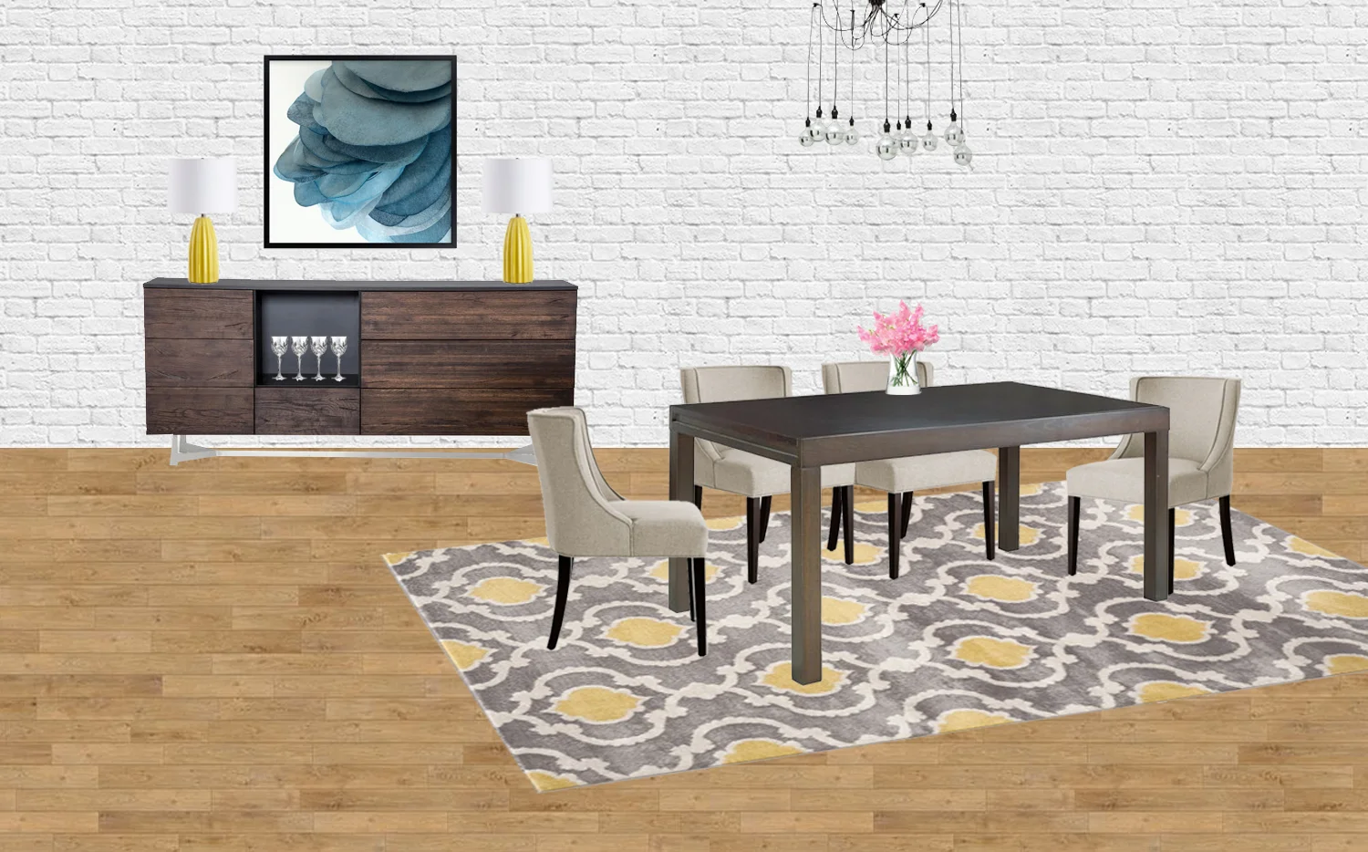
DESIGN BOARDS:
Here are the design boards I created for the space. As you'll notice, I added a little bit of decor to the boards to make them more lifelike - it's up to the client to decide what to purchase in the end. I like to give plenty of options. :)
DINING ROOM/OFFICE AFTER:
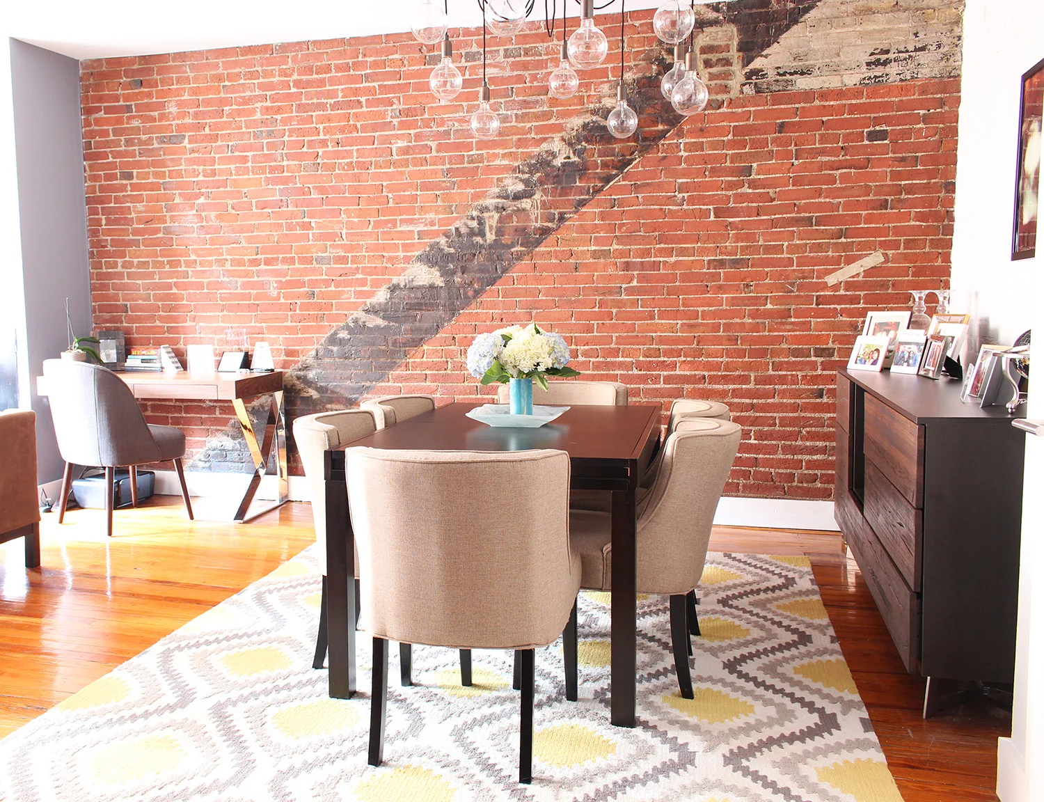
It's such a cozy and inviting space, don't you think? I'd happily plop down in one of those upholstered dining chairs* around that table and share a few glasses of wine and a good meal. The exposed brick backdrop doesn't hurt either! Also, that table extends, which makes it a very versatile piece for entertaining.
The sideboard we settled on turned out to be even lovelier in person than it was in the photos. The rich, dark tone in the wood wood goes right along with the other wood tones in the space provides SO much great storage. That's always a plus in a small city condo! One thing you can't see very well in these photos is the legs on this piece - definitely be sure to check them out on the website.
And then there's this swoopy modern light fixture - how cool is that guy? I can't take any credit for this one - Elizabeth was able to salvage it from the fire, thankfully! (Here's a similar one.)
If you look to the left of the dining space, you'll spot the office area. I showed my client a few different desk options, and she settled on this one, which like the sideboard, is even prettier in person than in the photos!
The chrome desk legs gleam and complement the chrome base of the sideboard beautifully. I also love how the curves of the mid-century style chair soften the hard angles in the desk. They're a great pair, right?
Despite the sad circumstances that led to this project, this ended up being a really fun one to pull together!
If you'd like to get the look of this space for your own home, the sources for the pieces are below (similar ones are listed if the source wasn't known or the piece is no longer available):
- Extendable dining table
- Dining chairs
- Rug
- Chandelier/light fixture (similar and super affordable!)
- Sideboard/buffet
- Art (from design board)
- Lamps (from design board)
- Desk
- Desk chair (similar)
- Marble bookend
Are you ready to tackle a decorating project in your home? Let's work on it together! Mix & Match has affordable e-design packages and I'm currently taking on new clients!
*This post contains affiliate links, which means Mix & Match earns a small commission from your purchase at no cost to you.


