Five Recent Favorite E-Designs
As I look toward wrapping up this fall’s e-design projects, I thought I’d take a look back and share five favorite boards from my Full Room E-Design service. It’s been a fun, FULL season of trying to pack it in before our second baby arrives in December and I take some time off for maternity leave.
As I’m sure you’ll pick up through looking at these design boards, you’ll see some common threads in terms of colors, styles, and finishes. I’d say my style trends toward a mix of modern, coastal, and dash of traditional. Each is unique, for sure, and tailored to the client, but if you want to get a good sense of what I love to design, this is a great place to start.
(Side note: It can also be a helpful resource if you’re looking to hire a designer for your own project. Getting a sense of their style and whether it resonates with you is a HUGE key to carrying out a successful project!)
I’ll share a little bit about each project below so you can get a feel for the background and its goals!
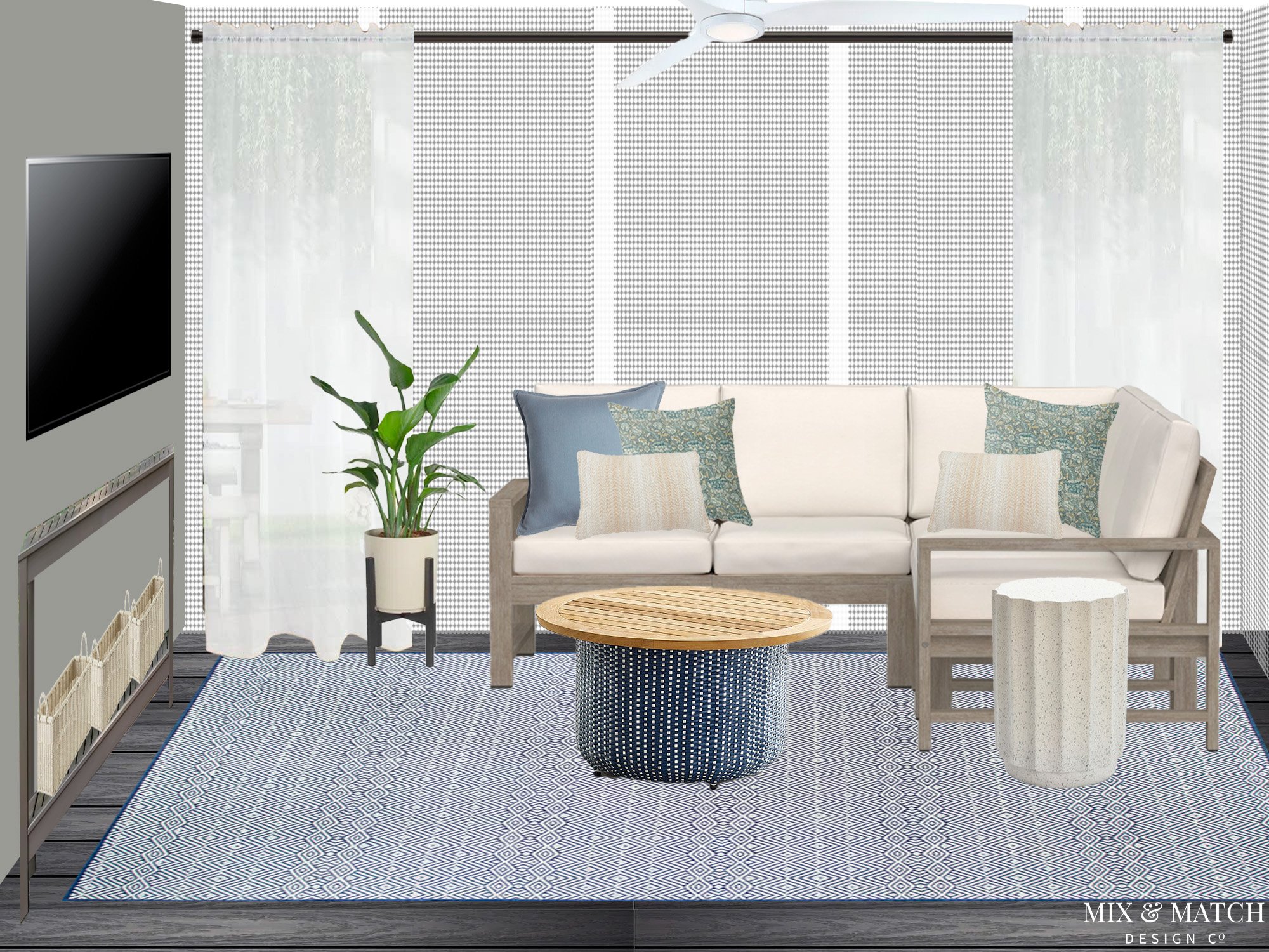
Fresh Coastal Screen Porch
This is the final space in a multi-phase first floor project for a sweet client I’ve worked with several times now! We’ve slowly worked our way through the different spaces this year, and we capped it off with a total refresh of her screen porch.
They inherited furniture from the previous homeowners and while it’s served the purpose of helping them utilize the space, they were ready to make it their own. They spend a LOT of time out here, and thankfully in Richmond, you can be outside about 3/4ths of the year, so it’s worth having a space you love!
Given its small size (about 10’x10’) and the fact that it’s a pass through to the backyard, space planning was crucial here. We landed on a smaller scale, but comfortable sectional for the corner where their family of three can sit comfortably or lounge to watch TV. When they entertain, they can also easily pull up a couple of extra chairs from their nearby patio dining table.
A round, blue and white storage coffee table offers a landing spot for food and drinks, and coordinates with the dining chairs that are just outside of this space. The console table can easily become a serving table or bar, and it offers an additional shelf for storage below. Multifunctional is the name of the game here!
This fresh coastal design is well on its way - all the pieces should be in place soon so they can enjoy these final few days of magical fall weather!
P.S. If you’ve been around for awhile, you may remember this kitchen refresh - it belongs to the same home!
Relaxed Southern Traditional Primary Bedroom
When my client described her style to me, she used the words “relaxed southern traditional - almost like summer in the mountains of Highlands/Cashiers, North Carolina.” I could picture it immediately, and couldn’t wait to bring that idea to life! She wanted to bring in more saturated colors, a blend of patterns, a mix of antique and new pieces.
She has great instincts, and my job was to help her visualize a fresh design to create a cozy sanctuary after a really hard season for her family.
We planned the design primarily around an oriental rug she had in her living room (the one you see here is a placeholder to give the look and feel of the vintage one she had) and decided to pull this beautiful olive green out of it for the upholstered bed. The rug also gave us a lot of options for accent colors in pillows on her bed. We landed on this combo of lighter blue and rusty red, which is super punchy. I love it when a client is willing to go a little bold!
I’m excited to put some final touches on this space and since it’s a local project, I’m hopeful I’ll be able to see it in person once everything is installed in the coming months.
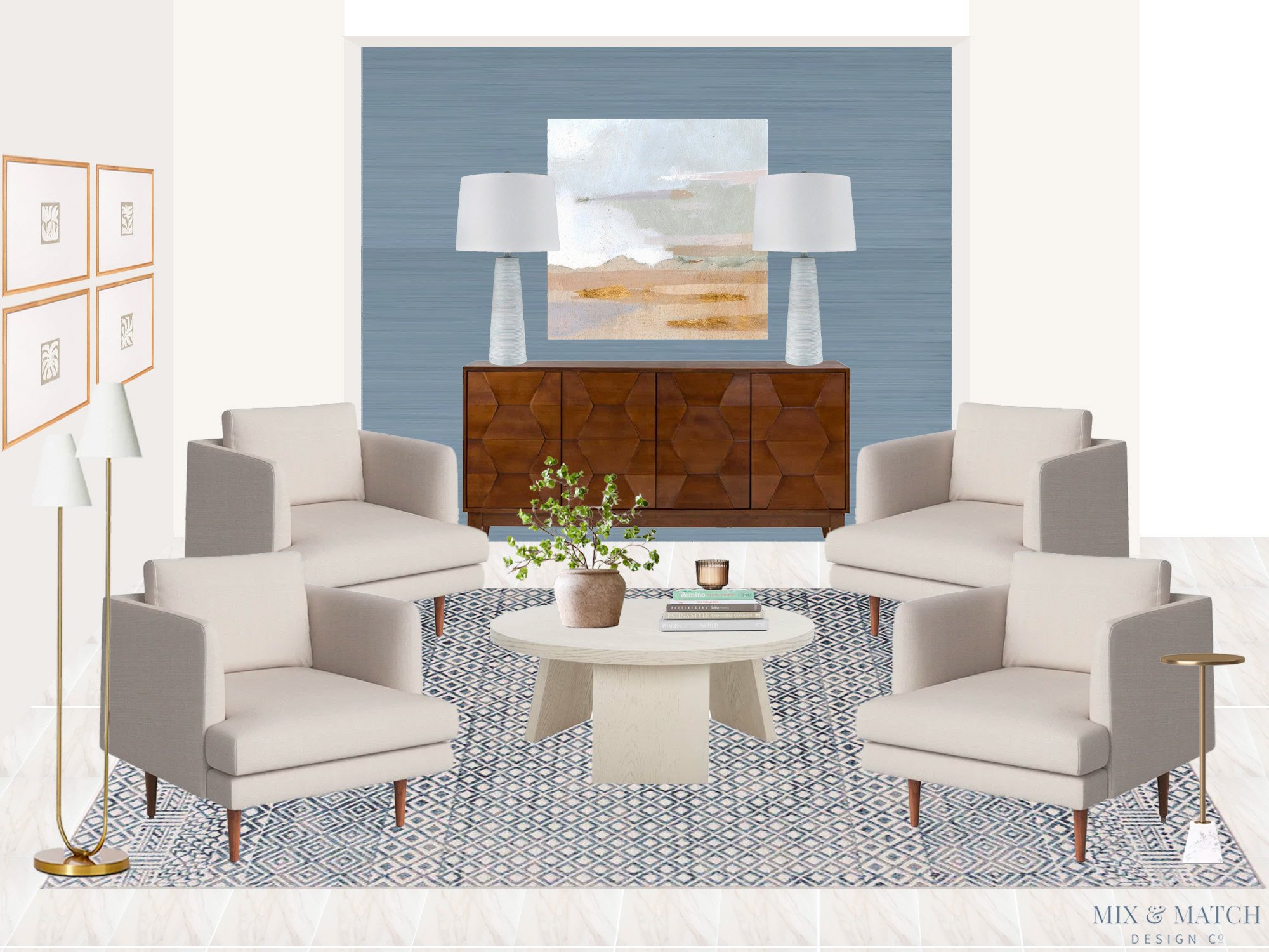
Coastal Modern Formal Living Room
This room is part of a larger project as well. We’re making our way through this home one room at a time, and it’s been a pleasure to help this couple take a blank slate and make it their own. This Florida home has some interesting (and challenging) architectural features to work with, and this space is no exception. It’s right off of the front door/entryway and is open to the adjacent dining room as well as the main hallway to the rear of the house.
My goal was to create a living room “zone” that felt purposeful and made a great first impression when you walk through the front door. Since it’s not their primary living space, we had a little more flexibility the type of furniture we could use as well as the arrangement. I proposed we create a conversation-focused spot using four matching chairs surrounding a round coffee table. The blue rug anchors the seating area to create that distinct “zone” we were after.
Since this large open space needed a focal point, we decided to highlight the niche wall with faux grasscloth wallpaper and a walnut sideboard that has really fun patterned doors. Art above and a pair of lamps cap it off!
We’re already onto the next couple of rooms in this home - we’re almost at the finish line for this project overall as well!
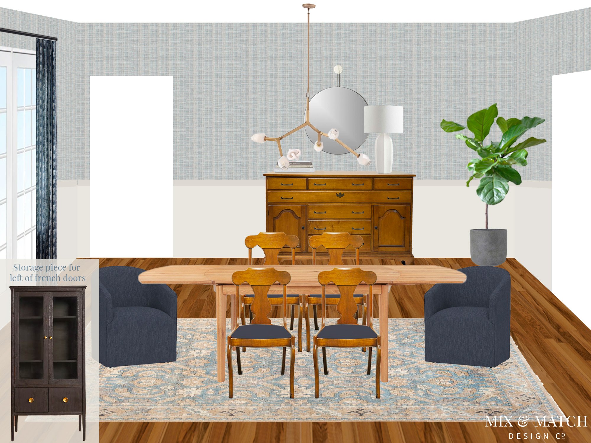
Modern-Antique Mixed Dining Room
I love working with repeat clients, and this is another one! I helped this family rethink and redesign their rear powder room a couple of years ago, and was thrilled to hear from them when they were ready to give their dining room a new look.
These clients had a couple of family pieces they wanted to use in the space (grandparents’ dining chairs and sideboard), but they wanted to mix them with more modern pieces as a contrast and balance. One of the keys to doing that well, especially if you’ve got wood pieces, is to make sure the undertones of the woods pair together. Even if you mix a modern dining table with antique chairs, if the wood tones coordinate, they have a way of blending together quite nicely.
To continue to bring in that balance, I made sure to incorporate some new pieces that had some traditional design elements as well. I’m particularly smitten with the tall black storage cabinet and vintage style rug. They bring another layer to this space to create a room that feels collected over time - just the way I like it!
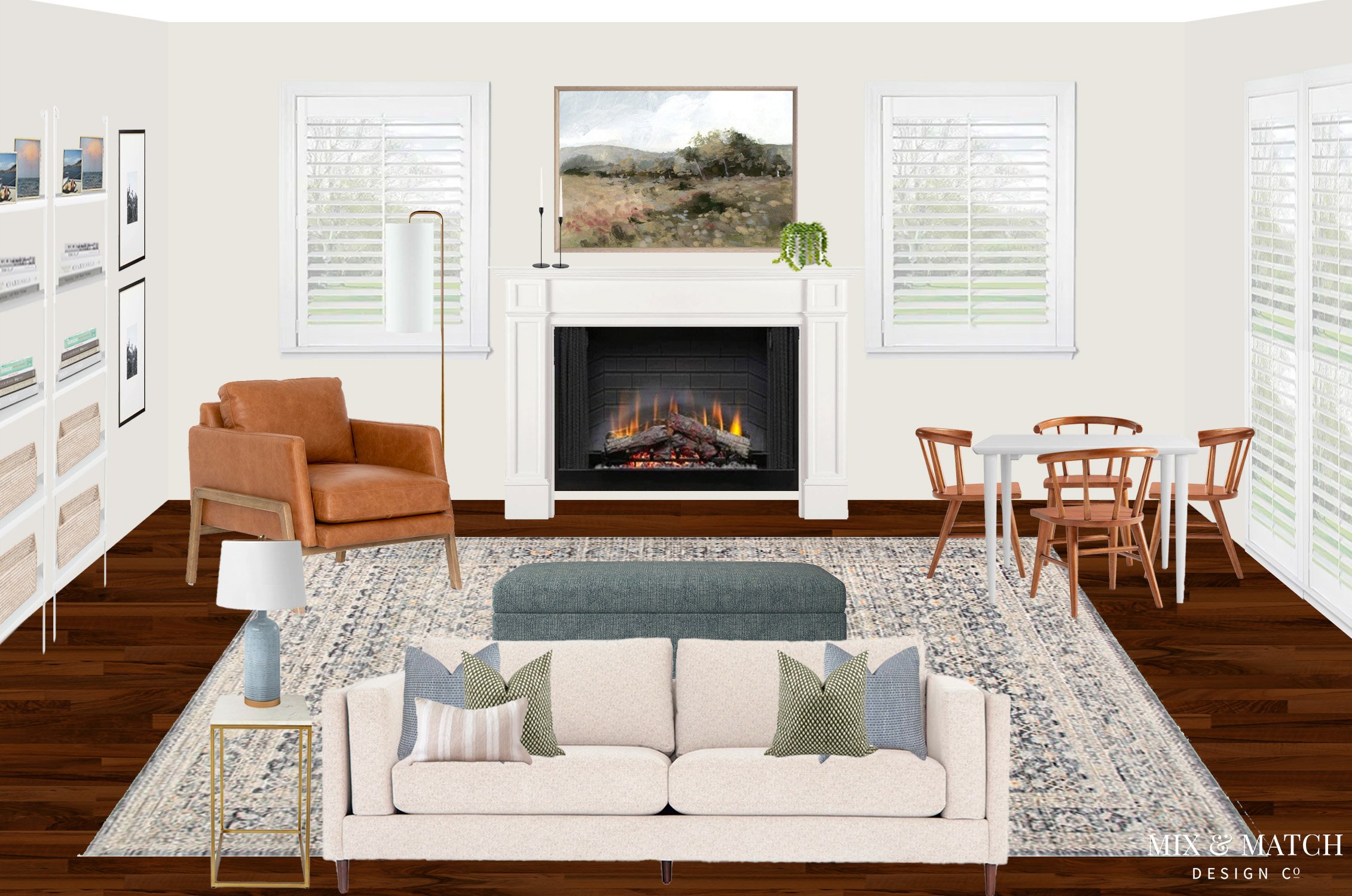
Coastal Modern Family Room
These clients came to me with a blank slate family room that’s connected to their kitchen. They were stumped on how to make it a beautiful space they could enjoy with their family, but also make it functional for a family with young kids. It’s a common issue for sure!
After landing on a space plan that gave them a nice, full size sofa and chair as the main seating, plus a small kids table in one of the corners, we were able to layer in some additional functional and pretty pieces that made the space really tick. A large storage ottoman offers space for toys and some slim, wall-mounted bookshelves make great use of a long wall that was previously empty. The great thing about bookshelves like these is that they can evolve over time to serve different needs.
I’m such a fan of how this space came together - it feels modern, cozy, and timeless all at the same time. I’m excited for this family to be able to finally enjoy being in this space and I hope it serves them well for a long time!


