Get the Look: Modern Bookshelf Styling
via Design*Sponge
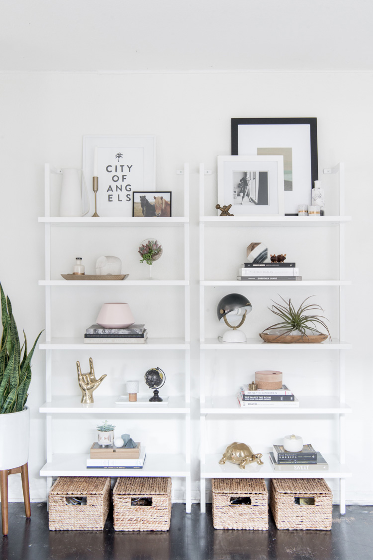
It's Friday, which means it's time for the latest installment of Get the Look! So many of you have mentioned how much you've enjoyed this series, and I'm so glad! Today's post has a slightly different twist to it - in addition to sharing similar pieces to the ones in the inspiration photo above, I'm going to give you some tips on how to style your bookshelves to look as pretty as these from lifestyle blogger, Anne Sage. She makes it look effortless, but let's face it - styling bookshelves can be tricky!
Less is often more when it comes to decorating your bookshelves, and today's inspiration image is the perfect example of that. Note that while there are a lot of objects on the shelves, there's also a lot of white space to keep it from feeling cluttered. By creating different groupings throughout, she keeps your eye moving from place to place, but it's never overwhelming - it's simply, well, interesting to look at. Wouldn't you agree?
Another reason it's so pretty to look at is that everything she chose to put on those bookshelves fell within a certain color palette. Nearly every piece is black, white, natural wood or brass. This combination of colors and finishes has a calming, peaceful effect, and feels really clean.
In addition to the notes above, here are a few practical takeaway tips on how to style your bookshelves to look like these:
- Start with books. The provide a great foundation for decorative objects, and add visual weight. Hardcover and coffee table style books work best (remove the glossy jackets if they have one). Group them together in odd numbers - three or five look best in my opinion. Scatter the stacks around on different shelves.
- Use trays to pull together a group of small objects or as a base for another piece (like the spidery plant on the right bookshelf).
- Vary the heights and widths of your objects. A great example of this is the highest shelf of the right bookcase. The layered black and white frames are different heights, as are the decorative objects. The placement looks purposeful, but has a little whimsy too.
- Always add something living! Be it a real or faux plant, it's the perfect finishing touch for any bookshelf.
Now scroll on down for the look-a-like pieces from Anne's bookshelves! The bookshelves themselves she used are the same as the one I have in my office - they're so great. Snap up a few of these goodies for your own home. They'll help make styling those bookshelves a breeze!
You can also pin the image below if you'd like to save this post for shopping later. Just hover over the image and a "Pin It" button will pop up!
Happy weekends, y'all!
Psst! Have you been following along with the other posts in the Get the Look series? These go up every Friday here on the blog. Each week, I take a photo of a beautifully designed space and find the look-a-like pieces you can purchase that will mimic the room's look and feel.
*This post includes affiliate links, which means Mix & Match earns a small commission from your purchase at no cost to you.


