The Final Before & After: Our 1930s Philadelphia Row House (Part 1)
A Philadelphia row home gets a modern makeover - the before and after of the living room, dining room, and kitchen.
A lot has happened in the past three months and I’m excited to be BACK! To catch you up, our son was born in mid-April (you can see his full “nursery nook” here!) and we put our little 1200 square foot 1930s Philadelphia row house on the market a few weeks later to make a big move back to Richmond, Virginia. Our house sold quickly - so quickly in fact, that we ended up being nomads for about a month while we house hunted for a new home! We finally closed on our Richmond house a little over a week ago and are thrilled to not be living out of suitcases anymore. It was bittersweet to leave Philly for sure, but we were feeling ready to make moves. Richmond is a place we’ve loved for a long time - it’s where we lived when we were first married and we decided it was finally time to make the move back this summer.
To tie a nice little bow on our time in Philadelphia, I thought it would be fun to share one final big ole house tour with before and after photos since we did quite a bit of work there over the past 3.5 years! Today, I’ll walk you through the first floor and next week I’ll cover the second floor.
We bought our house from an older couple who had lived there since 1970 and it needed a lot of updating to turn it into a light and airy modern home. We were up for the job thanks to some amazing renovation help from my retired-contractor father-in-law - we couldn’t have done it without him!
Let’s jump right in, shall we?
Living & Dining BEFORE
When you walk in the front door, you find yourself immediately in the living room, which then opens up to the dining room. Straight ahead through that doorway is the kitchen, and we knew we’d want to take that wall down to make the first floor one big, open space.
When we bought it, the house was completely carpeted and the first floor was painted a buttery yellow that made everything feel dingy and cramped. It had tons of potential, but it just needed a little love to bring it back to life! Every bit of the house got touched in some way - whether it was paint, flooring, or a total reno.
The one amazing thing we kept? That exposed brick wall in the stairwell!
The dining area also had an exposed brick wall (you can see it in the photo above), which we ended up drywalling over. I know that seems a little crazy since it’s so cool-looking, but after we ripped out the two adjacent closets to open up the room, it looked out of place all on its own. We figured we had our exposed brick in the hallway, so it was ok to let this one go!
AFTER
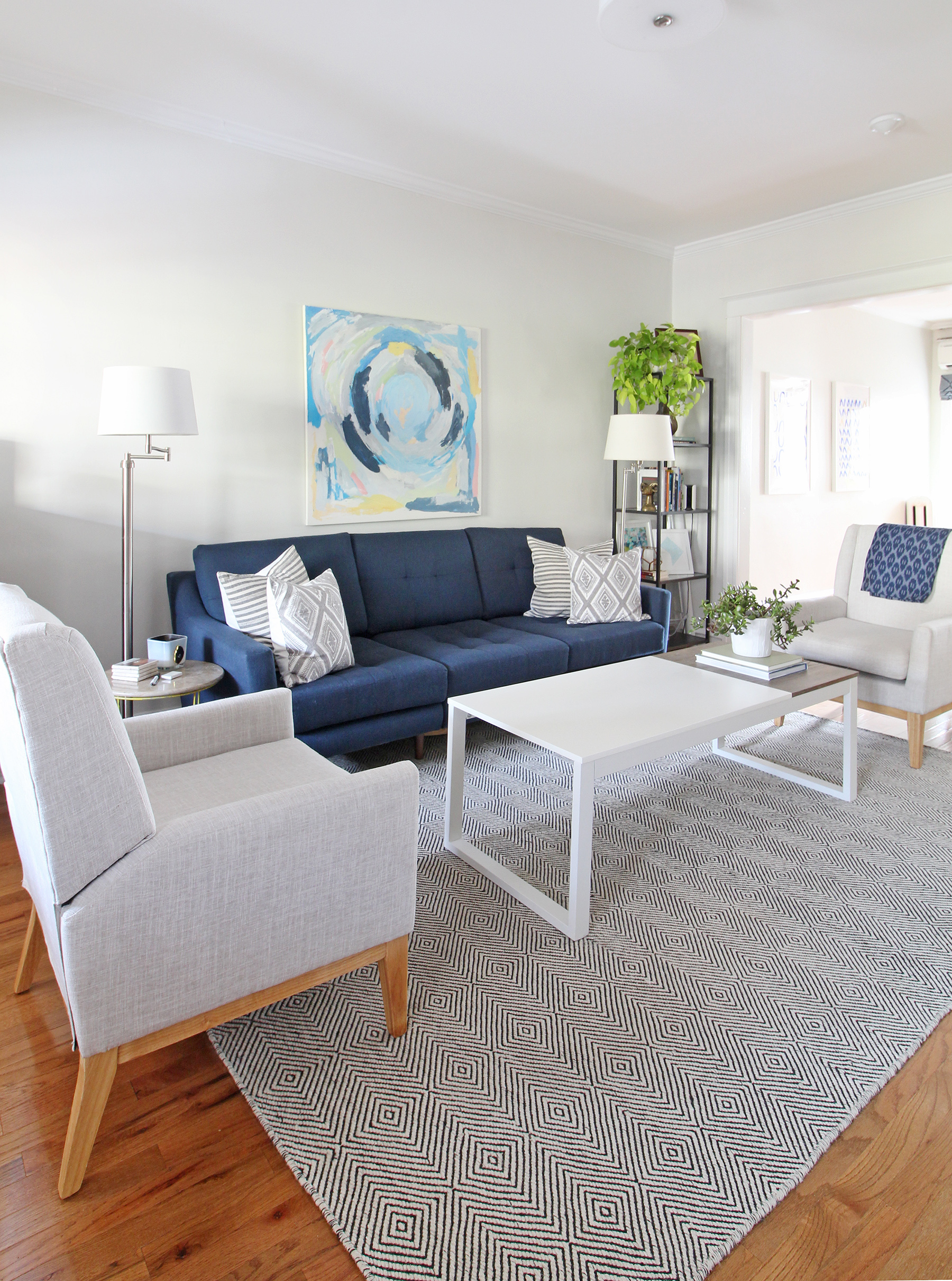
And here are some photos of how our living and dining room looked after we got our hands on them!
It was amazing how much of a difference new hardwood flooring and paint made - it felt so much brighter and airy despite it being a row house! We painted all the walls Benjamin Moore Winter White. It’s a super soft, almost white, gray. It’s a lovely color that took on a slightly different tone in each room of our house depending on the light. If you’re considering this color, be sure to test it on a few walls to see if you like it before you commit. That’s something I always recommend to my clients no matter what color they’re considering!
You can read more about our living room in this post and shop some of the piece below!
You can catch a glimpse of the exposed brick wall by the stairs in the photo above. One tip that I’ll pass along regarding the brick is that we spend a good amount of time cleaning it up and then sealed it with polycrylic so that it didn’t “shed” and make the house dusty. Though that seemed like overkill, I think it made a big difference in helping our house stay clean.
We loved, loved our dining room. Taking out the two closets in there was worth the loss of storage to have a bigger open space. They were on the wall where our mid-century china cabinet was (see below). When we had company over, folks always congregated in the area between the dining table and the cabinet, and I loved that there was plenty of space to mill around. It made our small house live so much bigger than its square footage would suggest!
Having a dining table that seated eight was also awesome. It was such a gift to be able to host many, many gatherings in this house throughout the years we were there. (Our dining table is the Dylan from CB2* and we love it. The wood top is gorgeous and the metal mid-century style legs are so fun and different.)
Shop our dining room below!
Kitchen BEFORE
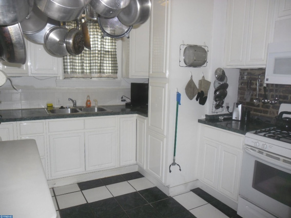
Though the kitchen had been renovated not so long ago, it wasn’t in great shape, felt super cramped with a ton of cabinetry, and it didn’t function well for the way we lived. We love hosting and having people over, so opening the kitchen up to the dining area (and therefore, the rest of the house!) was high on our priority list.
We took down that wall, removed and rearranged some of the cabinets, and moved the sink as a “Phase 1” reno, and then about eight months later, jumped into a full gut renovation. Here’s what it looked like when we bought the house:
Here’s what it looked like after “Phase 1” was complete:
Doing a Phase 1 reno really helped us figure out how we wanted the kitchen to look, feel, and function. It was totally worth living with a cobbled together space for a few months - even if it looked a little, let’s just call it…special. Now let’s take a peek at the fully renovated after!
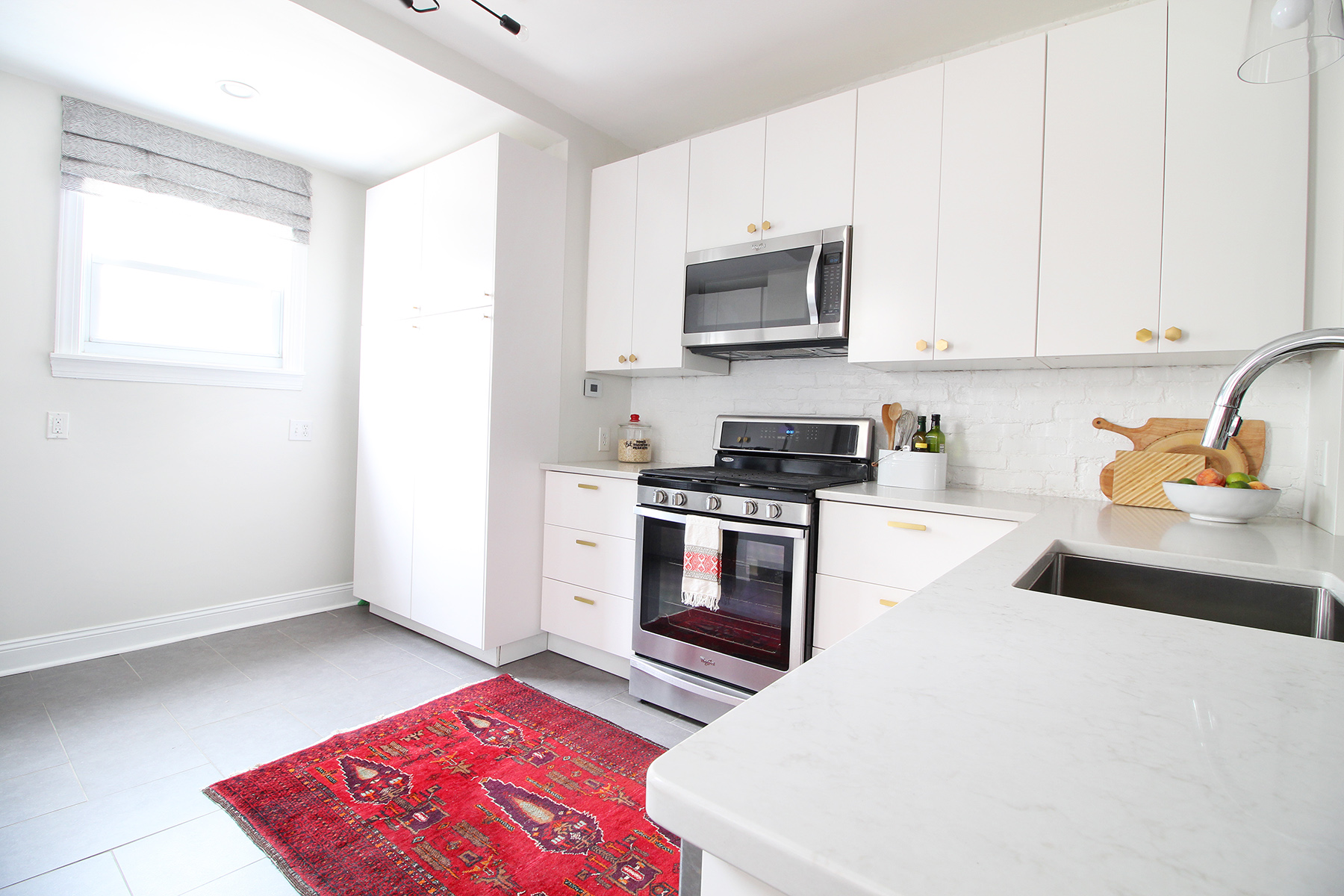
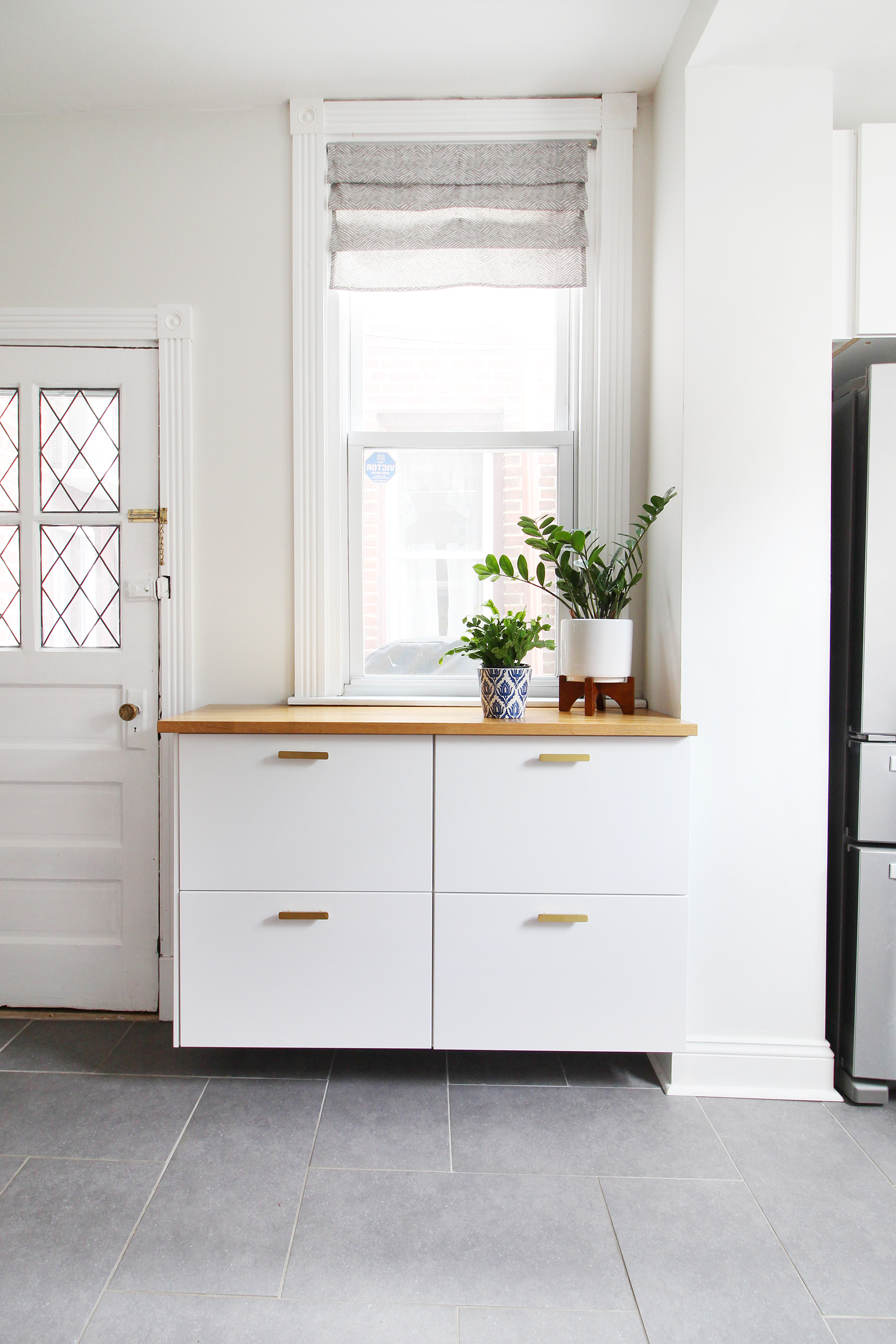
AFTER
We installed all new everything to create a modern, white kitchen including IKEA Sektion cabinets, quartz countertops (Caesarstone London Grey), and radiant heat under our tile floors. Putting in radiant heat was the BEST decision since our kitchen is cantilevered over our garage and the outside - it got so cold in here in the winter before we did that!
A lot of folks have asked if I would do IKEA cabinets again in another renovation, and I can wholeheartedly say yes. I absolutely loved them and honestly miss them in our new house. They are great quality, especially for the price, and the interior organization/customization can’t be beat.
If I do an IKEA kitchen again in the future, the one thing I would consider would be using the IKEA boxes with Semihandmade fronts. It allows you to get the look of a custom kitchen at a fraction of the cost. Though it’s more expensive that way, it’s still way less than a fully custom kitchen.
Want to read more about our kitchen renovation and get the sources? Head to these posts:
You can also shop some of the items in our kitchen below!
That wraps up Part 1 of my final before & after tour! Stay tuned for next week - I’ll be sharing our second floor that includes our bedroom, the guest room, hall bath, and my office/nursery nook!
*This post contains affiliate links, which means Mix & Match Design Company earns a small commission from your purchase at no cost to you.


