The Final Before & After: Our 1930s Philadelphia Row House (Part 2)
Welcome to Part 2 of the farewell tour of our Philadelphia row home! Today we’ll head upstairs where I’ll be showing you the master bedroom, guest bedroom, tiny bathroom, and office/nursery nook.
Missed Part 1? Head here!
We’re continuing to settle in in Richmond, and I hope I’ll have some progress to share with you soon on this house, but in the meantime, I’m having fun looking back at our Philadelphia home! As I mentioned last week, it was bittersweet to say goodbye, but we’re happy to be back in another city we love.
The upstairs of our home didn’t see as much of a dramatic renovation as downstairs, but it definitely got a good old fashioned makeover that gave it a fresh look. It went from dreary and sad to happy and bright thanks to some paint (Benjamin Moore Winter White) and new hardwood floors. Those two changes plus new furniture and decor that fit our cozy modern style made for a second floor that we enjoyed spending time in!
Let’s jump into the before and afters!
Master Bedroom BEFORE
The brown paint and brown-gray carpet wasn’t doing this room any favors, and it made the room feel small. This room actually gets some of the best natural light in the whole house, so we wanted to capitalize on that by replacing the brown with the almost white gray paint.
AFTER
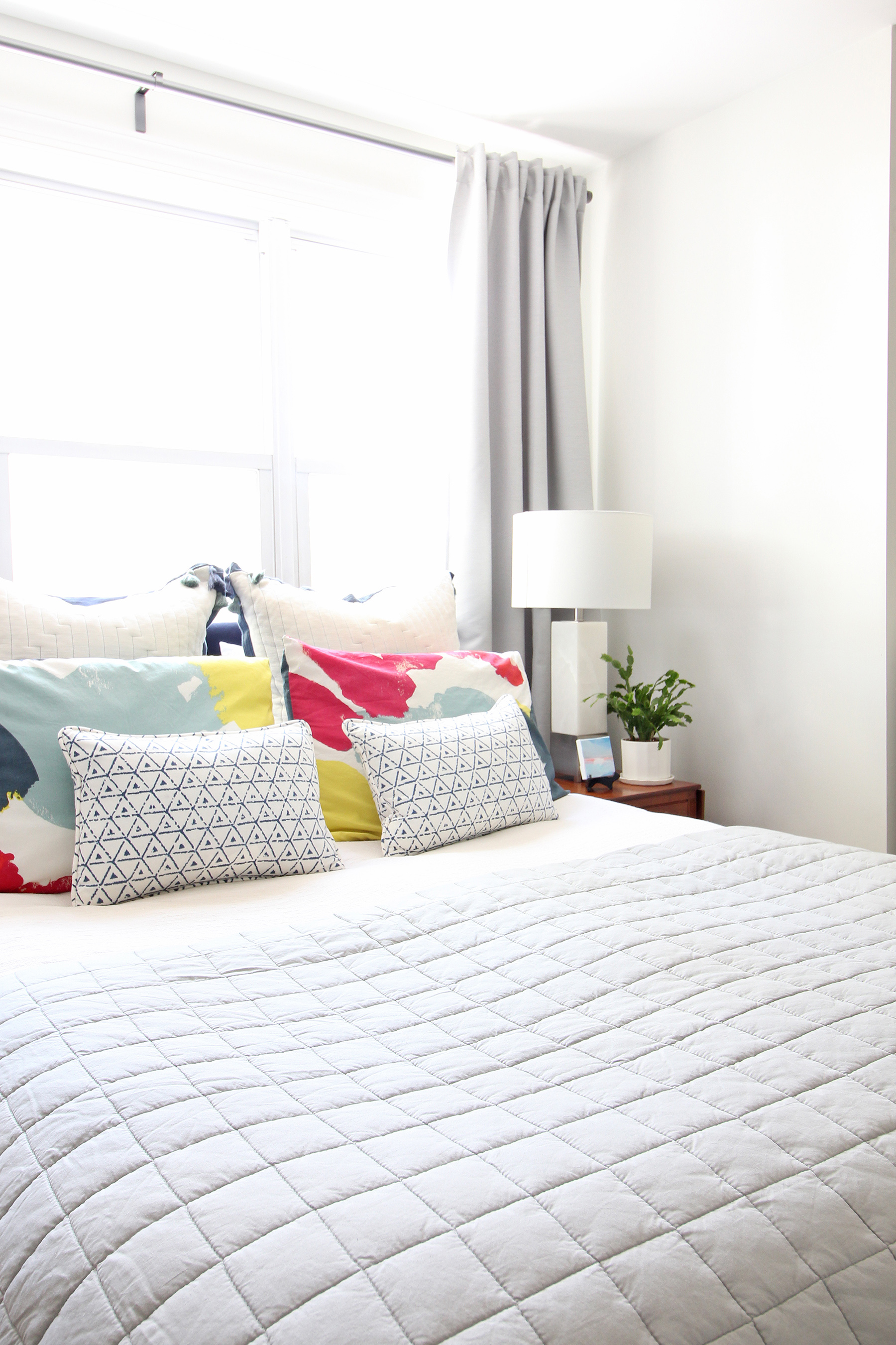
And here’s what our bedroom looked like after we made those changes!
Looks like a completely different room, right? For a small house, it lived large thanks to some functional furniture and by placing the bed in front of the windows (read more about why that’s ok in this post!). We used the “nook” for three modern side-by-side dressers, which added a ton of storage.
The upholstered headboard is something I DIY’d as a temporary solution until we found what we actually wanted, and then we ended up keeping it until we moved! It’s funny how that happens sometimes. Our nightstands are antiques that belonged to my grandmother - I love having a little something old or vintage in a room when possible! I think it gives a space so much character and warmth.
Want to see more of our bedroom? See one version here and another earlier one here.
You can shop the look below for some similar (or in some cases, exact) pieces we have here! Sadly, a lot of what you see has been discontinued, but hopefully these will point you in the right direction.
Guest Room - BEFORE
Our guest room is one project I’m super proud of - I gave it a total makeover during the One Room Challenge in the spring of 2018 and it was definitely one of the rooms I was saddest to leave behind. I added removable wallpaper in here and it will always be one of my favorite “risks” that I took with our home.
But before we get to that, let’s take a look at what it looked like before:
Pretty bland and boring right? Out went the carpet just like everywhere else and we gave the walls a coat of Winter White in here as well (the white you see was just primer - the previous owners didn’t get around to painting the room “for real” apparently!). Then we moved a bed, some mismatched nightstands, and a dresser in here and called it a day. It had a bit of a hodgepodge look (you can see the “Phase 1” look here in this post if you want to check it out), but was fine and functional. It wasn’t until I decided to do the One Room Challenge that I got to kick it up a few notches in the style department!
AFTER
Oh man, I loved this little space. The overall look is what I called “eclectic modern farmhouse” and it’s a pretty good representation of what my general design style is these days. This was a spot I was proud for guests to stay in when they came to visit!
That blue-green floral wallpaper made the room and the modern white Windsor style bed just popped off of it. My mom found those vintage mid-century nightstands at an estate sale and I added the marble tops to give them a fresh look (and cover the damaged laminate).
Shop the look below!
Bathroom - BEFORE
I wish I could have been a fly on the wall when the previous owners decided on not one, but two shades of purple for the one tiny bathroom in this house. Maybe they were just craving a pop of color? Make it a conversation starter? I’m not totally sure, but I was ready to see it go before we even moved in! :)
Sorry for the scary lighting, but I just snapped this photo quickly right before we got ready to paint it. We gave this bathroom a truly budget-friendly makeover, but it made a HUGE difference. Here’s what it looked like after lots of hours of painting and a little creativity!
I was originally going to put wallpaper in here, but got cold feet thinking about the moisture a bathroom tends to have and also, we wanted to keep this makeover super budget friendly. So, I came up with the blue hash pattern you see here and freehanded it one afternoon. It was a risk, but it paid off! I absolutely loved this, and it was always a conversation starter when folks came over.
In the more subtle change category, I also painted frame of the bathroom mirror brass, and flipped the sconces upside down and put in new glass shades that had a bit more of a modern look. Everything else stayed the same in here, but it feels like a completely different space!
Office/Nursery Nook - BEFORE
Living in a small house meant that some rooms need to serve multiple purposes, and the third bedroom in our house became quite the multitasker! For a couple of years, it was my office (i.e. the Mix & Match Design Company world headquarters!), and then when we found out we were pregnant with John William, it also became the “nursery nook” for his first few months of life.
Here’s what it looked like when we bought it - half the walls were red and half were white primer. Again, such an interesting choice of paint!
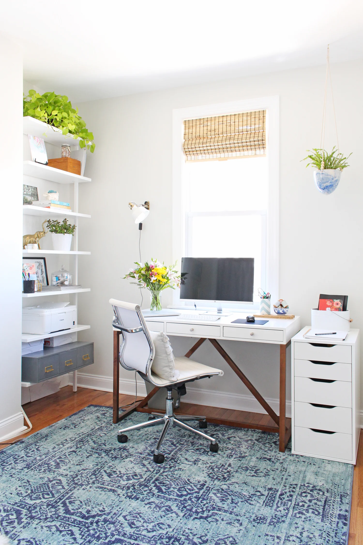
Once again, Benjamin Moore’s Winter White came to the rescue, and new hardwood floors replaced the carpet to give this space a clean slate. Then, in 2017, I gave my office a makeover to make it more functional and pretty during the One Room Challenge that spring. I absolutely loved working in here!
Home Office - AFTER
If you want to see the complete before and after, be sure to check out the One Room Challenge posts. You can start with this one.
Then, in its second life, the office part remained the same, but the other half of the room went from storage to a nursery space for our little guy! I kept the general modern eclectic style the same, but added in functional pieces like a dresser/changing station, and turned the closet into a “nursery nook.”
Shop the office look below:
Nursery Nook - AFTER
Goodness, looking back at this space makes me want to cry! We waited so long for John William (we went through years of infertility as well as a miscarriage), that I never thought we’d even ever have an opportunity to decorate a nursery. Though all of those pieces came with us to Richmond, seeing his “first” room is something super special. It had a modern, Scandinavian vibe going on, and I’m excited to build on what I had there in our new house.
Be sure to check out the big reveal of our nursery nook and get all the details in this post!
Shop the nursery nook look below:
That wraps up Part 2 of my final before & after tour! I hope you enjoyed taking a peek at our Philadelphia row home as much as I did. We have SO many memories from that house and I’m looking forward to the new ones we make in our house in Richmond!
*This post contains affiliate links, which means Mix & Match Design Company earns a small commission from your purchase at no cost to you.


